Chapter 1 Introduction to data visualization
1.1 Brief history of data visualization
Data visualisation is not a modern development with early data visualisation tracing back thousands of years, which were used to illustrate the trade or distribution of resources. The introduction of paper and parchment led to further development of visualisations. For example, the image below, taken from an appendix of a textbook in monastery schools, shows one of the earliest known two-dimensional charts describing planetary movement.
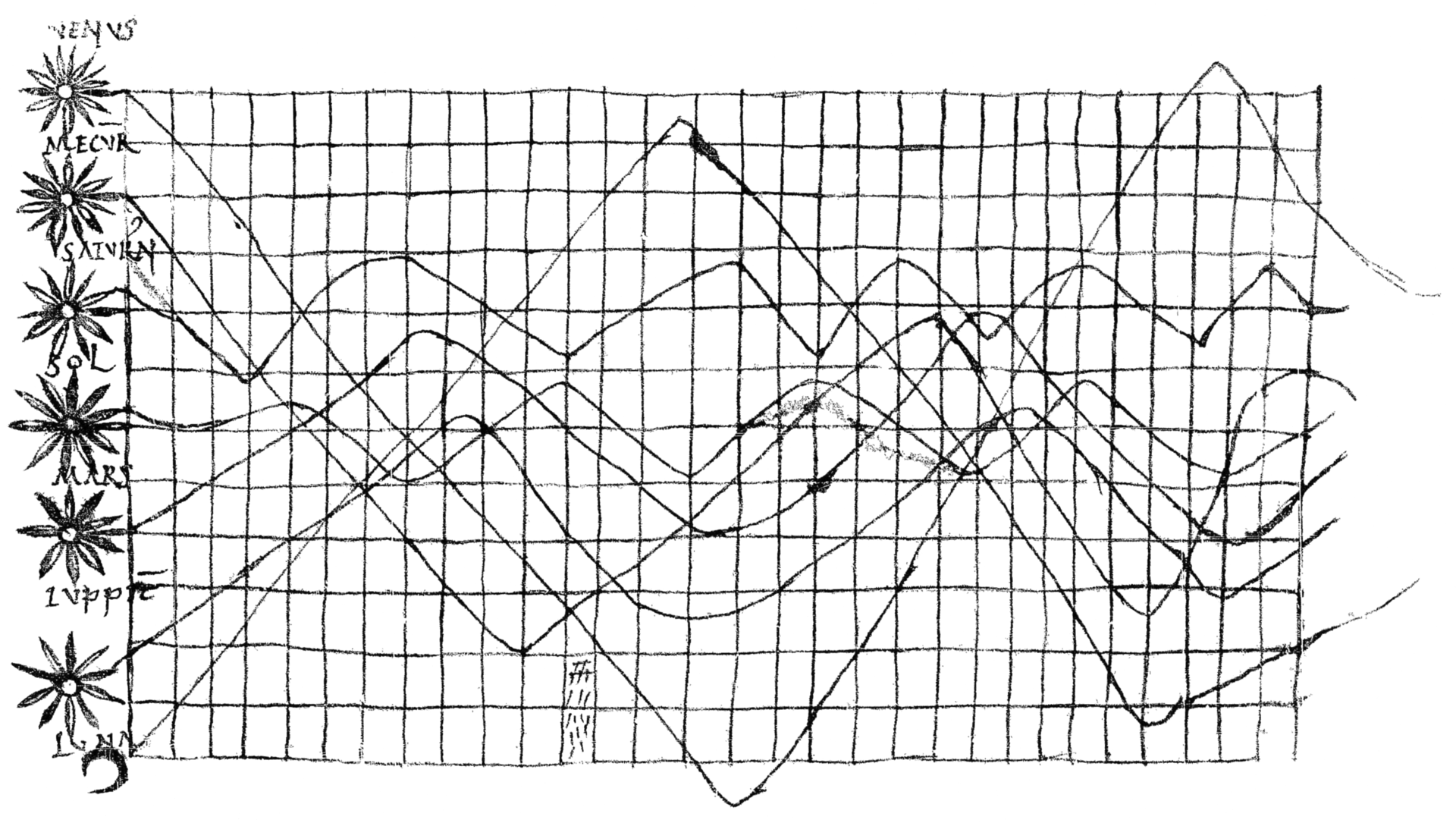
Figure 1.1: Planetary movements, taken from De cursu per zodiacum (The Course of the Zodiac), 10/11th century.
During the 17th century, Pierre de Fermat and Blaise Pascal’s work on statistics and probability theory would lay the groundwork for what we now deem as data. According to the Interaction Design Foundation, these theoretical developments allowed William Playfair to develop statistical graphics, allowing for the graphical communication of quantitative data, which he often apply to economic data. Playfair invented the line, area and bar chart, an example of which is the trade-balance time-series chart between England and Denmark & Norway shown below.
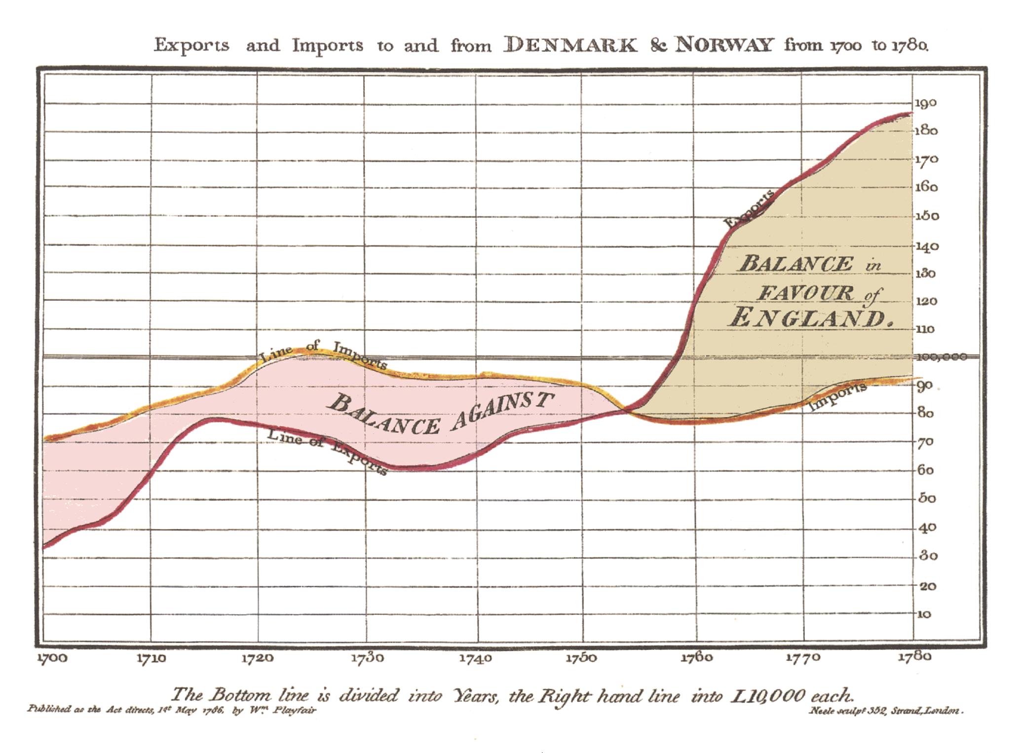
Figure 1.2: Playfair’s trade-balance time-series chart, published in his Commercial and Political Atlas, 1786.
In the later half of the 20th century, Jacques Bertin would elaborate on the use of visual variables (e.g. position, size, shape, colour) to represent quantitative information accurately and efficiently. During the same period, John Tukey expanded exploratory data analysis with new statistical approaches while Edward Tufte would refine data visualization techniques with his book “The Visual Display of Quantitative Information”. With the advent of computers, hand drawn visualisations would be increasingly replaced by computer-drawn counterparts. Furthermore, this is accompanied by the development of new programming languages, some of which are catered towards data analytics and visualisation.
1.2 Programming and data visualization
Two of the most popular programming languages for data science, which
include visualisation, would be the Python and R language. Python was created
over 30 years as an object-oriented, flexible and easy-to-learn programming
language. Over decades of development, Python has seen numerous updates
including the latest python3, which fixes many flaws in previous versions but
is no longer with the older python2. The R language is slightly younger,
primarily designed for statistical computing and graphics, is a spiritual
successor to older S programming language. Similar to Python, R has seen
numerous changes over the years with its latest major update to version 4.0 in
2020. We have also seen a proliferation of packages for both programming
languages, providing easy-to-use functions to accomplish common tasks such as
data visualisation in an efficient and reproducible manner. Notable packages
in the R programming language include dplyr and ggplot2 which we will be
using in this workshop for data wrangling and visualisation respectively.
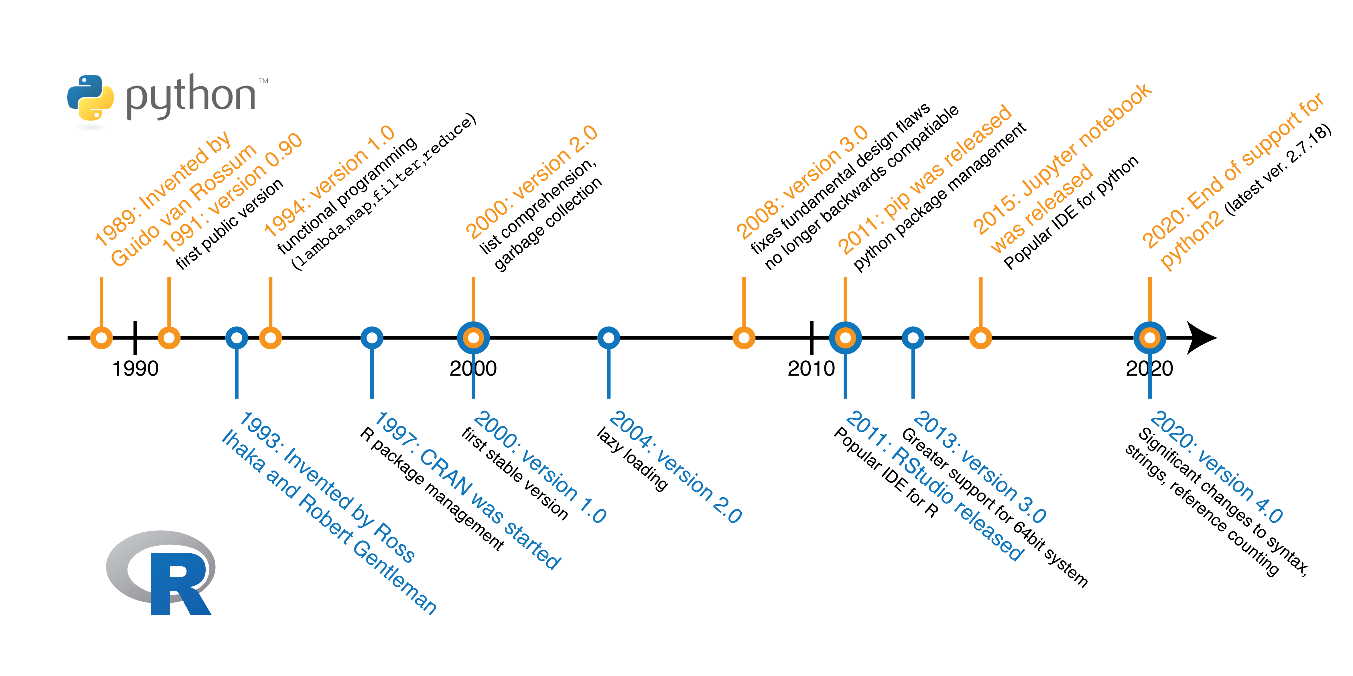
Figure 1.3: Developmental milestones during the history of the Python and R programming language.
With the increase in the amount of data generated (see plot below), programming has became an indispensible tool in data analysis. Compared to spreadsheet-based tools e.g. Microsoft Excel, programming-based approaches facilitate automation and reduce human error. Take for example, comparing the use of the R programming language and Microsoft Excel to generate a plot showing the amount of data generated with time (see plot below). Using the R programming language, one would need to type just under ten lines of code. In contrast, generating the same plot in Microsoft Excel would require about a similar number of clicks. The amount of time required to generate one plot would probably be similar. However, the difference arises when multiple similar plots are required where the programming approach would allow for more consistent plots. More importantly, the parameters used for plotting can be easily inspected from the code.
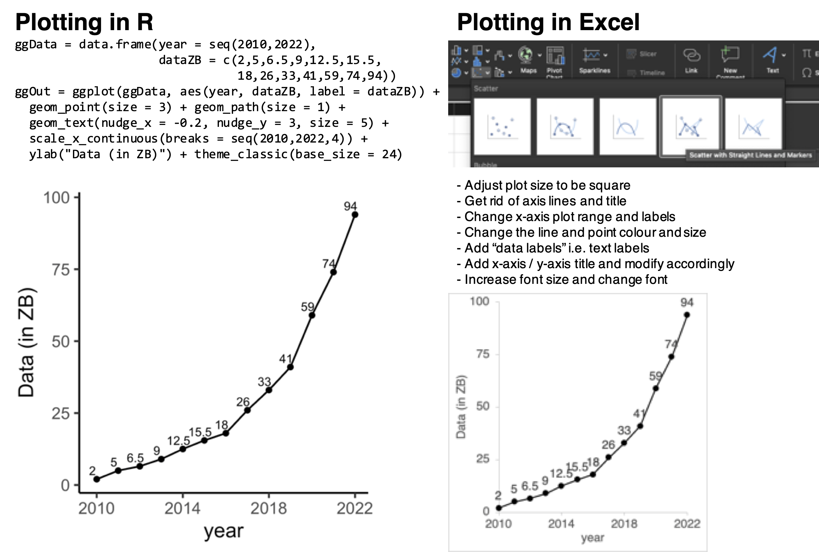
Figure 1.4: Amount of data generated worldwide with time, visualised using the R programming language as compared to using the spreadsheet-based Microsoft Excel.
1.3 Principles of data visualization
Regardless of the tool used to visualise the data, it is important that the data is represented in an appropriate manner. Data can be misrepresented in many forms, resulting in a lost of graphical integrity. Common examples of data misrepresentation (see image below) include (a) binning data in an unbalanced manner [2011-2018 contains data from 8 years whereas 2019-2020 only contains data from 2 years], (b) not plotting the y-axis from zero, which tends to exaggerate differences, (c) cherry picking of data [only a specific period of time is plotted, giving a false trend], (d) transformation of the axis, which tends to distort trends and (e) representing a continuous x-axis in a categorical manner, which distorts the progression along the x-axis [in this case, time].
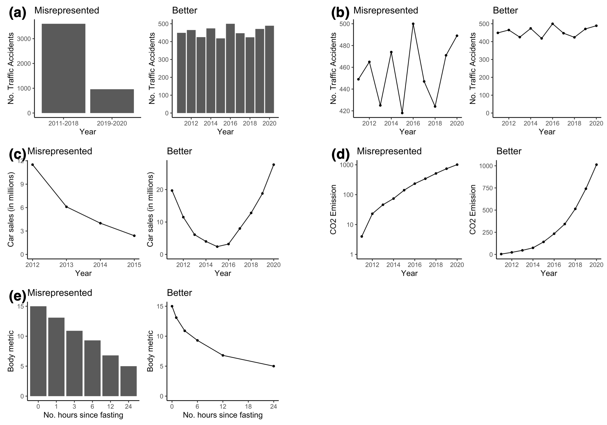
Figure 1.5: Data can be misrepresented in many forms, resulting in a lost of graphical integrity.
Other than graphical integrity, there are other good practices in data visualisation. First, it is crucial to maintain a high data-to-ink ratio where “ink” used for non-data or graphical distractions should be kept to a minimum. Second, as figures often act as a visual aid, it is important to only include details / data that helps in the narrative i.e. a good amount of data density. Busy plots should be avoided and alternative representations such as tables should be considered if the data is sparse. Third, three-dimensional visualisations should be avoided as they are often susceptible to optical illusions and thus misrepresent relationships in data. Fourth, to aid the audience in interpreting the visualisation, it is reccomended to annotate / emphasize certain parts of the figure with words or lines. Furthermore, it might be useful to reorder the way in which data are plotted (in an ascending or descending manner) for easier comparison between categories.
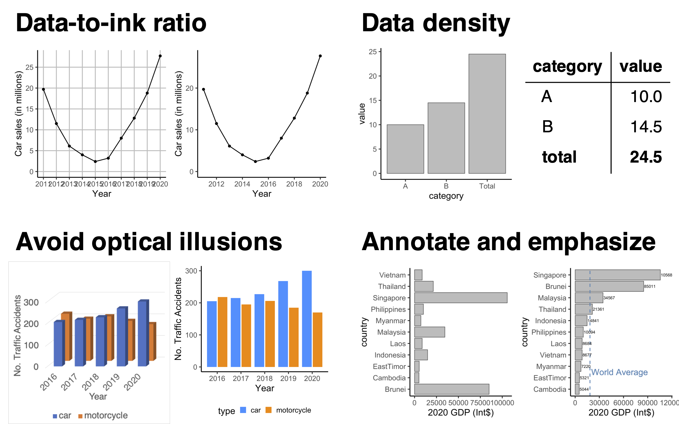
Figure 1.6: graph-concepts.
1.4 Aesthetics (colours and fonts)
Another often neglected aspect of data visualisation is the aesthetics of the
plot, in particular the choice of colours and fonts. Regarding colour, there
exist several resources to generate custom colour palettes such as
Adobe Color. Furthermore, there are programming
packages containing pre-made colour palettes. In R, the RColorBrewer package
contains several colour palettes (see below), which can be separated into (i)
sequential palettes containing colours of decreasing lightness and of a single
hue, (ii) qualitative palettes for categorical variables and (iii) diverging
palettes containing colours from a dark-to-light-to-dark lightness, commonly
used to represent transitions from negative values to zero to positive values.
There are also useful articles discussing
“How to pick beautiful colours”,
“Color use guidelines” and
“Mapping quantitative data to color”.
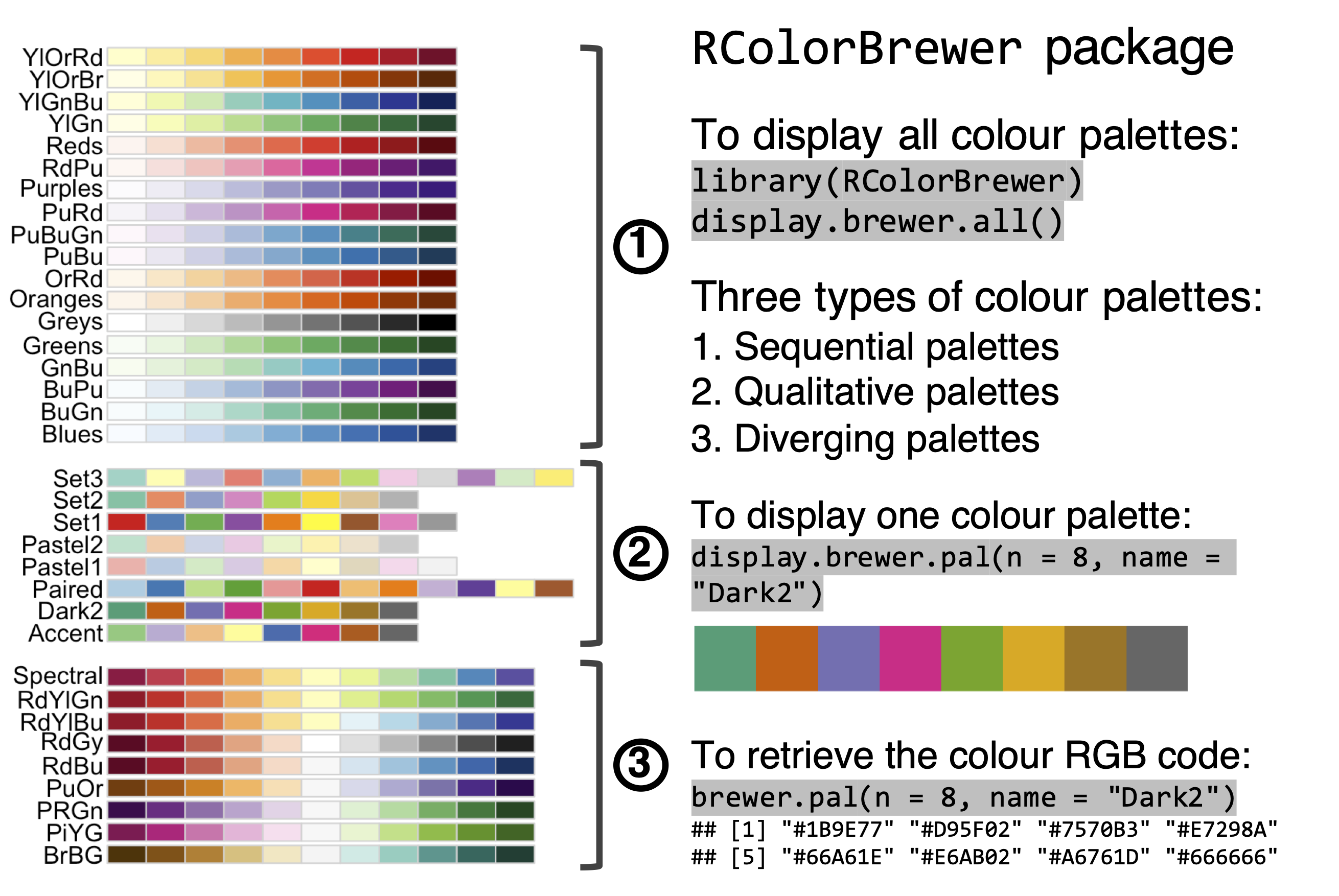
Figure 1.7: The RColorBrewer package contains several colour palettes, which can be queried and used in data visualisation in R.
Different fonts can be used to evoke different feelings. Many traditional fonts are Serif fonts where the letters or symbols contain serif, which are small decorative stroke at the end of a larger stroke. More recently, there has been a shift to Sans Serif fonts which do not have any extending strokes. In fact, Helvetica and Arial, two of the most commonly used fonts today, are Sans Serif fonts. Also, there are monospaced fonts, which are predominantly used for computer code. In the context of data visualisation, Sans Serif fonts are preferred as these fonts are deemed to be direct and clean, and thus does not distract the audience when interpreting the data.
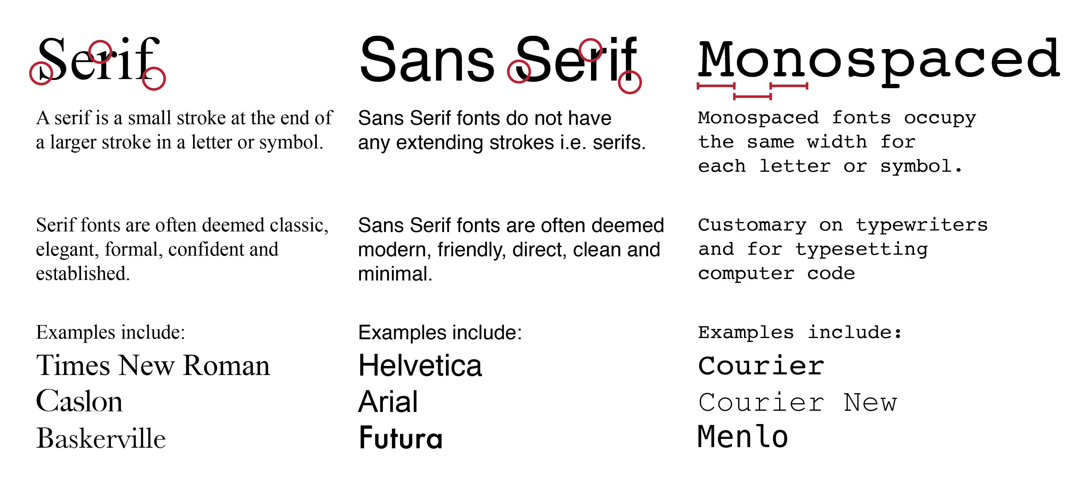
Figure 1.8: Fonts can be categorised into Serif fonts, Sans Serif fonts and monospaced fonts.