Chapter 3 Basic data visualization
3.1 Types of plots and visual variables
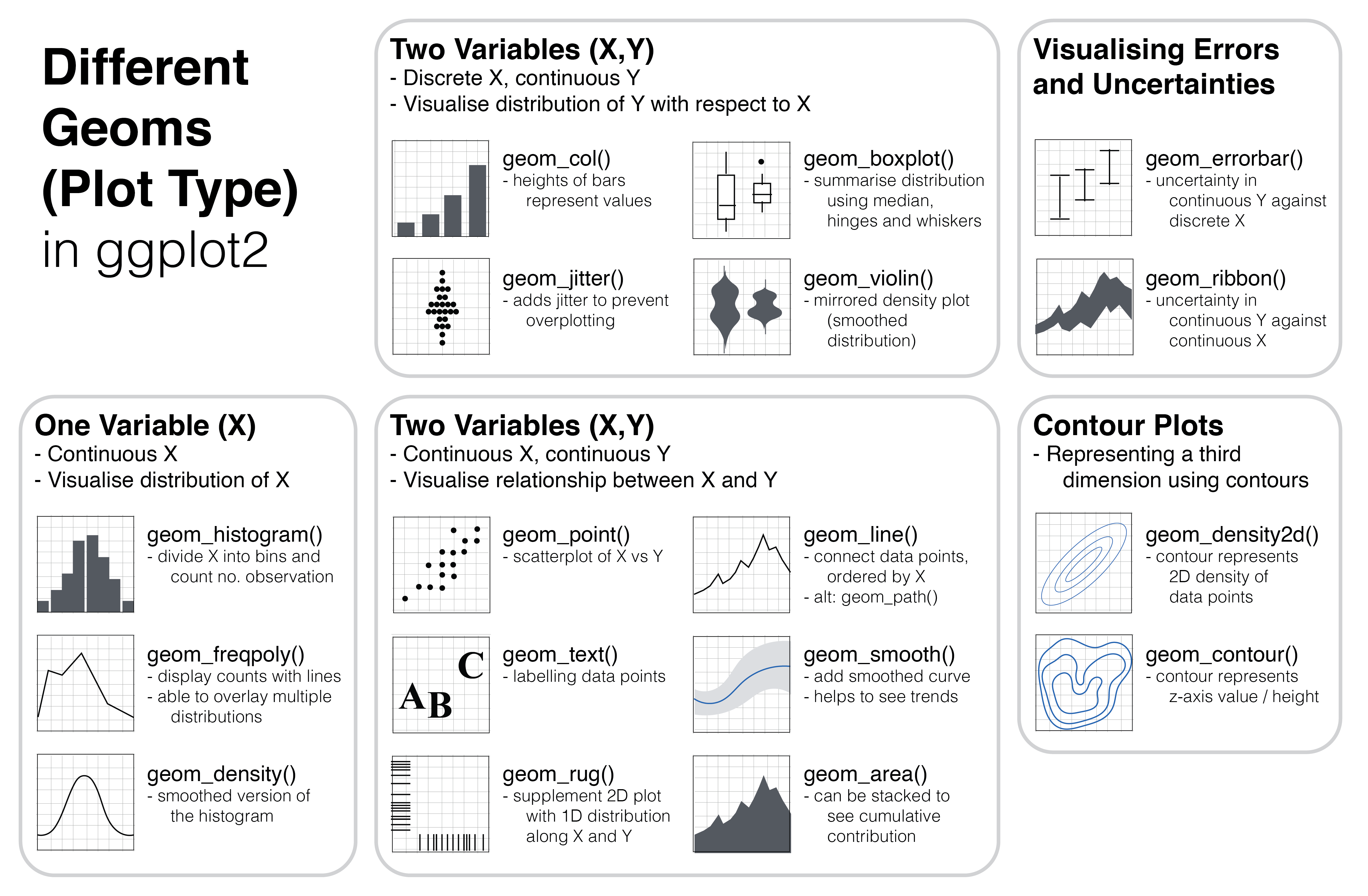
Figure 3.1: Different types of plot (known as geom in ggplot2) can be used depending on the structure of the data, namely the number of variables and whether the variables are discrete or continuous.
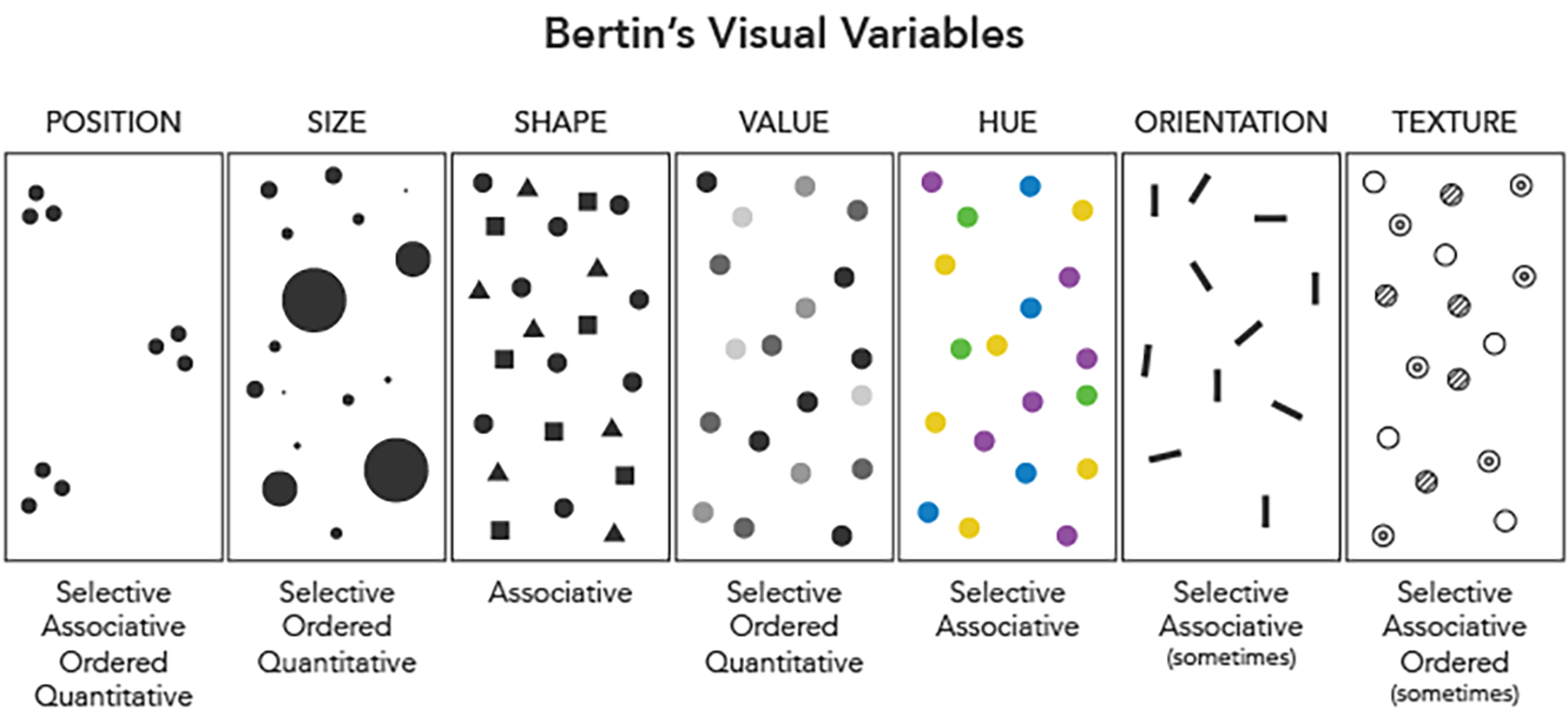
Figure 3.2: Visual variables, proposed by Jacques Bertin in 1967, namely visual elements that can be changed to reflect different attributes of the data. For example, different colours (which is essentially value + hue) can be used to represent different countries in the context of COVID-19 statistics. Image taken from https://www.axismaps.com/guide/general/visual-variables/
3.2 ggplot2 and grammar of graphics
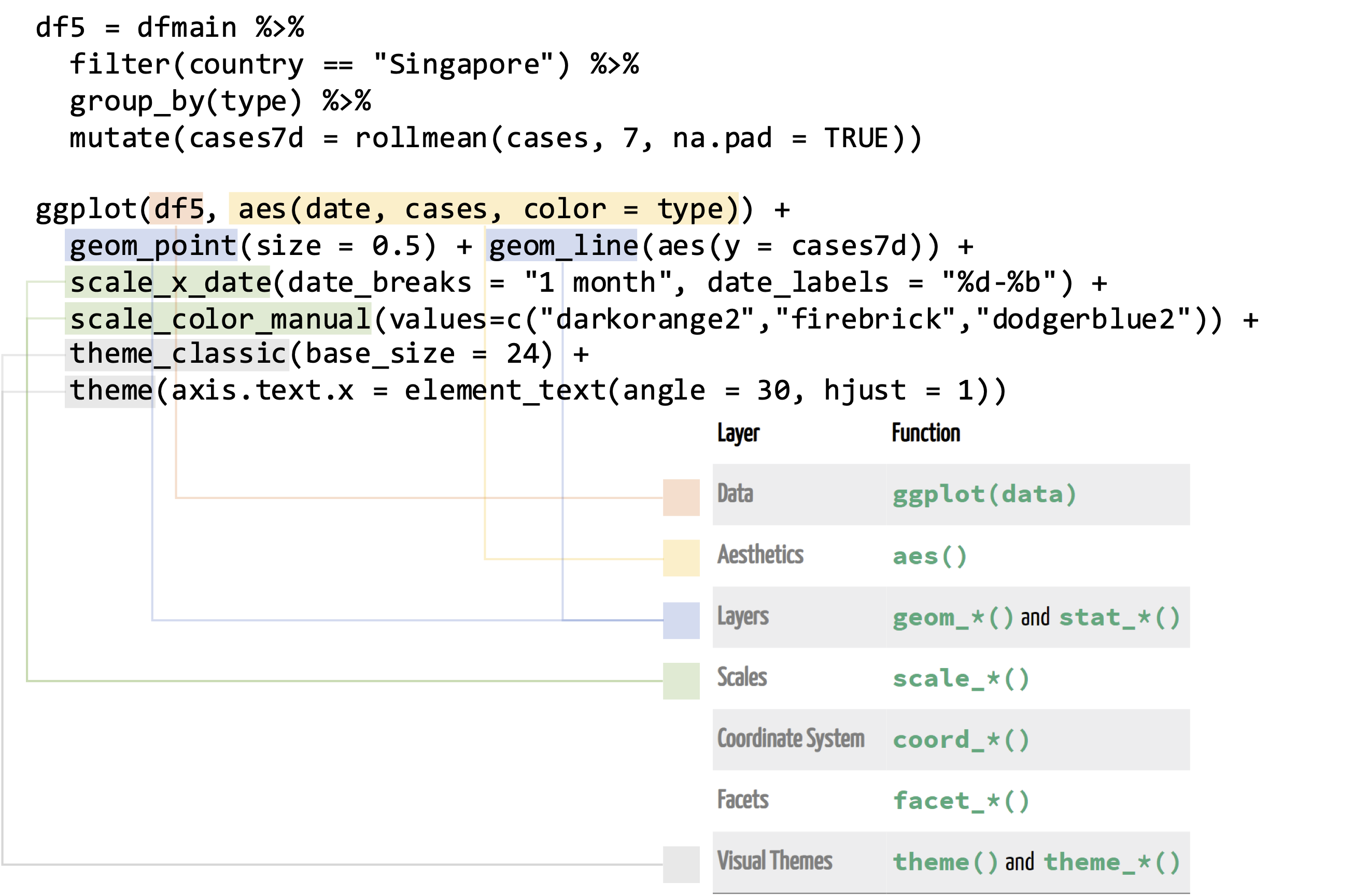
Figure 3.3: Structure of a ggplot, which includes (i) specifying the data (red), (ii) specifying the mapping of columns to aesthetics (gold), (iii) defining geoms i.e. the type of plot (blue), (iv) defining how scales i.e. axis labels / colour palettes are displayed and (v) providing changes to visual themes (grey).
library(tidyverse)
library(coronavirus)
library(zoo)
library(RColorBrewer)
knitr::opts_chunk$set(fig.width=9, fig.height=6) # set plot height/width in this webpage
dfmain <- coronavirus

df5 = dfmain %>%
  filter(country == "Singapore") %>%
  group_by(type) %>%
  mutate(cases7d = rollmean(cases, 7, na.pad = TRUE))

ggplot(df5, aes(date, cases, color = type)) +
  geom_point(size = 0.5) + geom_line(aes(y = cases7d)) +
  scale_x_date(date_breaks = "1 month", date_labels = "%d-%b") +
  scale_color_manual(values=c("darkorange2","firebrick","dodgerblue2")) +
  theme_classic(base_size = 24) +
  theme(axis.text.x = element_text(angle = 30, hjust = 1))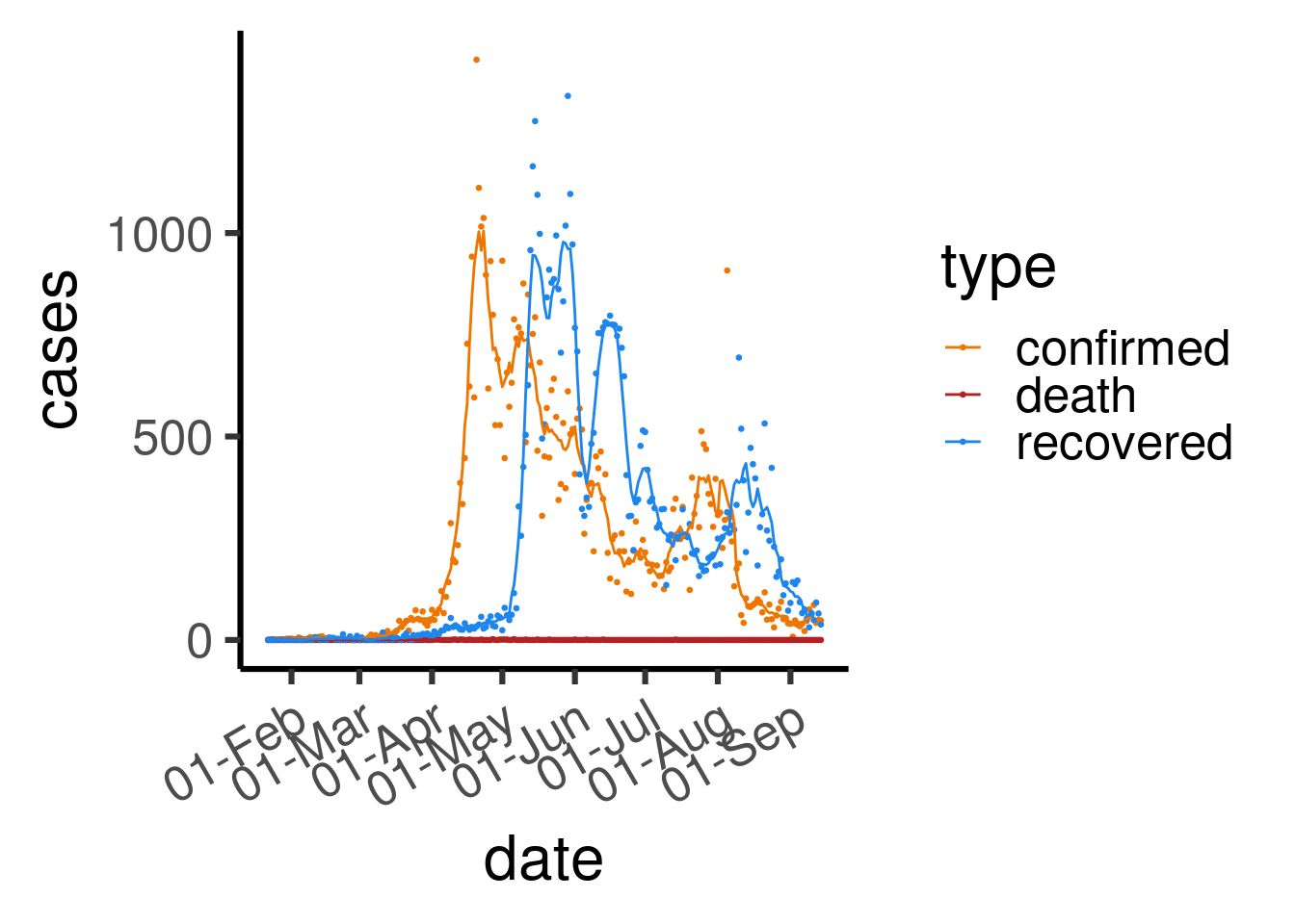
Figure 3.4: Number of daily COVID-19 cases, coloured by type (confirmed / death / recovered) in Singapore. Dots reflect actual numbers while lines represent 7-day rolling averages.
selectCountries = c("Singapore", "Malaysia",
                    "Japan", "Korea, South", "Taiwan*")
df6 <- dfmain %>%
  filter(type == "confirmed") %>%
  filter(country %in% selectCountries) %>%
  group_by(country) %>%
  arrange(date, .by_group = TRUE) %>%
  mutate(totalcases = cumsum(cases)) %>%
  mutate(roll7d = rollmean(cases, 7, fill = NA)) %>%
  filter(!is.na(roll7d)) %>%
  filter(totalcases >= 50) %>%
  mutate(dayN = row_number())
df6$country <- factor(df6$country, levels = selectCountries)

ggplot(df6, aes(dayN, roll7d, color = country)) +
  geom_line(size = 1) +
  xlab("No. days since total cases >= 50") +
  ylab("Daily new cases") +
  scale_color_manual("", values = c("black","grey","red","darkorange","blue")) +
  theme_classic(base_size = 24) +
  guides(color = guide_legend(nrow = 2)) +
  theme(legend.position = "bottom")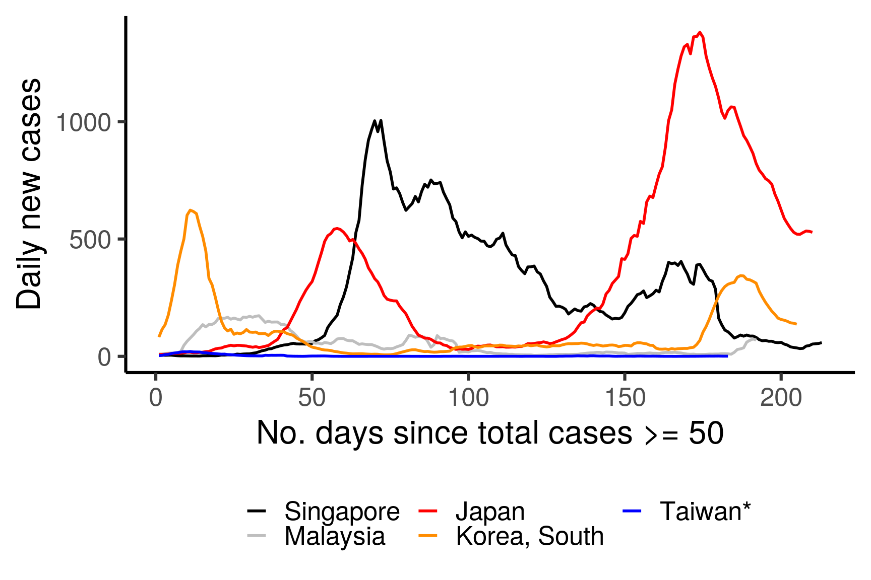
Figure 3.5: 7-day rolling averages of the number of daily COVID-19 cases for selected countries, coloured by country. The x-axis is adjusted to show the number of days since more than 50 total cases are confirmed in the corresponding country.
3.3 More plots to explore!
3.3.1 Total number of cases worldwide
df <- dfmain %>%
  filter(type == "confirmed") %>%
  group_by(country) %>%
  arrange(date, .by_group = TRUE) %>%
  mutate(totalcases = cumsum(cases)) %>%
  group_by(date) %>%
  summarise(totalcases = sum(totalcases))


ggplot(df, aes(date, totalcases)) +
  geom_point() + geom_path() +
  scale_x_date(date_breaks = "1 month", date_labels = "%d-%b") +
  theme_classic(base_size = 24) +
  theme(axis.text.x = element_text(angle = 30, hjust = 1))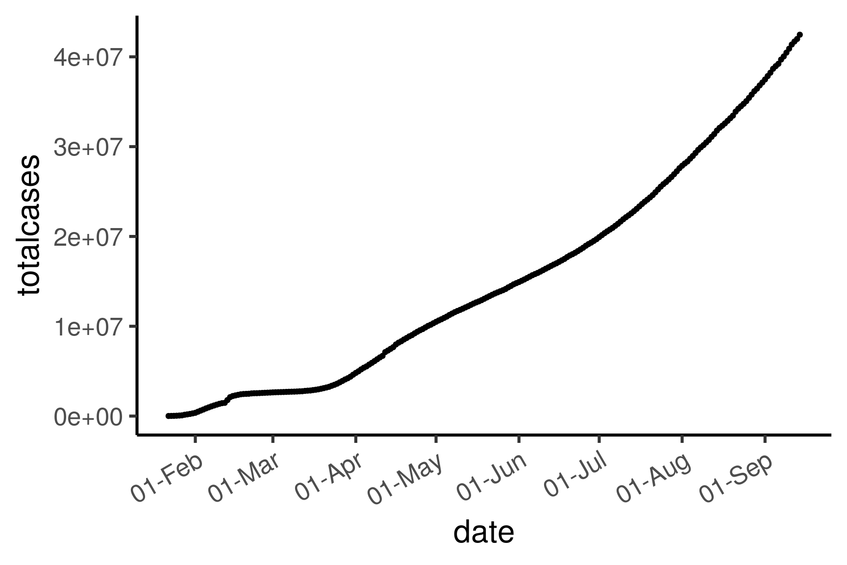
3.3.2 Total number of new cases per country (top 10)
df <- dfmain %>%
  filter(type == "confirmed") %>%
  group_by(country) %>%
  summarise(totalcases = sum(cases)) %>%
  arrange(desc(totalcases))
top10countries <- c(df$country[1:10],"China")

df <- dfmain %>%
  filter(type == "confirmed") %>%
  mutate(top10 = replace(country, !country %in% top10countries, "others")) %>%
  group_by(top10, date) %>%
  summarise(newcases = sum(cases))
df$top10 = factor(df$top10, levels = c(top10countries, "others"))

ggplot(df, aes(date, newcases, fill = top10)) +
  geom_area() +
  scale_x_date(date_breaks = "1 month", date_labels = "%d-%b") +
  scale_fill_manual("", values = c(brewer.pal(name = "Paired", n = 12)[c(1:10,12)],"grey")) +
  theme_classic(base_size = 24) +
  theme(axis.text.x = element_text(angle = 30, hjust = 1),
        legend.position = "bottom")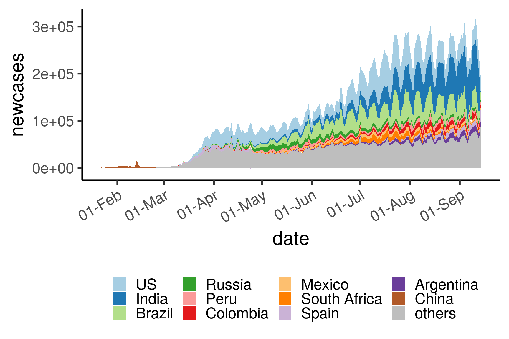
3.3.3 Total active/recovered/death in Singapore
df <- dfmain %>%
  filter(country == "Singapore") %>%
  select(c("date","type","cases")) %>%
  group_by(type) %>%
  arrange(date, .by_group = TRUE) %>%
  mutate(cases = cumsum(cases)) %>%
  pivot_wider(names_from = type, values_from = cases) %>%
  mutate(active = confirmed - death - recovered) %>%
  pivot_longer(-date, names_to = "type", values_to = "totalcases") %>%
  filter(type != "confirmed")
df$type <- factor(df$type, levels = c("active","recovered","death"))

ggplot(df, aes(date, totalcases, color = type)) +
  geom_path(size = 1) +
  ylab("Total cases") + ggtitle("COVID-19 cases in Singapore") +
  scale_x_date(date_breaks = "1 month", date_labels = "%d-%b") +
  scale_color_manual("", values = c("firebrick","steelblue","grey")) +
  theme_classic(base_size = 24) +
  theme(axis.text.x = element_text(angle = 30, hjust = 1),
        legend.position = "bottom")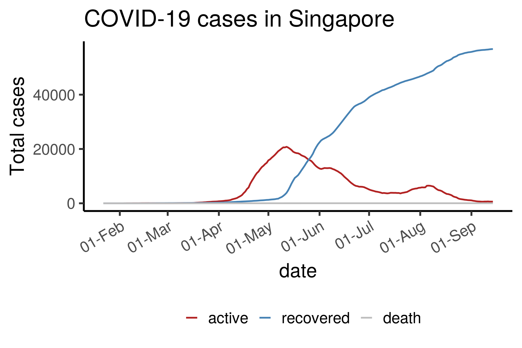
3.3.4 Total active/recovered/death in Singapore (boxplot)
Here, we bin the cases into months and display each month’s distribution using a boxplot. This is mainly to illustrate how to do a boxplot.
df <- dfmain %>%
  filter(country == "Singapore") %>%
  select(c("date","type","cases")) %>%
  # pivot_wider(names_from = type, values_from = cases) %>%
  # mutate(active = confirmed - death - recovered) %>%
  # pivot_longer(-date, names_to = "type", values_to = "cases") %>%
  # filter(type != "confirmed") %>%
  mutate(month = format(date,"%Y-%m"))
df$type <- factor(df$type, levels = c("confirmed","recovered","death"))

ggplot(df, aes(month, cases, color = type)) +
  geom_boxplot() +
  ylab("Total cases") + ggtitle("COVID-19 cases in Singapore") +
  scale_color_manual("", values = c("firebrick","steelblue","grey")) +
  theme_classic(base_size = 24) +
  theme(axis.text.x = element_text(angle = 30, hjust = 1),
        legend.position = "bottom")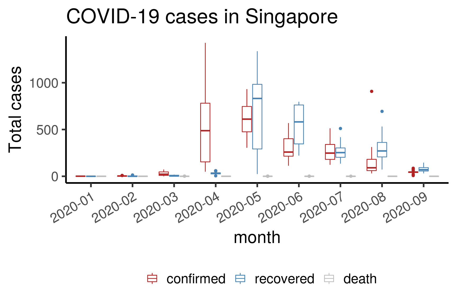
3.3.5 Daily new cases in selected countries
selectCountries = c("Singapore", "Malaysia",
                    "Taiwan", "Hong Kong", "Japan", "S. Korea")
df <- dfmain %>%
  filter(type == "confirmed") %>%
  mutate(country = replace(country, province == "Hong Kong", "Hong Kong")) %>%
  mutate(country = replace(country, country == "Taiwan*", "Taiwan")) %>%
  mutate(country = replace(country, country == "Korea, South", "S. Korea")) %>%
  filter(country %in% selectCountries) %>%
  group_by(country) %>%
  mutate(roll7d = rollmean(cases, 7, fill = NA)) %>%
  filter(!is.na(roll7d))
df$country <- factor(df$country, levels = selectCountries)

ggplot(df, aes(date, roll7d, color = country)) +
  geom_path(size = 1) +
  ylab("Daily new cases") +
  scale_x_date(date_breaks = "1 month", date_labels = "%d-%b") +
  scale_color_manual("", values = c("black","grey","blue","purple","red","darkorange")) +
  theme_classic(base_size = 24) + guides(color = guide_legend(nrow = 2)) +
  theme(axis.text.x = element_text(angle = 30, hjust = 1),
        legend.position = "bottom")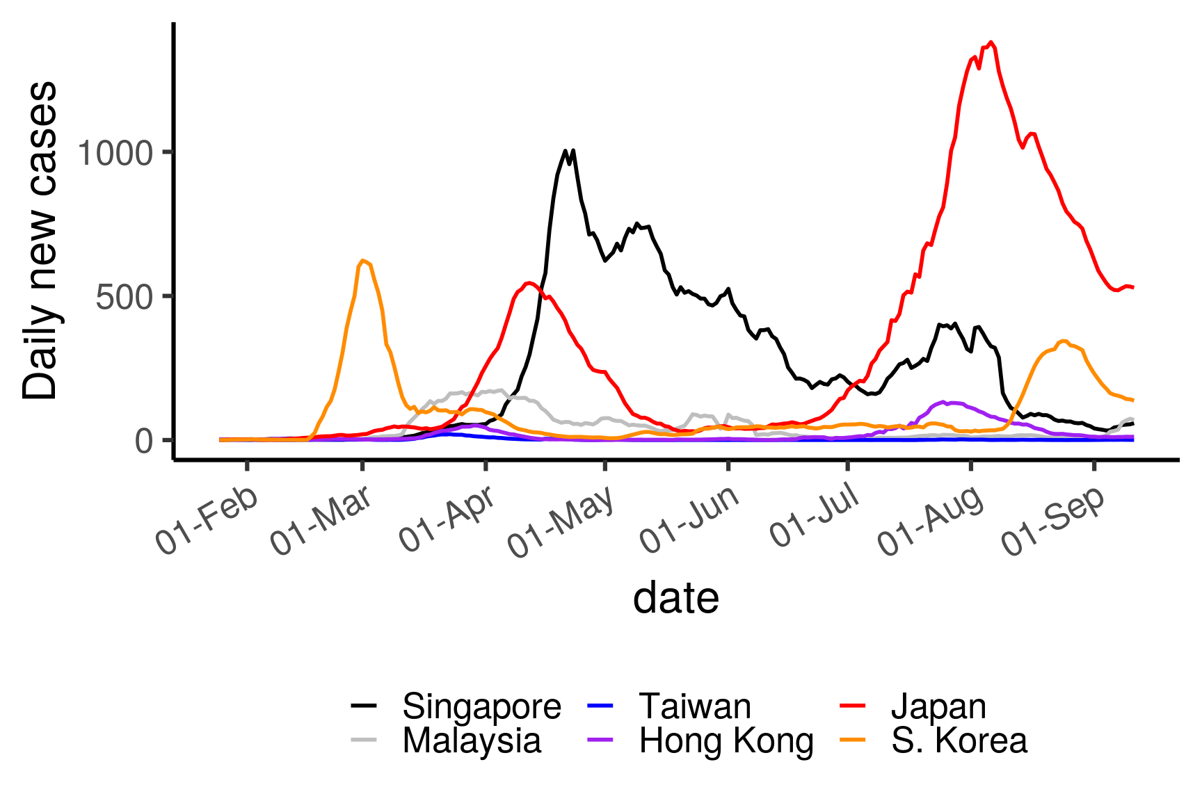
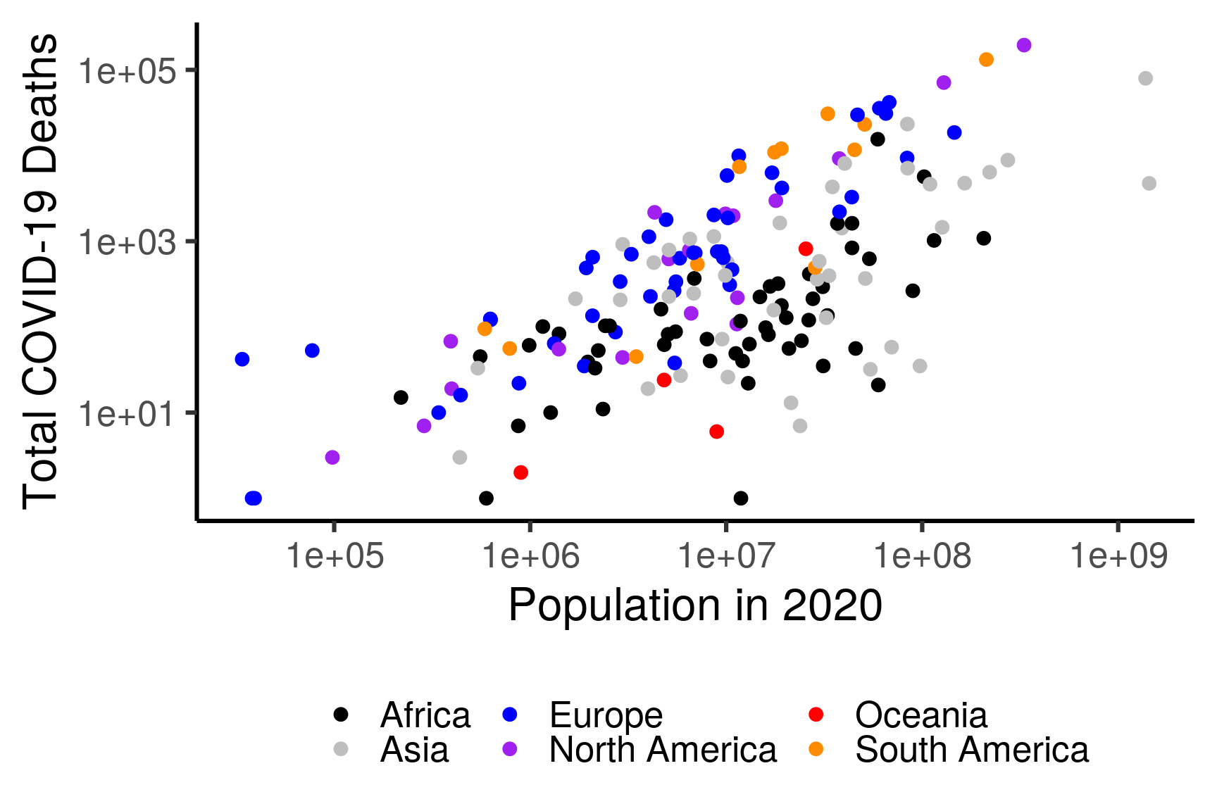
3.3.6 COVID-19 deaths vs Population
This requires an additional file countryMetadata.tsv containing additional metadata regarding each country, which can be downloaded here.
countryMeta = read.csv("data/countryMetadata.tsv", sep = "\t")

df <- dfmain %>%
  filter(type == "death") %>%
  group_by(country) %>%
  summarise(totalDeaths = sum(cases)) %>%
  inner_join(countryMeta, by = "country") %>%
  filter(totalDeaths > 0)
## `summarise()` ungrouping output (override with `.groups` argument)ggplot(df, aes(population, totalDeaths, color = continent)) +
geom_point(size = 3) + # geom_smooth(method = "lm", se = FALSE) +
ylab("Total COVID-19 Deaths") + xlab("Population in 2020") +
scale_x_log10() + scale_y_log10() +
scale_color_manual("", values = c("black","grey","blue","purple","red","darkorange")) +
theme_classic(base_size = 24) + guides(color = guide_legend(nrow = 2)) +
theme(legend.position = "bottom")