Chapter 2 Basic Analysis
2.1 First impression of the data
In this guide, we will be starting the analysis from the raw counts matrix. We assumed that reads alignment and UMI counting has already been performed (Section ??). Furthermore, we will be focusing on single-cell data generated using the commercial 10X genomics platform, which is a droplet-based and tag-based technique (Section 1.2.3), employing UMIs (Section 1.2.2). Changes to the analysis pipeline to accomodate full-length techniques will be provided when necessary.
2.1.1 10X summary report
Before beginning the analysis proper, it is helpful to look into any summary statistics that is generated during the alignment and counting process. One such example is the 10X summary report (Figure 2.1), created by the Cell Ranger tool, when generating counts matrices from 10X scRNA-seq experiments.
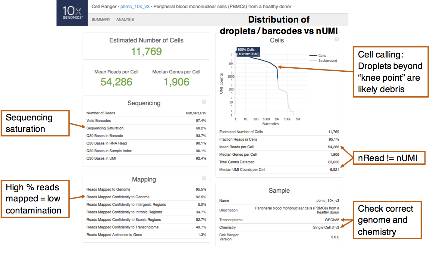
Figure 2.1: An example 10X summary report obtained from scRNA-seq of peripheral blood mononuclear cells (PBMCs). Important summary statistics to note are indicated.
The left half of the report describes sequencing and mapping statistics. One thing to note is the “sequencing saturation”, which estimates the proportion of mRNA transcripts that has been sequenced. This is calculated by downsampling the mean number of reads per cell and obtaining the corresponding number of UMIs (nUMI). The relationship between the number of UMIs obtained against the number of reads is then extrapolated to the asymptote, which corresponds to 100% saturation. A low sequencing saturation implies that deeper sequencing will likely recover more UMIs. That said, some preliminary analysis should first be performed to determine if the current number of UMIs recovered is able to answer the biological questions of interest. Also, check that a high percentage of reads are mapped to the genome, which indicates low amounts of contamination.
The top-right portion of the report plots the nUMI captured in each droplet / barcode, with the droplets ordered in decreasing nUMI from left to right. On the left side of the plot, droplets have very high nUMI and are likely to contain cells. As we scan through the droplets towards the right, we eventually encounter a “knee point” where there is a drastic drop in the nUMI. This likely signifies a transition from observing cell-containing droplets to droplets containing cell debris or no cells at all. Droplets that are deemed by Cell Ranger to contain cells are coloured blue here and the algorithm tends to include slightly more cells beyond the plot shoulder. These cells with smaller nUMIs will have to be removed in the quality control step.
From the summary report, there is another important observation: the nUMI does not correspond to the number of reads per cell. Recall that this is because reads with the same UMI originated from a single mRNA molecule and is thus treated as a single UMI count (Section 1.2.2). Thus, the number of counts i.e. nUMI is usually only a fraction (about 1/8 to 1/3) of the number of reads.
2.1.2 Example dataset: Human healthy bone marrow
For the remainder of this guide, we will be analyzing the scRNA-seq of human healthy bone marrow. We chose this dataset because (i) the immune cell types in the bone marrow are generally well-understood, (ii) the bone marrow is highly heterogeneous with different lineages and (iii) this dataset contains multiple 10X libraries from different donors, which is commonplace in modern single-cell studies.
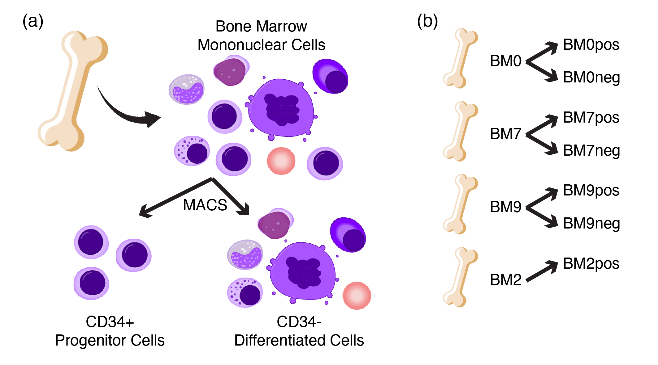
Figure 2.2: Schematic of healthy bone marrow scRNA-seq data. (a) BM-MNCs from different donors were isolated and sorted into CD34+ progenitor and CD34- differentiated fractions, (b) resulting in a total of seven libraries from four donors. Note that the BM2neg library is excluded due to low quality sample.
In this scRNA-seq experiment, bone marrow mononuclear cells (BM-MNCs) are isolated from four donors labelled BM0, BM7, BM9 and BM2. For each donor, the BM-MNCs are further sorted into CD34+ (progenitors) and CD34- (differentiated) fractions via Magnetic Activated Cell Sorting (MACS). This sorting step is performed to ensure that the rare CD34+ progenitor compartment is sufficiently represented in terms of cell numbers. Thus, the libraries are labelled with the donorID followed by pos/neg for the CD34+/CD34- fraction e.g. BM0pos. Note that the BM2neg library is excluded due to low quality sample. Overall, this resulted in a total of 7 libraries with ~40,000 cells. The reprocessed raw counts matrices can be download in this download link.
2.2 Reading in single-cell data
Next, we proceed to understand the general structure of scRNA-seq datasets and
how to read these matrices into the Seurat package.
2.2.1 Data structure
In general, single-cell gene expression comprise three main components. First, there is the UMI counts matrix with each row and column representing a gene and a cell respectively. Note that certain computational tools, especially those written in Python programming language, assume the transpose where a row represent a cell instead and vice versa. This is likely due to the machine learning conventions in Python where the rows usually refer to the sample i.e. the cell while the columns are related to the features of the sample, in this case the genes. Due to the sparsity of the gene expression (Section 1.3.3), these matrices are usually stored in the sparse matrix format to reduce storage and memory consumption.
Second, the column data (or colData for short) contains cell-level information e.g. the cell barcode and library. In analyzed datasets, additional annotations such as the cell type may be included. Third, the row data (or rowData) consist of gene-level information such as the ensembl IDs and gene names. In general, the rows / rowData are not restricted to genes but can also include other features such as cell surface protein levels (quantified by antibody capture) and CRISPR guide RNAs. In that case, information regarding the the assay type is also included in the rowData.
2.2.2 File formats
There are several ways to store the three main components of single-cell data.
The most direct way is to have a separate text file for each component as
exemplified by the Cell Ranger tool output. Cell Ranger outputs the single-cell
gene expression in three gz-compressed files: (i) matrix.mtx.gz that contains
the counts matrix in sparse matrix format, (ii) barcode.tsv.gz that contains
the cell barcodes and (iii) features.tsv.gz that contains gene information.
A trio of files is created for each library.
Another popular file format is the Hierarchical Data Format (abbreviated HDF5 or H5), a binary format that compresses the data much more efficiently than traditional zip/gz-based approaches, resulting in file sizes that are several times smaller. Another advantage is that the gene expression, colData and rowData are all stored in a single H5 file. Also, Cell Ranger can output single-cell gene expression in the H5 format. Given the large number of single cells profiled across numerous libraries, there is now a lean towards the H5 file format. There is also another file format called the loom file, which is based off the H5 data structure.
It should be pointed out that the single-cell gene expression data from different libraries are usually stored in separate files. It is possible that cells in different libraries can have the same cell barcode. Thus, when combining gene expression data from different libraries, it is crucial to include a prefix in the cell barcode to avoid any potential “barcode” clashes.
2.2.3 Seurat / single-cell objects
As mentioned in Section 1.3.2, there are several “platform”
packages and we will be using the Seurat package in this guide. Seurat
supports both trio-text-file and H5-file formats. When running the Seurat
pipeline, the output data are stored in a single Seurat object. Different
types of information are stored in the different slots of a Seurat object and
the list of available slots can be accessed via the slotNames() function.
Individual slots can then be accessed via the @ symbol, e.g. seu@meta.data
gives the cell metadata / colData, stored as a dataframe. Other useful slots
include seu@assays[["RNA"]] which accesses the gene expression data.
Notably, Seurat objects can be converted to other single-cell objects e.g.
SingleCellExperiment and cds (short for cell_data_set) objects, which are
commonly used in other R-based single-cell analysis packages. Conversion to
python-based formats e.g. h5ad (short for H5-AnnData) for use with the
scanpy package is also supported. For more information, visit this official
Seurat link.
2.2.4 Code
Again, the human bone marrow scRNA-seq dataset, which we will be using in this guide, can be download in this download link.
Below is a code snippet for reading in the above raw counts matrices in the
H5-file format. Conveniently, Seurat has a Read10X_h5 function, tailored to
read in H5-files generated from Cell Ranger. As mentioned in Section
2.2.2, we included a prefix marking the library in the cell
barcode i.e. colnames(tmp) to avoid any potential “barcode” clashes. The
final inpUMIs contains the UMI counts across all seven libraries.
##### Load required packages
rm(list = ls())
library(data.table)
library(Matrix)
library(ggplot2)
library(patchwork)
library(grid)
library(gridExtra)
library(RColorBrewer)
library(Seurat)
library(clustree)
library(pheatmap)
library(clusterProfiler)
library(msigdbr)
if(!dir.exists("images/")){dir.create("images/")} # Folder to store outputs

### Define color palettes and plot themes
colLib = brewer.pal(7, "Paired")                 # color for libraries
names(colLib) = c("BM0pos", "BM0neg", "BM7pos", "BM7neg",
                  "BM9pos", "BM9neg", "BM2pos")
colDnr = colLib[c(1,3,5,7)]                      # color for donors
names(colDnr) = c("BM0", "BM7", "BM9", "BM2")
colGEX = c("grey85", brewer.pal(7, "Reds"))      # color for gene expression
colCcy = c("black", "blue", "darkorange")        # color for cellcycle phase
plotTheme <- theme_classic(base_size = 18)
nC <- 4 # Number of threads / cores on computer


### Read in files
# Read in h5 files which are in the `0data/` directory
inpUMIs <- NULL
for(i in names(colLib)){
  tmp <- Read10X_h5(paste0("0data/", i, ".h5"))
  colnames(tmp) <- paste0(i, "_", colnames(tmp)) # Append sample prefix
  inpUMIs <- cbind(inpUMIs, tmp)
}
rm(tmp)
2.3 Quality control (QC)
Due to the high technical noise in single-cell data, quality control (QC) is necessary to identify and remove low-quality data. The QC can be separated into cell QC and gene QC which filters low-quality / dying cells and removes very lowly-expressed genes respectively (Figure 2.3).
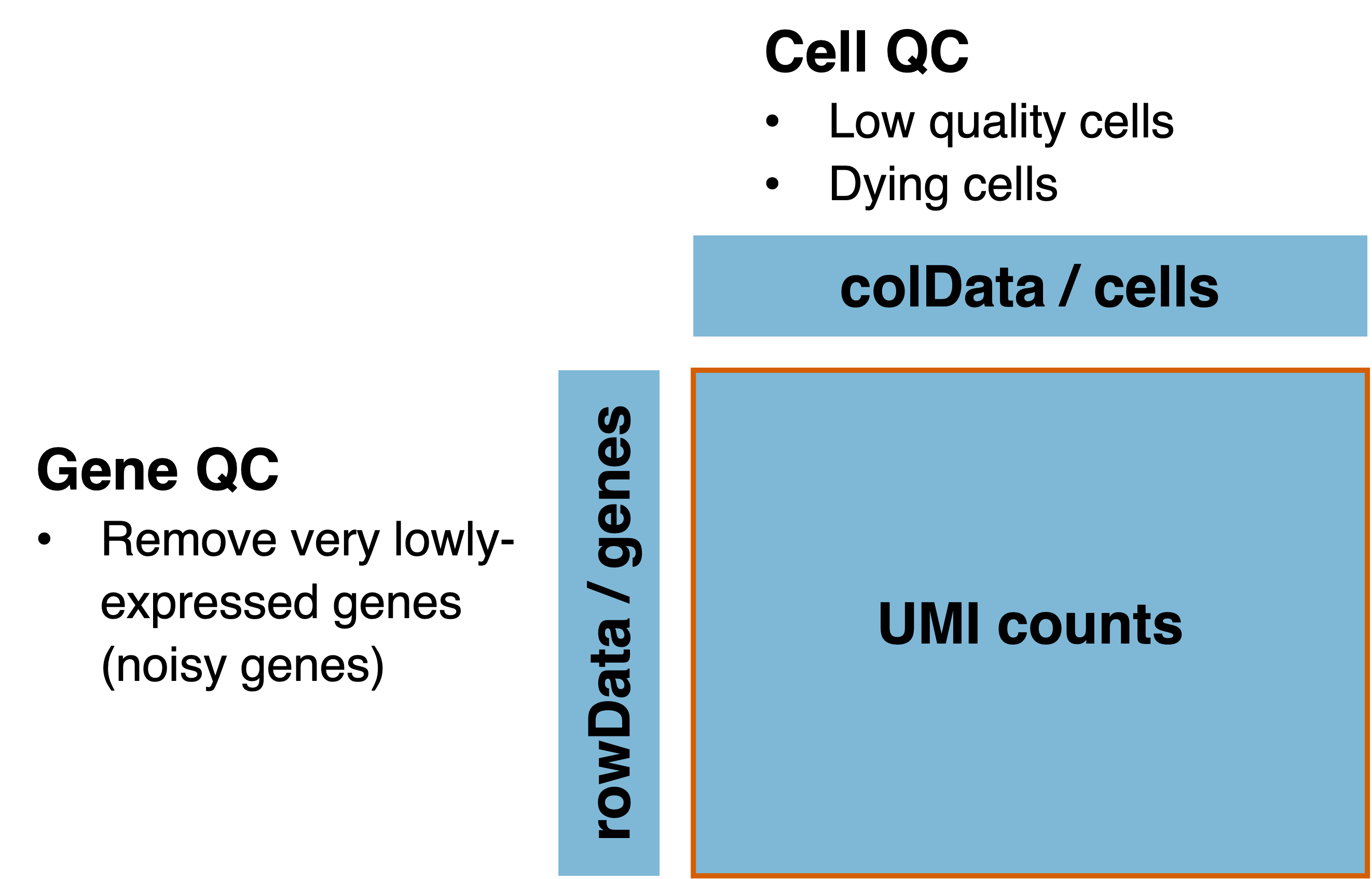
Figure 2.3: Quality control for single-cell data can be separated into cell QC and gene QC.
2.3.1 Cell QC
Undesirable cells have to be removed before any downstream analysis. These cells include (i) doublets where more than one cell has been captured in a single droplet and assigned the same barcode, (ii) lysing cells / cell debris where the cell integrity has been compromised and (iii) cells that are under stress or dying. If these cells were not removed, downstream analysis may be skewed towards finding the differences between the low-quality and normal cells instead of uncovering the underlying biology.
We remove undesirable cells based on (i) number of UMIs per cell nUMI, (ii)
number of detected genes per cell nGene and (iii) the percentage of UMIs
assigned to mitochondrial (MT) genes pctMT (Figure 2.4).
For (i), we remove cells with extremely low and extremely nUMI. The former
are likely cells with little RNA content, indicative of low-quality or dying
cells, while the latter represent potential doublets. For (ii) we remove cells
with a low nGene, which indicate a poor capture of the diverse transcriptome.
For (iii), we remove cells with high pctMT, which usually imply that the
cells are dying or under stress.
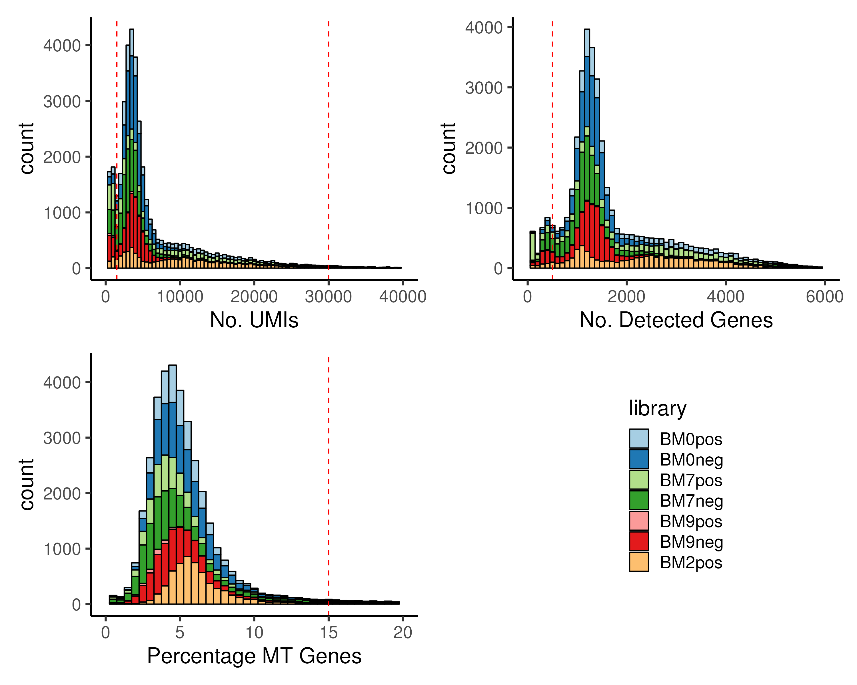
Figure 2.4: Cells with (top left) extremely low or extremely high number of UMIs, nUMI, (top right) low number of detected genes, nGene and (bottom left) high percentage MT genes, pctMT, have to be removed prior to downstream analysis. In the example, we removed cells with either nUMI ≤ 1500 or nUMI ≥ 30000 or nGene ≤ 500 or pctMT ≥ 15%.
The QC cutoffs are highly dependent on the scRNA-seq technique and sequencing
depth. Thus, it is often determined empirically by plotting histograms to
visualize the distribution of these QC metrics. Ideally, a bimodal distribution
should be observed for nUMI and nGene, separating low- and high-quality
cells. For pctMT, typical cutoff ranges from 10% to 15%. However, one may
relax the pctMT cutoff depending on the biology. For example, higher cutoffs
are acceptable in scRNA-seq studies involving immune response to stimulus where
immune cells are under stress. Another example is in stem cell differentiation
where the stem cell populations are actively dividing and thus have higher
mitochondria activity.
Apart from using empirical cutoffs, there exist computational tools that can distinguish whether a droplet contains an intact cell or not, such as the EmptyDrops algorithm (Lun et al. 2019). Also, there are computational tools for the identification of doublets such as the DoubletFinder (McGinnis, Murrow, and Gartner 2019) and Scrublet (Wolock, Lopez, and Klein 2019). These algorithms look for cells that exhibit transcriptional profile reminiscent of two cell states being mixed together. See this study (Xi and Li 2021) for a detailed benchmarking of doublet detection methods. However, care has to be taken when running these algorithms as it may remove actual hybrid cells, for example, cells that are transdifferentiating between two cell types.
2.3.2 Gene QC
Apart from undesirable cells, low abundance genes also have to be removed
as they are too noisy for reliable statistical inference. Furthermore, removal
of these uninformative genes results in increased detection power for the
remaining genes. Lowly-expressed genes can be identified from (i) the average
number of UMIs per gene and (ii) number of cells expressing the gene nExpr
(Figure 2.5). Again, empirical cutoffs are chosen from the
histograms of \(\log_{10}(\text{Average UMI})\) and \(\log_{10}(\text{nExpr})\).
Typically, two peaks are observed on the histogram, corresponding to genes with
low and high abundance and an empirical cutoff is chosen between the two peaks.
It is possible that one single cell can contains many UMIs of the same gene,
resulting in an inflated average number of UMIs. Thus, we only apply a cutoff
to nExpr.
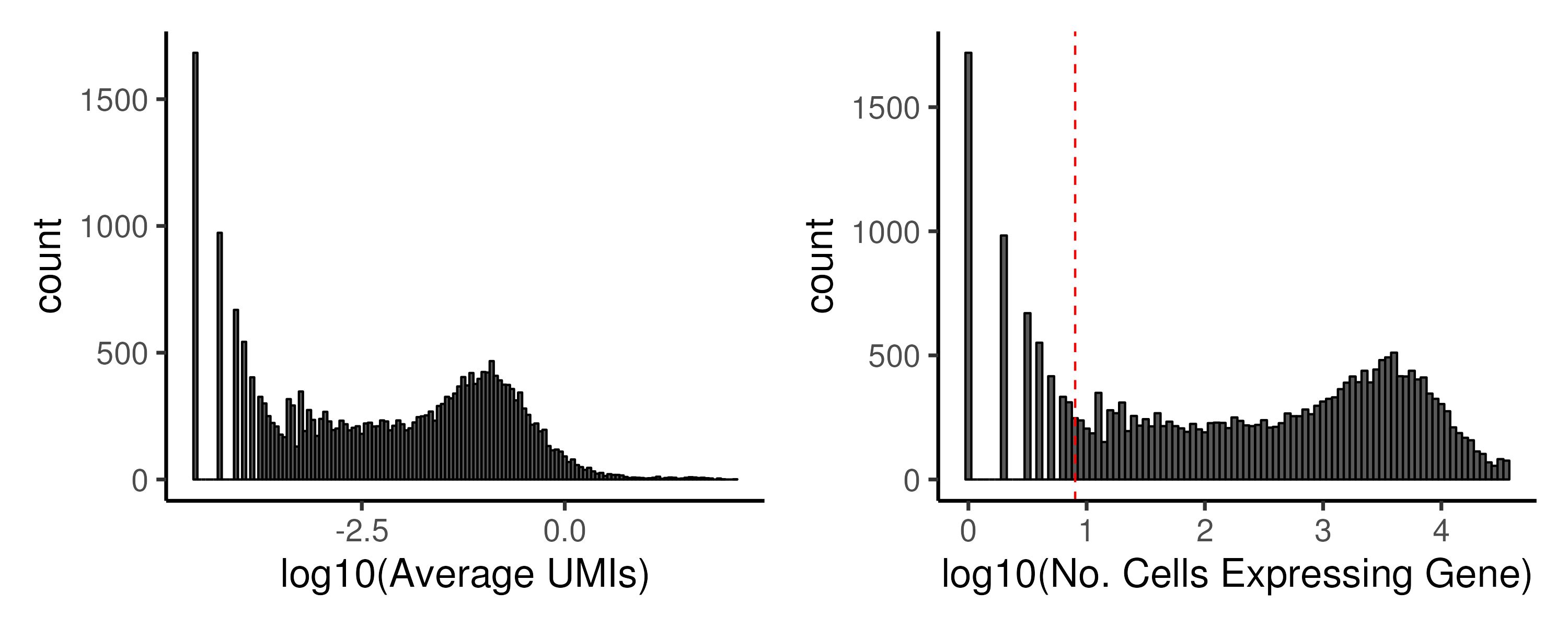
Figure 2.5: Low abundance genes have to be removed prior to downstream analysis. In the example, we keep genes that are expressed in at least 8 cells.
Typical cutoff for nExpr ranges between 5–20 cells, dependent on the total
number of cells. A rule of thumb for nExpr is to estimate the number of cells
expected in the smallest population and the proportion of cells expressing a
gene. For example, if the smallest population comprises 100 cells and we expect
only 10% of the cells to express a gene, then nExpr can be 10 cells. This
ensures that we do not remove genes that are only expressed by rare cell
populations. Unlike cell QC, we usually recommend a more conservative cutoff
for gene QC. This is because once discarded, the gene expression will no longer
be available. This can pose a problem in the re-usability of the dataset in the
future where one may wish to integrate this dataset with others.
2.3.3 Cell QC first or gene QC first?
A common question at this point is whether the cell QC or gene QC should be performed first. Here, we argue that it is better to perform cell QC first. In a contrived setting, suppose that there are genes that are predominantly expressed in low-quality cells. If gene QC is first performed, these genes would be retained. However, after cell QC, with the low-quality cells being removed, these genes become even more lowly expressed and may affect downstream analysis. By performing gene QC last, it is ensured that every retained gene has some minimum expression level.
Now, let’s consider the scenario where cell QC is performed first. After both
cell and gene QC, the nUMI, nGene, and pctMT metrics would have changed
due to the removal of lowly-expressed genes. However, this change is negligible
as we have only removed lowly-expressed genes which only contribute a very
small number of UMIs.
2.3.4 Code
Below is the code for performing cell QC, followed by gene QC. Also, we are
primarily working with data.tables instead of data.frames since the former is
computationally faster and uses a relatively simpler syntax. The final output
after QC inpUMIs contains the QC-ed UMI counts matrix.
### A. Perform QC
# Compute cell QC metrics
oupQCcell <- data.table(
  sampleID = colnames(inpUMIs),
  library = tstrsplit(colnames(inpUMIs), "_")[[1]],
  nUMI = colSums(inpUMIs),
  nGene = colSums(inpUMIs != 0),
  pctMT = colSums(inpUMIs[grep("^MT-", rownames(inpUMIs)),]))
oupQCcell$pctMT <- 100 * oupQCcell$pctMT / oupQCcell$nUMI
oupQCcell$library <- factor(oupQCcell$library, levels = names(colLib))

# Plot cell QC metrics (all output goes into images folder)
p1 <- ggplot(oupQCcell, aes(nUMI, fill = library)) +
  geom_histogram(binwidth = 500, color = "black") + xlim(c(0,40e3)) +
  geom_vline(xintercept = c(1.5e3,30e3), color = "red", linetype = "dashed")+
  xlab("No. UMIs") + scale_fill_manual(values = colLib) + plotTheme
p2 <- ggplot(oupQCcell, aes(nGene, fill = library)) +
  geom_histogram(binwidth = 100, color = "black") + xlim(c(0,6e3)) +
  geom_vline(xintercept = c(0.5e3), color = "red", linetype = "dashed")+
  xlab("No. Detected Genes") + scale_fill_manual(values = colLib) + plotTheme
p3 <- ggplot(oupQCcell, aes(pctMT, fill = library)) +
  geom_histogram(binwidth = 0.5, color = "black") + xlim(c(0,20)) +
  geom_vline(xintercept = c(15), color = "red", linetype = "dashed")+
  xlab("Percentage MT Genes") + scale_fill_manual(values = colLib) + plotTheme
ggsave(p1 + p2 + p3 + guide_area() + plot_layout(nrow = 2, guides = "collect"),
       width = 10, height = 8, filename = "images/basicCellQC.png")

# Remove low quality cells (39548 cells down to 33852 cells post- QC)
oupQCcell <- oupQCcell[nUMI > 1.5e3]
oupQCcell <- oupQCcell[nUMI < 30e3]
oupQCcell <- oupQCcell[nGene > 0.5e3]
oupQCcell <- oupQCcell[pctMT < 15]
inpUMIs <- inpUMIs[, as.character(oupQCcell$sampleID)]

# Compute gene QC metrics
inpUMIs <- inpUMIs[rowSums(inpUMIs) > 0,]   # Remove genes with no reads
oupQCgene <- data.table(
  gene = rownames(inpUMIs),
  meanRead = rowSums(inpUMIs) / ncol(inpUMIs),
  cellExpr = rowSums(inpUMIs > 0))
oupQCgene$log10meanRead <- log10(oupQCgene$meanRead)
oupQCgene$log10cellExpr <- log10(oupQCgene$cellExpr)

# Plot gene QC metrics
p1 <- ggplot(oupQCgene, aes(log10meanRead)) +
  geom_histogram(binwidth = 0.05, color = "black") +
  # geom_vline(xintercept = c(-3), color = "red", linetype = "dashed")+
  xlab("log10(Average UMIs)") + plotTheme
p2 <- ggplot(oupQCgene[cellExpr != 0], aes(log10cellExpr)) +
  geom_histogram(binwidth = 0.05, color = "black") +
  geom_vline(xintercept = log10(8), color = "red", linetype = "dashed")+
  xlab("log10(No. Cells Expressing Gene)") + plotTheme
ggsave(p1 + p2, width = 10, height = 4, filename = "images/basicGeneQC.png")

# Remove lowly expressed genes (24660 genes down to 19677 genes post- QC)
oupQCgene <- oupQCgene[cellExpr >= 8]
inpUMIs <- inpUMIs[as.character(oupQCgene$gene), ]
2.4 Preprocessing using Seurat
With QC done, we can proceed to preprocess the data using the Seurat pipeline. Preprocessing is necessary to prepare the data for downstream analysis.
2.4.1 Data normalization
The first preprocessing step is normalization. Normalization is crucial to adjust the raw RNA-seq counts for technical differences, often related to the sampling of the RNA molecules during single-cell capture and sequencing. This allows for the different single cells / samples to be compared directly. Errors in normalization can have a significant impact on downstream analysis. For example, single cells may cluster according to the number of UMIs, a technical factor, instead of the underlying biology and an inflated number of false positives may be observed in differential expression analysis (Section 3.2.1).
In single-cell analysis, the main technical factor to normalize for is the library size. Evident from the cell QC step (Section 2.3.1), the number of UMIs being sampled in a single cell can vary drastically, often by a factor of 10–50 times. In contrast, the sequencing depth in bulk RNA-seq usually do not differ by more than a factor of 5. Note that for tag-based methods, such as 10X genomics, there is no need to normalize for gene length, since only a single UMI is captured per RNA molecule.
2.4.2 Different normalization strategies
One straightforward way to perform library normalization is to simply divide the raw UMI counts by the total number of UMIs and then multiply this proportion by a scale factor. The scale factor is typically of the same order of magnitude as the total number of UMIs so that one normalized count corresponds roughly to one raw count observed in an “average-sized” single cell. This is important as a pseudocount of one is often added when log-transforming the normalized gene expression. In the Seurat pipeline, the default scale factor is \(10^4\) as that is the typical number of UMIs from scRNA-seq experiments involving 10X genomics commercial kits. However, this scale factor may not be appropriate for techniques that sample more reads per single cell e.g. single cells have \(\approx 10^5-10^6\) reads in Smart-seq2 experiments. Thus, one can use a data-driven approach to determine the scale factor by using the median of the number of UMIs across all cells.
The library-size-based normalization assumes that all single cells / samples have the similar amount of RNA material, which is not necessarily true. To mitigate this, others have proposed to identify genes that are not changing across all single cells / samples and use these genes for normalization. This is common in bulk RNA-seq normalization e.g. the RLE and TMM normalization in DESeq2 (Love, Huber, and Anders 2014) and edgeR (Robinson, McCarthy, and Smyth 2010) packages respectively. However, these bulk methods do not work well on scRNA-seq data due to the high proportion of zero counts. To resolve this issue, the scran algorithm pools several cells together (~20-100 cells) to reduce the number of zero counts and then performs RLE normalization on these pooled cells (Lun, Bach, and Marioni 2016). The normalization factor, commonly known as the size factor, of individual cells is obtained by deconvoluting the factor of pooled cells. Alternatively, one can regress the gene expression against the number of UMIs to remove any potential technical variation associated with the library size. scTransform is one such algorithm that uses a regularized negative binomial regression model (Hafemeister and Satija 2019). The regularization avoids overfitting and prevents excessive removal of variance associated with library size that may be biological in nature.
For this guide, we will use the simple library-size-based normalization (also called the “LogNormalize” method in Seurat) using the Seurat default scale factor of \(10^4\) since we are working with 10X datasets and the number of UMI across cells (Figure 2.4) is of that order of magnitude.
2.4.3 Feature selection
Due to the inherently noisy nature of scRNA-seq data, it is unwise to use all the detected genes for downstream analysis such as dimension reduction and clustering. Thus, we need to select a set of “informative” features / genes that can be used to describe the underlying biology. This will not only remove irrelevant and noisy features but also reduce computation time.
2.4.4 Different feature selection approaches
One straightforward method for feature selection is to identify highly variable genes (HVGs), assuming that genes driving the biological process has to change its gene expression (Brennecke et al. 2013). However, scRNA-seq is inherently noisy and the large proportion of zero counts would inflate the gene variance. Thus, one should not directly use the gene variance, which comprises both technical and biological contributions. Instead, the technical variance, which usually varies with the mean expression, can be estimated and then subtracted to give the remaining biological variance. For example, in the Seurat pipeline, the gene variance is fitted against the mean expression (Figure 2.6, blue line, left panel). A standardized variance is then calculated for each gene, representing the deviation of the gene’s variance from the fitted value (Figure 2.6, right panel). In essence, these HVGs represent genes that are more variable than other genes with a similar average expression.
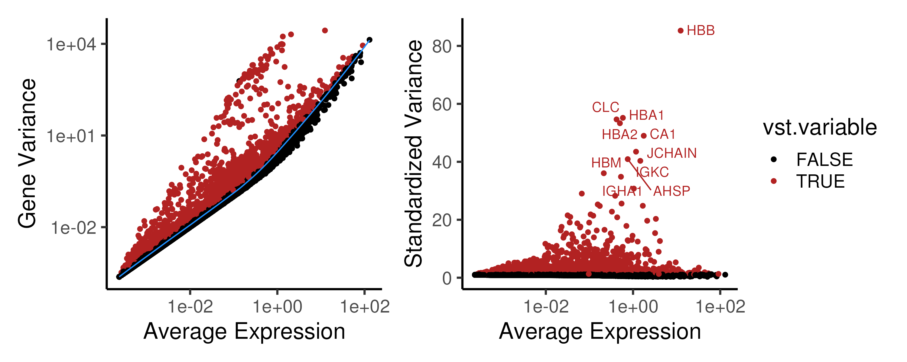
Figure 2.6: (Left panel) In the Seurat pipeline, the gene variance is fitted against the mean expression to estimate the techincal variance. (Right panel) The deviation of a gene’s variance from the fitted value i.e. the standardized variance is then used to rank the HVGs and the top 2000 HVGs (marked in red) are chosen for downstream analysis.
Other than variance-based feature selection methods, there are alternatives to
select features / genes for downstream analysis. First, genes that are highly
correlated to each other can be chosen as feature genes. The DUBStepR algorithm
achieves this by binning genes by expression to compute their correlation range
z-scores, which are used to select well-correlated genes (Ranjan et al. 2021).
Second, genes with low dropout rate (i.e. the proportion of zero counts) can be
used as feature genes. The M3drop method estimates the dropout rate of each
gene and then selects the top genes with minimal dropouts (Andrews and Hemberg 2019).
Third, in some regression-based algorithms such as scTransform
(Hafemeister and Satija 2019), the residuals after regressing out technical factors
(such as nUMI) can be deemed as biological variance and used to rank genes
for feature selection.
2.4.5 Code
We first create the Seurat object, recomputed the pctMT and populated the
library and donor information in the metadata. The library-size-based
normalization is then performed using using Seurat’s default scale factor.
Next, feature selection is performed by identifying HVGs via the standardized
variance calculated by Seurat. We then extracted these gene-level metrics and
plotted both gene/standardized variance against the average expression for each
gene as shown in Figure 2.6. By default, the top 2000 HVGs are
selected for downstream analysis. Typical number of HVGs to use varies from
1500 to 2000.
### B. Create Seurat object + Preprocessing
# Create Seurat Object
# nCount_RNA = & no. UMI counts; nFeature_RNA = no. detected genes
# We will also compute percentage MT genes here and set the library
seu <- CreateSeuratObject(inpUMIs, project = "bm")
colnames(seu@meta.data)
seu$pctMT <- 100 * colSums(inpUMIs[grep("^MT-",rownames(inpUMIs)),])
seu$pctMT <- seu$pctMT / seu$nCount_RNA

# Create library and donor column
seu$library = factor(seu$orig.ident, levels = names(colLib))
Idents(seu) <- seu$library
seu$donor = gsub("pos|neg", "", seu$library)
seu$donor = factor(seu$donor)

# Normalization + Feature selection
seu <- NormalizeData(seu)
seu <- FindVariableFeatures(seu)

# Plot gene expression mean vs variance
ggData = seu@assays$RNA@meta.features
p1 <- ggplot(ggData, aes(vst.mean, vst.variance, color = vst.variable)) +
  geom_point() + scale_color_manual(values = c("black", "firebrick")) +
  geom_line(aes(vst.mean, vst.variance.expected), color = "dodgerblue") +
  xlab("Average Expression") + ylab("Gene Variance") +
  scale_x_log10() + scale_y_log10() + plotTheme
p2 <- ggplot(ggData, aes(vst.mean, vst.variance.standardized,
                         color = vst.variable)) +
  geom_point() + scale_color_manual(values = c("black", "firebrick")) +
  xlab("Average Expression") + ylab("Standardized Variance") +
  scale_x_log10() + plotTheme + theme(legend.position = "none")
p2 <- LabelPoints(plot = p2, repel = TRUE, points = VariableFeatures(seu)[1:10])
ggsave(p1 + p2 + plot_layout(guides = "collect"),
       width = 10, height = 4, filename = "images/basicHVG.png")
2.5 Basic dimension reduction (DR)
After preprocessing the data (via normalization and feature selection), one of the first analysis is to visualize the single-cells to identify the various cell populations that are captured in the scRNA-seq experiment. To achieve this, we need to reduce the high-dimensional scRNA-seq (> 15k genes) into lower dimensions.
2.5.1 A gentle introduction to DR
Dimension reduction is often performed prior to many downstream analysis such as clustering (Section 3). Here, we will briefly explore the rationale behind performing dimension reduction. For a more in-depth discussion, refer to the more detailed section on different dimension reduction methods (Section ??), which is closely related to trajectory inference.
There are several reasons for performing dimension reduction
(Figure 2.7). First, by reducing the data to 2D or 3D,
one can easily visualize the data. This is especially important for human
interpretation as we are not used to perceiving the world beyond three
dimensions. Visual inspection of the data allows us to identify general cell
populations and check if cells are grouping by any technical factors i.e.
nUMI and pctMT or batch effect. Second, dimension reduction reduces the
random noise in the data. scRNA-seq is noisy and thenoise often manifest as
higher dimensions in dimension reduction algorithms. These higher dimensions
can then be discarded to better distinguish any biological signal in downstream
analysis. In fact, deep learning models such as autoencoders utilizes such
concepts where the data is compressed / encoded from high to low dimensions and
then decoded back to the original state. This encode-decode process “squeezes”
out the random noise, ensuring that only meaningful signal is retained. Third,
dimension reduction avoids the curse of dimensionality (Altman and Krzywinski 2018).
As the number of dimension increases, the “volume” that data can occupy i
ncreases rapidly. This resulting data becomes very sparse, making it difficult
to identify differences between data points as the distances between samples
becomes very similar. Furthermore, as the number of dimensions increases, many
of these dimensions tend to be related to each other. Some of the downstream
analysis may have problems dealing with this multicollinearity. In fact, this
is common in biology where many genes (which are the dimensions) often act in a
concerted manner during some biological process. Thus, dimension reduction
seeks to “consolidate” these related dimensions and reduce them.
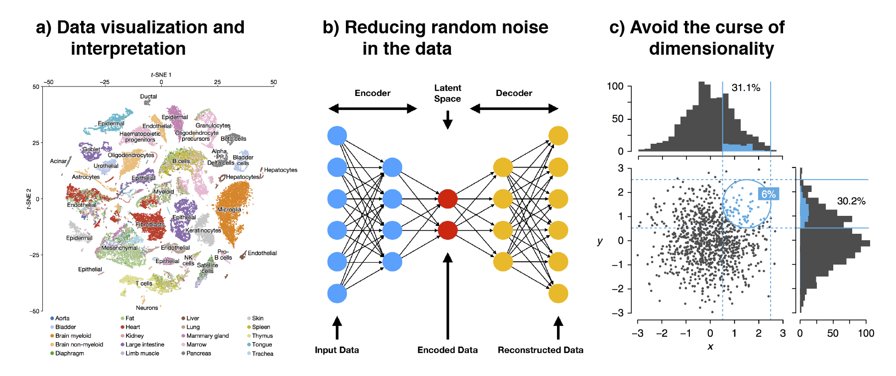
Figure 2.7: The three main reasons to perform dimension reduction in single-cell analysis is for (a) data visualization, (b) removal of random noise by “discarding” higher dimensions and (c) to avoid the curse of dimensionality.
The accuracy of dimension reduction algorithms lies in how faithful the low-dimensional embeddings are in recapitulating the structure of the data, in this case the relationship between the single cells. This can be further separated into (i) local structure where transcriptionally similar cells are grouped together and cellular subtypes are resolved and (ii) global structure which involves the relationship or hierarchies between major cell states. For a comparison of dimension reduction algorithms, one can refer to Sun et al. (2019) which provides recommendations based on the size of the dataset i.e. the number of cells and the intended downstream analysis e.g. cell clustering or trajectory inference.
2.5.2 PCA: Principal component analysis
One of the most common form of dimension reduction is Principal Component Analysis (PCA). PCA rotates the data about their mean in a way that maximizes the majority of the variance in the first few dimensions (Figure 2.8). The resulting principle components (PCs) are such that (i) PC1 accounts for the highest amount of variance in the data with decreasing variance explained in subsequent PCs and (ii) the PCs are orthogonal to each other. Since rotations are linear transformations, the distances between data points are exactly preserved. In fact, PCA is an assumption-free algorithm that only aims to maximize the variance along the PCs.
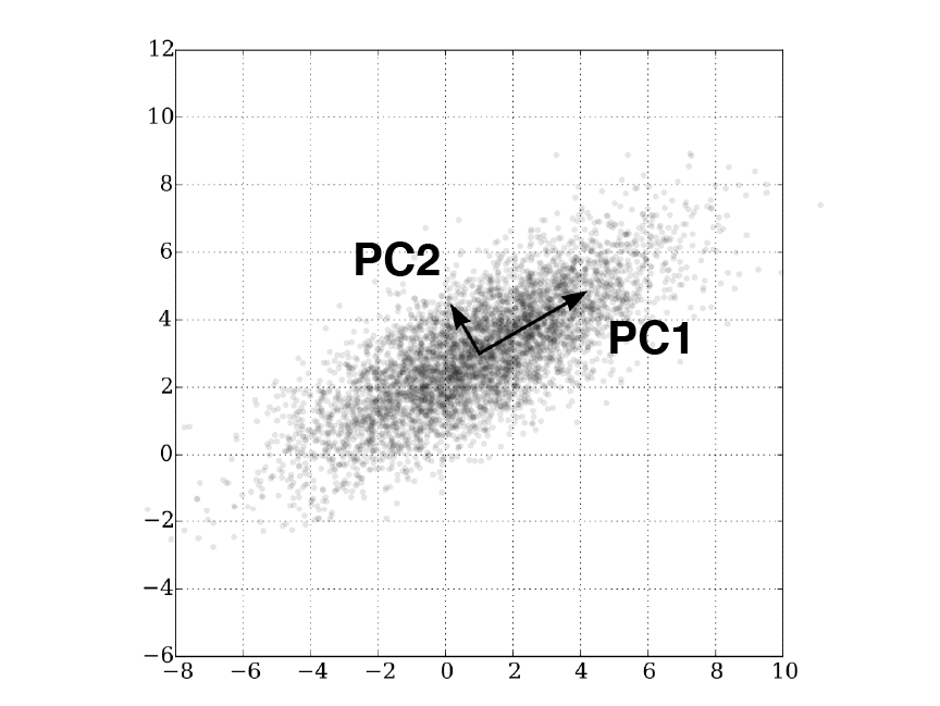
Figure 2.8: PCA rotates the data to align with principal components which maximizes the variance. In this 2D example, majority of the variance lies along the bottom-left-to-top-right diagonal, corresponding to PC1.
When performing PCA, it is important to scale the expression of each gene to unit variance. This is because PCA is sensitive to scale (Lever, Krzywinski, and Altman 2017) and features / genes with larger variance can dominate the PCA results. Furthermore, the gene expression should be log-transformed prior to scaling as the transformation provides some measure of variance stabilization (Law et al. 2014), also ensuring that high-abundance genes with large variances do not dominate downstream analyses.
Unlike bulk RNA-seq, the variance explained by PC1 can be low in scRNA-seq analysis (often <10%). This can be attributed to several reasons. First, there are usually multiple factors driving the variance in single-cell data e.g. multiple cell lineages in the scRNA-seq of an organ or tissue. The complex “shape” of the data meant that variances are spread across many PCs. This is unlike bulk RNA-seq where there is usually only one (or two) driving force e.g. time in a timeseries experiment. Second, random noise in the data (due to the excessive zeros) account for large amounts of variance in the higher PCs.
In our example, PC1 mainly separate the CD34+ samples (light-colored libraries) from the CD34- samples (dark-colored libraries), implying that PC1 describes the variation between progenitor and differentiated cells (Figure 2.9).
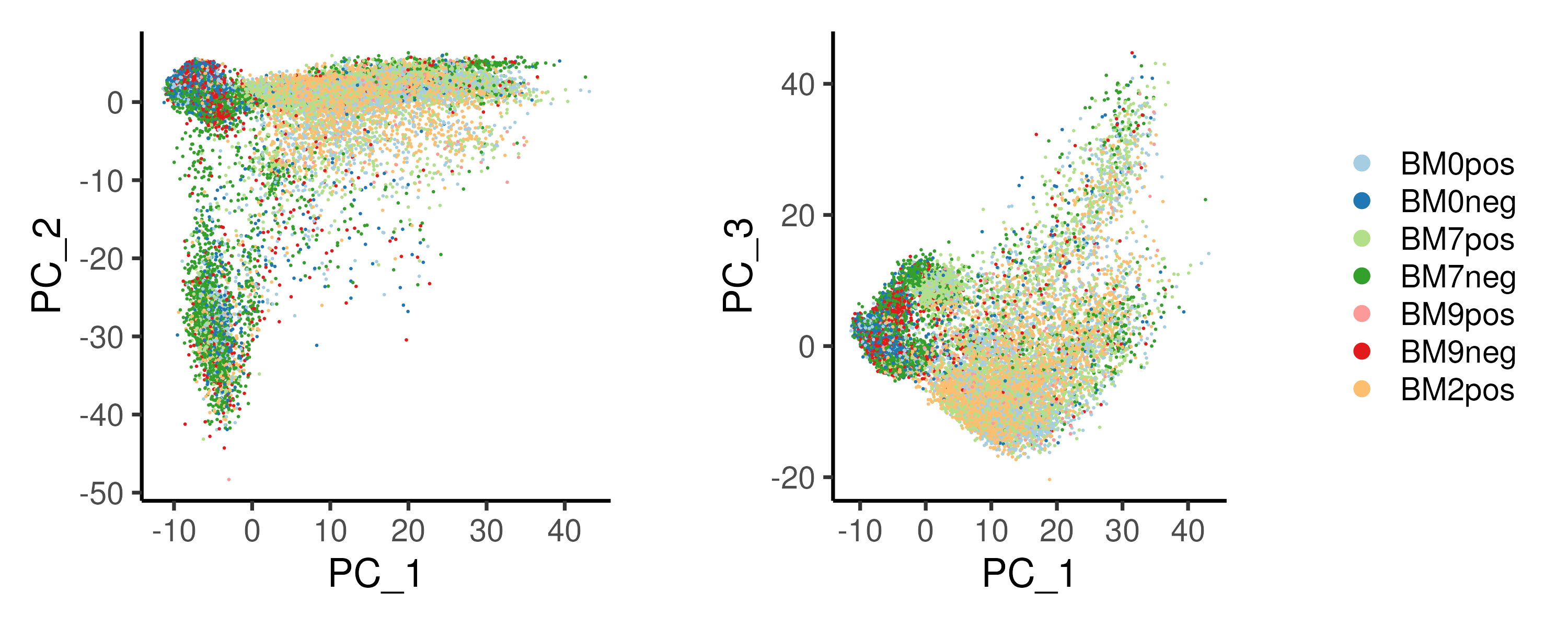
Figure 2.9: PCA on the example cardiac differentation dataset reveals bifurcation in cell fate, with PC1 and PC2 representing the progression of the differentiation and the different cell fates respectively.
Other dimension reduction algorithms and downstream clustering analysis often use the top \(n\) PCs as inputs. One can identify the optimal number of PCs using the elbow method (Figure 2.10). The variance explained by each PC is plotted and the optimal number of PCs lies at the point where there is no longer a drastic drop in variance explained, corresponding to an “elbow”. Note that selecting the number of PCs in this manner can be very subjective and the “elbow” cannot always be unambiguously identified. Another approach to choose the number of PCs is to pick the top \(n\) PCs such that a particular amount (say 90%) of the variance is included. However, this usually results in a high number of PCs being selected, including a lot of variance from random noise.
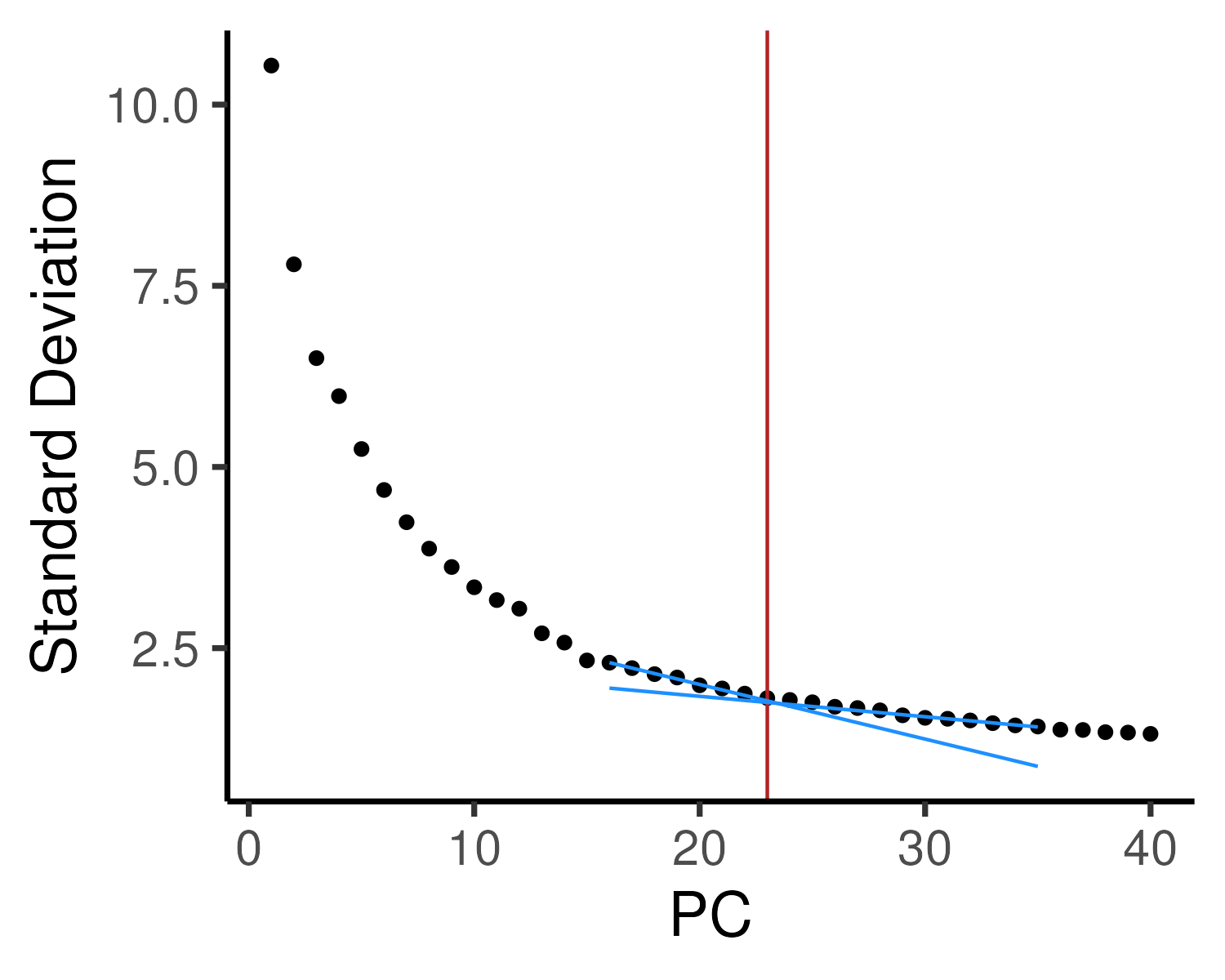
Figure 2.10: The variance explained by each PC (elbow plot) is plotted to determine the optimal number of PCs. Here, we have drawn two additional lines to identify the “elbow”, corresponding to the top 23 PCs, which will be used for downstream analysis.
2.5.3 t-SNE: t-distributed stochastic neighbor embedding
t-distributed Stochastic Neighbor Embedding (t-SNE) projects high-dimensional gene expression data onto a 2D/3D space such that highly similar single cells are grouped together (Maaten and Hinton 2008). The algorithm uses a probabilistic framework involving a heavy-tailed Student t-distribution (and hence the “t-distributed” in its name) to measure similarities in low-dimensional space. t-SNE also ensures that points do not overlap in low-dimensional projections, allowing for easy plotting of each single cell. However, due to the heavy-tailed distribution, global relationships between different cell states, i.e. distances between far away cells, are often not preserved. Consequently, cluster sizes and the distances between clusters cannot be properly interpreted in a t-SNE projection (Figure 2.11). Furthermore, the appearance of a t-SNE projection is largely influenced by the “perplexity” parameter. To better understand how t-SNE works, one can visit https://distill.pub/2016/misread-tsne/ to understand how a t-SNE projection changes with different “perplexity” parameters and datasets.
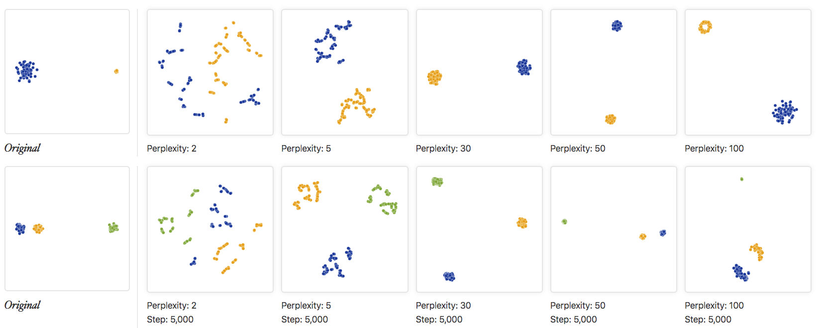
Figure 2.11: The original data and various t-SNE projections with different “perplexity” parameters are shown. The top row shows an example of two clusters with different sizes while the bottom row shows an example of three clusters with different inter-cluster distances. Clearly, the cluster sizes and the distances between clusters are not preserved in a t-SNE plot. Image taken from https://distill.pub/2016/misread-tsne/
2.5.4 UMAP: Uniform manifold approximation and projection
An alternative dimension reduction method is the Unified Manifold Approximation Projection (UMAP, McInnes, Healy, and Melville (2018)). UMAP attempts to learn the topology (relationships between single cells) of the data and finds a low-dimensional embedding with a similar “structure”. The topology is learnt via a weighted \(k\)-neighbour graph and the weights in the graph represent the similarity between single cells. Furthermore, repulsive forces are applied between data points to ensure that points are not cluttered together, allowing for easy visualization of each single cell (as in the case for t-SNE). However, UMAP preserves the global structure of the dataset better then t-SNE and there is an increased adoption of UMAP over t-SNE in single-cell analysis (Becht et al. 2019).
The UMAP algorithm is mainly governed by two paramaters: n_neighbors and
min_dist. n_neighbors specifies the number of neighbours \(k\) in the
\(k\)-neighbour graph with a low \(k\) emphasizing local structure and a high \(k\)
favoring global structure. min_dist specifies the minimum distance between
points in the reduced dimension, controlling the “compactness” of the points.
For a better understanding of these two parameters, visit
https://pair-code.github.io/understanding-umap/.
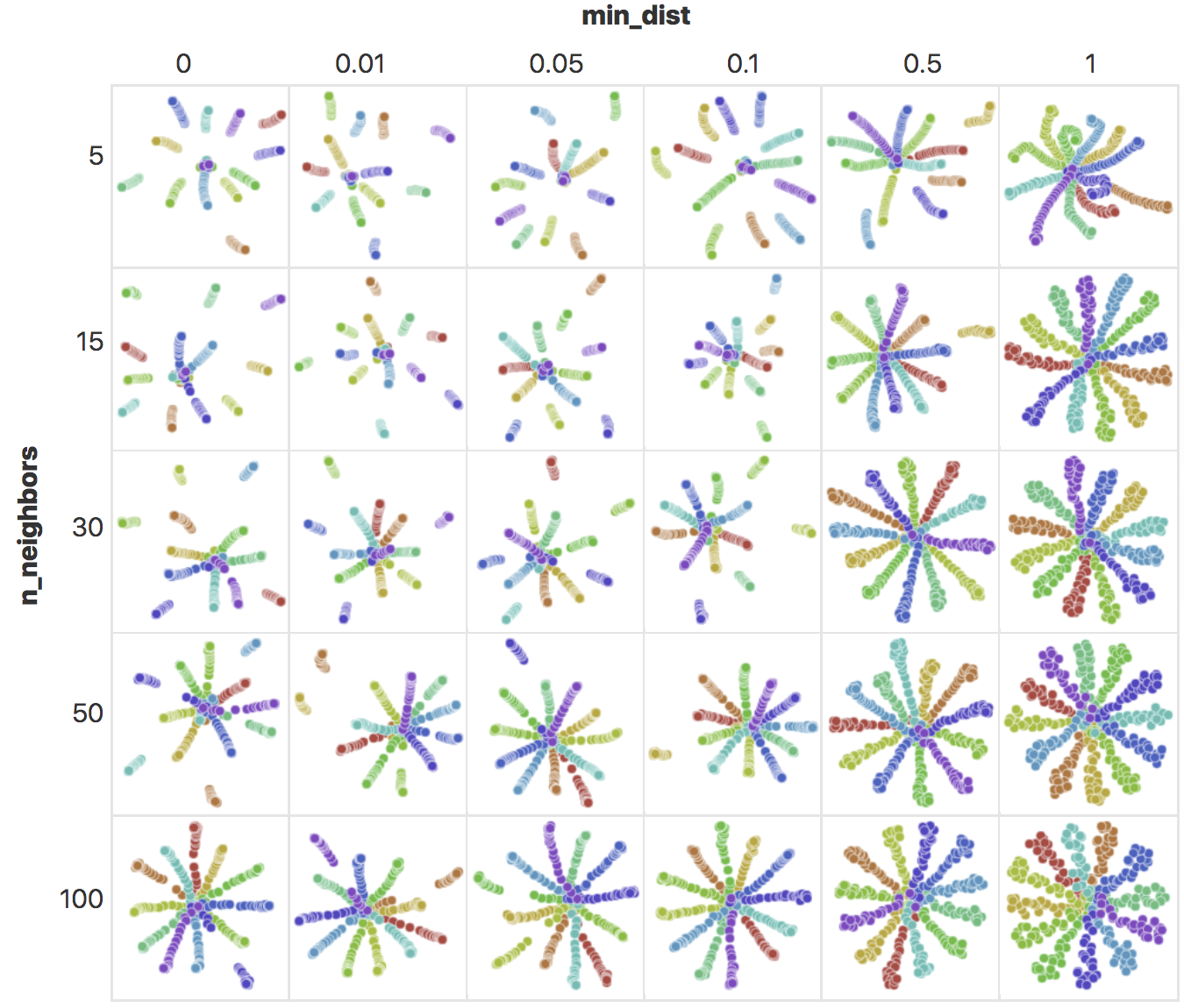
Figure 2.12: UMAP embeddings of points arranged in a radial star pattern, generated with different n_neighbors and min_dist values. As n_neighbors increase, there is an increased emphasis in global structure and the radial pattern becomes more obvious. With increased min_dist, the minimum distance between points increases, making the points less compact. Image taken from https://pair-code.github.io/understanding-umap/
The UMAP computed by Seurat uses a default of n_neighbors = 30 and
min_dist = 0.3, which works well for most modern single-cell datasets
containing 5,000–50,000 cells. One may wish to adjust n_neighbors to a
smaller number for smaller datasets and vice versa.
2.5.5 UMAP vs t-SNE
PCA, t-SNE and UMAP are three very common dimension reduction algorithms applied to scRNA-seq data. Here, we compare the three approaches in their ability to preserving data structure, sensitivity to parameters and computation time.
| Property | PCA | t-SNE | UMAP |
|---|---|---|---|
| Preserves distances b/w points? | Exact | No | To a large extent |
| Local structure | Exact | To some extent | Yes |
| Global structure | Exact | No | Yes |
| Are points spaced out? | No | Yes | Yes |
| Dependent on parameters? | No (PCA is assumption free) | Yes | To some extent |
| Computation time | Fast (irbla) | Slow | Fast |
Here, we compare the t-SNE and UMAP projections for the example dataset (Figure 2.13). In both projections, the CD34+ progenitors and CD34- differentiated cells separate clearly with the T-cells and B-cells forming distinct islands (See CD19 and CD4/CD8B expression in Figure 2.14). Notably, the T-cells occupy a “larger area” in the t-SNE projection as compared to the UMAP counterpart. Also, the T-cells has an “U-shaped” distribution in t-SNE space as opposed to a more “linear” distribution in UMAP space. Thus, one can have very different interpretations from the two projections. Furthermore, the monocytes (See CD14 expression in Figure 2.14) are “connected” to the CD34+ progenitors in UMAP space but forms a distinct cluster in t-SNE space (top left corner in t-SNE space). This is likely because there are very few cells “connecting” the monocytes to their progenitors and this weak connection is not prioritized in t-SNE which emphasizes the local structure within monocytes.
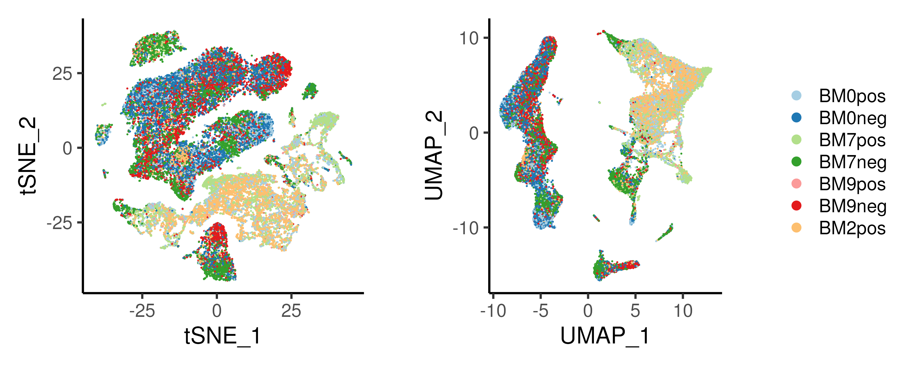
Figure 2.13: (Left) t-SNE and (Right) UMAP projection of the example bone marrow dataset. Single cells are largely seperated by CD34+/CD34- populations.
A common step after generating the UMAP/t-SNE projections is to visualise the gene expression patterns of known genes marking different population. In Figure 2.14, we plotted some genes marking the HSCs and cells of the myeloid or lymphoid lineage.
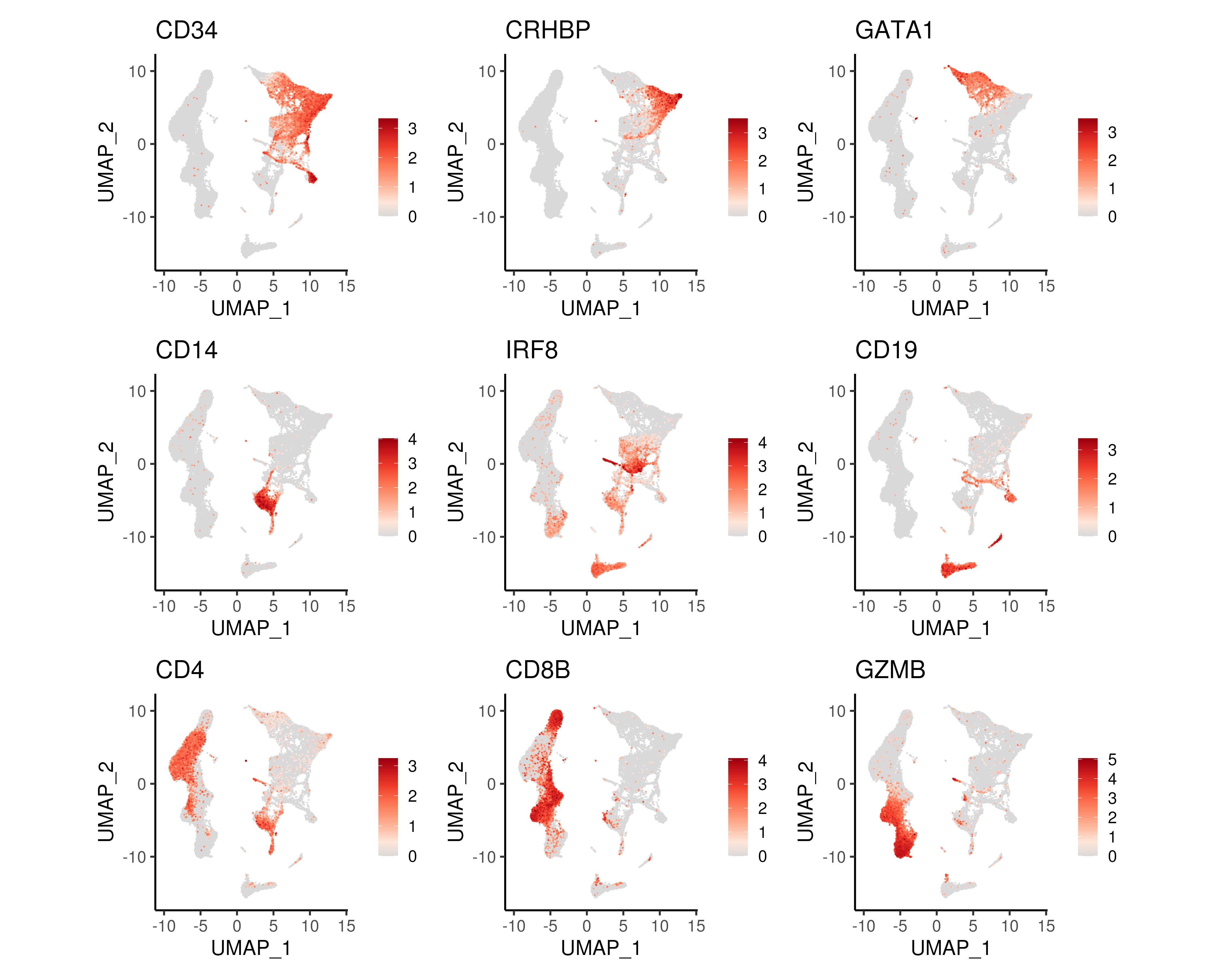
Figure 2.14: UMAP projections coloured by gene expression of genes marking progenitor cells (CD34), HSCs (CRHBP), erythoid lineage (GATA1), monocytes (CD14), dendritic cells (IRF8), B-lymphocytes (CD19), T-lymphocytes (CD4 and CD8B) and NK cells (GZMB).
2.5.6 Code
PCA, t-SNE and UMAP dimension reduction can be performed and visualized easily
in the Seurat package. As discussed earlier, scaling of the gene expression
is performed prior to PCA. t-SNE and UMAP takes in the top \(n\) PCs as input.
From the elbow plot of the PCA, we have chosen the top 23 PCs (from the elbow
plot, specified by the nPC variable) for t-SNE and UMAP projections as well
as downstream analysis.
### C. PCA / tSNE / UMAP
# Run PCA
seu <- ScaleData(object = seu)    # Scale data prior to PCA
seu <- RunPCA(seu)

p1 <- DimPlot(seu, reduction = "pca", pt.size = 0.1, shuffle = TRUE,
              cols = colLib) + plotTheme + coord_fixed()
p2 <- DimPlot(seu, reduction = "pca", pt.size = 0.1, shuffle = TRUE,
              cols = colLib, dims = c(1,3)) + plotTheme + coord_fixed()
ggsave(p1 + p2 + plot_layout(guides = "collect"),
       width = 10, height = 4, filename = "images/basicPCA.png")

# Elbow plot
p1 <- ElbowPlot(seu, ndims = 40)
ggData <- seu@reductions[["pca"]]@stdev  # Fit lines for elbow plot
lm(y~x, data = data.frame(x = 16:20, y = ggData[16:20]))
lm(y~x, data = data.frame(x = 31:35, y = ggData[31:35]))
nPC <- 23 # determined from elbow plot
p1 <- p1 + plotTheme + geom_vline(xintercept = nPC, color = "firebrick") +
  geom_path(data = data.frame(x = 16:35, y = 16:35*-0.07535 + 3.50590),
            aes(x,y), color = "dodgerblue") +
  geom_path(data = data.frame(x = 16:35, y = 16:35*-0.0282 + 2.3996),
            aes(x,y), color = "dodgerblue")
ggsave(p1, width = 5, height = 4, filename = "images/basicPCAelbow.png")

# Run tSNE
seu <- RunTSNE(seu, dims = 1:nPC, num_threads = nC)
p1 <- DimPlot(seu, reduction = "tsne", pt.size = 0.1, shuffle = TRUE,
              cols = colLib) + plotTheme + coord_fixed()

# Run UMAP
seu <- RunUMAP(seu, dims = 1:nPC)
p2 <- DimPlot(seu, reduction = "umap", pt.size = 0.1, shuffle = TRUE,
              cols = colLib) + plotTheme + coord_fixed()
ggsave(p1 + p2 + plot_layout(guides = "collect"),
       width = 10, height = 4, filename = "images/basicTsUm.png")

# Plot some genes from literature
p1 <- FeaturePlot(seu, reduction = "umap", pt.size = 0.1,
                  features = c("CD34","CRHBP","GATA1",
                               "CD14","IRF8","CD19",
                               "CD4","CD8B","GZMB"), order = TRUE) &
  scale_color_gradientn(colors = colGEX) & plotTheme & coord_fixed()
ggsave(p1, width = 15, height = 12, filename = "images/basicUmapGex.png")

# Save Seurat Object at end of each section
saveRDS(seu, file = "bmSeu.rds")