Chapter 6 Trajectory Inference and Pseudotime
6.1 Why perform trajectory inference?
Trajectory analysis in single-cell analysis is a computational technique used to reconstruct the dynamic progression of cells through a biological process, such as differentiation, development, or disease progression. The inferred trajectories reveals branching points where cells diverge into different paths, representing crucial decision points in processes like cell fate determination or the onset of disease (Figure 6.1). Furthermore, by ordering cells based on their gene expression profiles, trajectory analysis assigns a “pseudotime” to each cell, reflecting its position along the inferred trajectory.
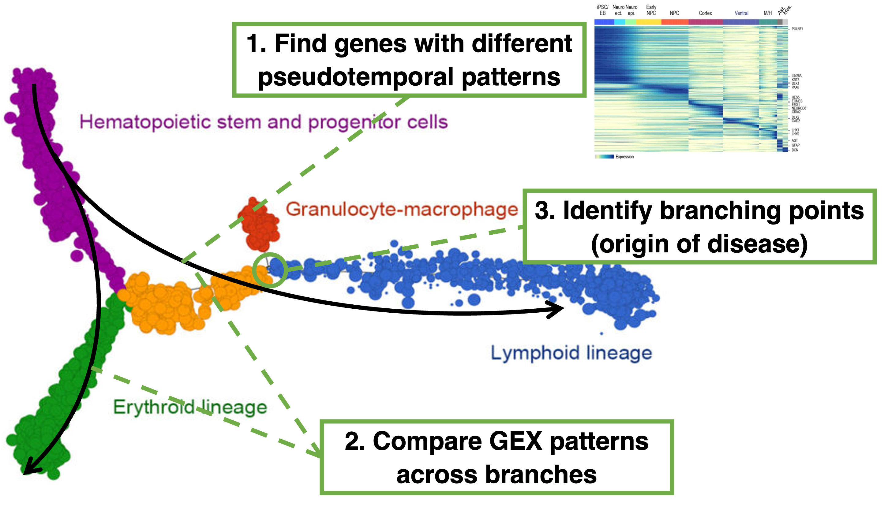
Figure 6.1: The three main reasons to perform trajectory inference and pseudotime analysis in single-cell analysis is for (a) finding genes whose expression changes across the trajectory, (b) compare gene expression patterns across branches and (c) identifying branching points intrajectories.
Thus, trajectory inference and pseudotime analysis can help in answering several biological questions. First, trajectory analysis can find genes whose expression changes across the trajectory. By analyzing gene expression along the pseudotime axis, one can find genes that are up-regulated or down-regulated at specific stages of the process. This includes genes that are transiently expressed that would otherwise be missed when only comparing the initial and final state. The identified genes can be further grouped to understand the sequential activation or repression of gene programs, revealing key regulatory genes that drive transitions between different cell states or stages. Second, trajectory analysis can identify genes with different patterns across branches. Branches in a trajectory represent divergent cell fates or states, where cells follow different paths after a certain point in the process. By examining how gene expression changes along each branch, researchers can identify branch-specific genes, which are crucial for driving the divergence into different cell fates. Third, trajectory inference allows for the identification of branching points in a trajectory where a population of cells diverges into different paths. This divergence often represent crucial decision points in a biological process, such as the commitment to a specific cell lineage or the onset of disease. By identifying the branching points and the gene expression changes associated with them, researchers can pinpoint key regulators and potential therapeutic targets that could intervene in the disease process early on.
6.2 Different approaches for trajectory inference
The intuition behind trajectory inference in single-cell data is that each cell represents a snapshot in “time” within a continuous biological process, such as differentiation or disease progression (Figure 6.2). Due to the inherent biological heterogeneity within a time-point and biological progression between time-points, cells are spread out along a continuum based on their gene expression profiles. This heterogeneity / continuum reflects the varying stages of the biological process captured by the cells. The core idea is to arrange cells in a way that reflects their transition from one state to another, tracing or connecting these cells according to transcriptional similarity. Overall, this will identify a path that represents the progression of cell states i.e. the inferred trajectory. The trajectory can be linear, representing a continuous progression, or it can involve branching, where cells diverge into different fates or states.
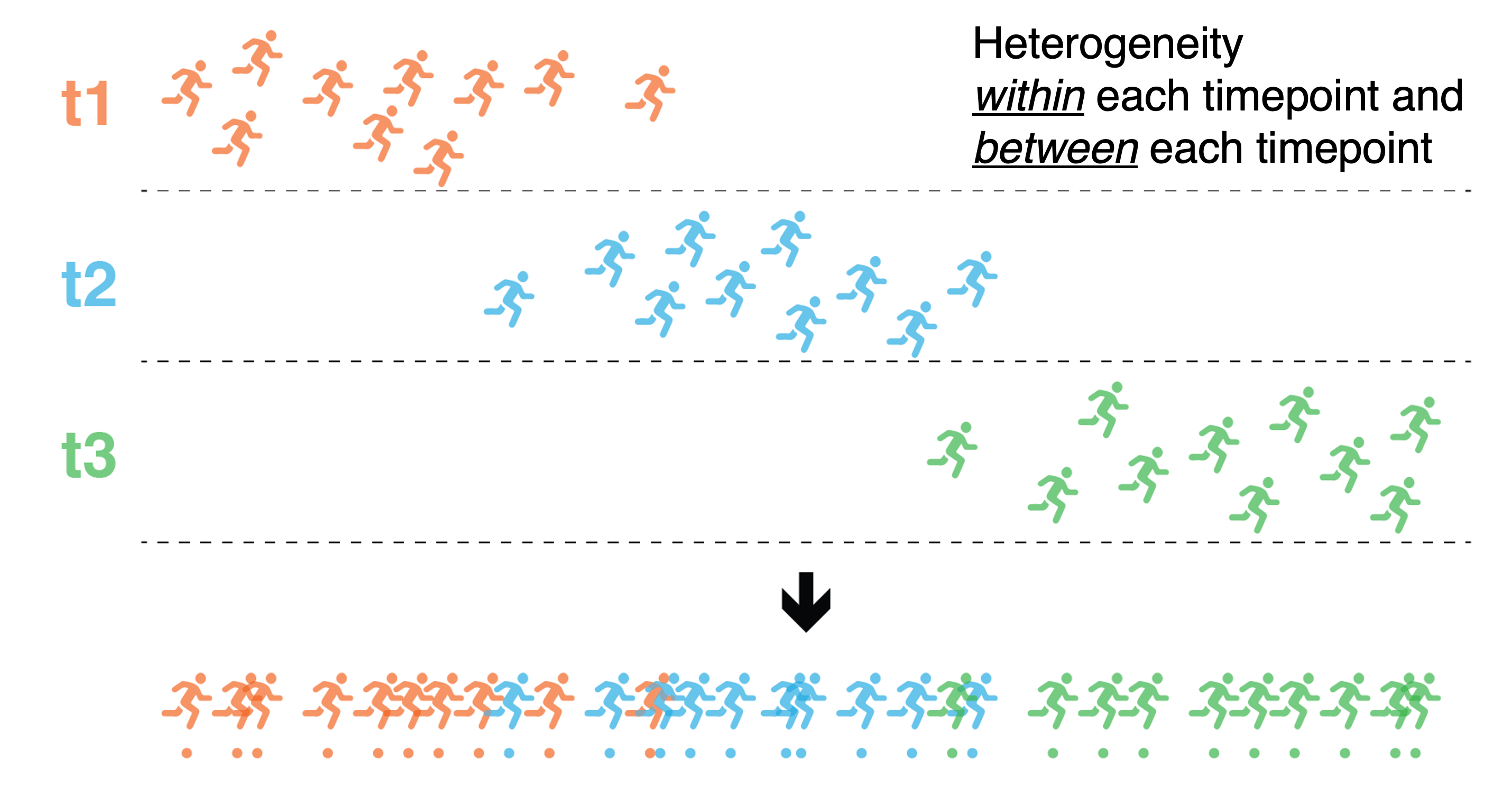
Figure 6.2: Intuition behind trajectory inference. Due to the inherent biological heterogeneity within a time-point and biological progression between time-points, cells are spread out along a continuum based on their gene expression profiles. By connecting these cells, this will identify a path that represents the progression of cell states i.e. the inferred trajectory.
This connecting of single cells to infer a trajectory can be achieved through different approaches. One common method is to build a graph where cells are nodes, and edges represent transcriptional similarities between them. This graph can be constructed at the single-cell level, where each cell is individually placed along the trajectory, or at the cluster level, where groups of similar cells (clusters) are connected. Furthermore, the transcriptional similarities between cells or clusters can be quantified using the gene expression or on one of the reduced dimension introduced in Section 5.
A published benchmarking study comparing different trajectory inference algorithms highlighted that simple approaches such as minimum spanning tree (MST), a graph that connects all the nodes with the shortest possible total edge length, recovers well the underlying trajectory (Saelens et al. 2019). (Figure 6.3) It also recommended the use of the Slingshot algorithm on datasets with simple topologies i.e. trajectories with little to no branching and that the PAGA method had higher scores on datasets with tree-like or more complex trajectories.
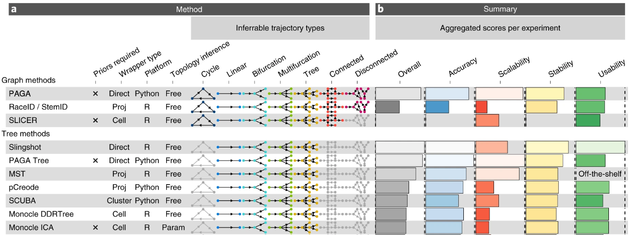
Figure 6.3: Top ranking trajectory inferrence algorithms benchmarked by Saelens et al. 2019.
6.3 What is pseudotime?
Pseudotime is a computational concept used to represent the progression of cells through a biological process by ordering them along a continuum based on their gene expression profiles. Thus, pseudotime can be seen as the “distance covered” along the trajectory. Cells at the beginning of the process are assigned an earlier pseudotime, while those further along receive a later pseudotime, reflecting their relative transcriptional states. However, pseudotime is a measure of transcriptional dissimilarity between cells rather than actual chronological time, meaning it may not correspond precisely to real time. This discrepancy can occur in instances where there is no transcriptional activity or when transcription is accelerated, leading to deviations between pseudotime and the actual temporal progression of the biological process.
By relating gene expression to pseudotime, one can identify genes whose expression levels vary with pseudotime in a dynamic manner, revealing key regulators or markers of different stages in the biologicalprocess. This approach helps to understand the temporal order of gene activation and the underlying mechanisms driving cellular changes. There are several algorithms that can perform trajectory-based differential expression and we will focus on one of such algorithms called tradeSeq in Section 6.7.
6.4 Slingshot and PAGA
The Slingshot algorithm constructs trajectories by building a minimum spanning tree (MST) that connects all the cell clusters. The MST allows for the ordering of the cell clusters and identifies multiple branching trajectories (if any). The method then fits smooth curves through the data for each of the identified trajectories, connecting clusters following the MST, and assigns each cell a pseudotime value along these trajectories (Figure 6.4).
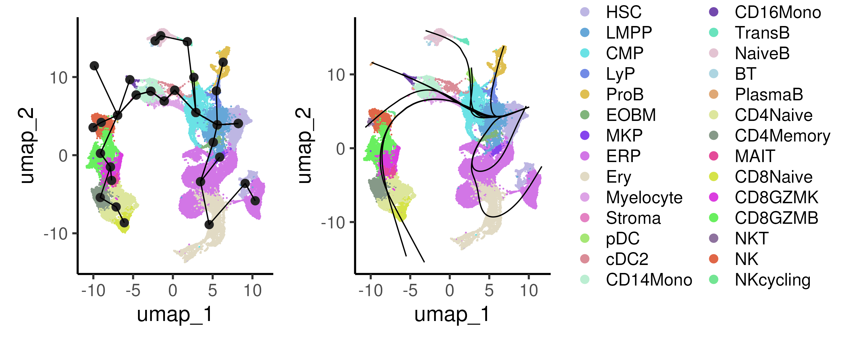
Figure 6.4: The Slingshot algorithm first connects all the cell clusters via a minimum spanning tree (left panel) to identify multiple branching trajectories. For each trajectory, Slingshot fits a smooth curve through the data (right panel) and assigns each cell a pseudotime value.
In Slingshot, the method assumes that the trajectories follow a tree-like structure and hence is unable to infer more complex trajectories involving many branches or cyclic trajectories. For more complex trajectories, the Partition-based graph abstraction (PAGA) method can be used instead. PAGA represents the global connectivity structure of cells as a graph, where nodes correspond to cell clusters and edges represent the connectivity or transitions between these clusters. Unlike traditional methods that may impose a linear or branched structure, PAGA provides a more flexible, abstract representation of the data, capturing both the continuous and discrete aspects of cellular differentiation. By quantifying the connectivity between clusters, PAGA allows researchers to identify key transitions and branching decision points in cellular processes. In Figure 6.5, we applied two different cutoffs to visualize the key connectivity between cell clusters.
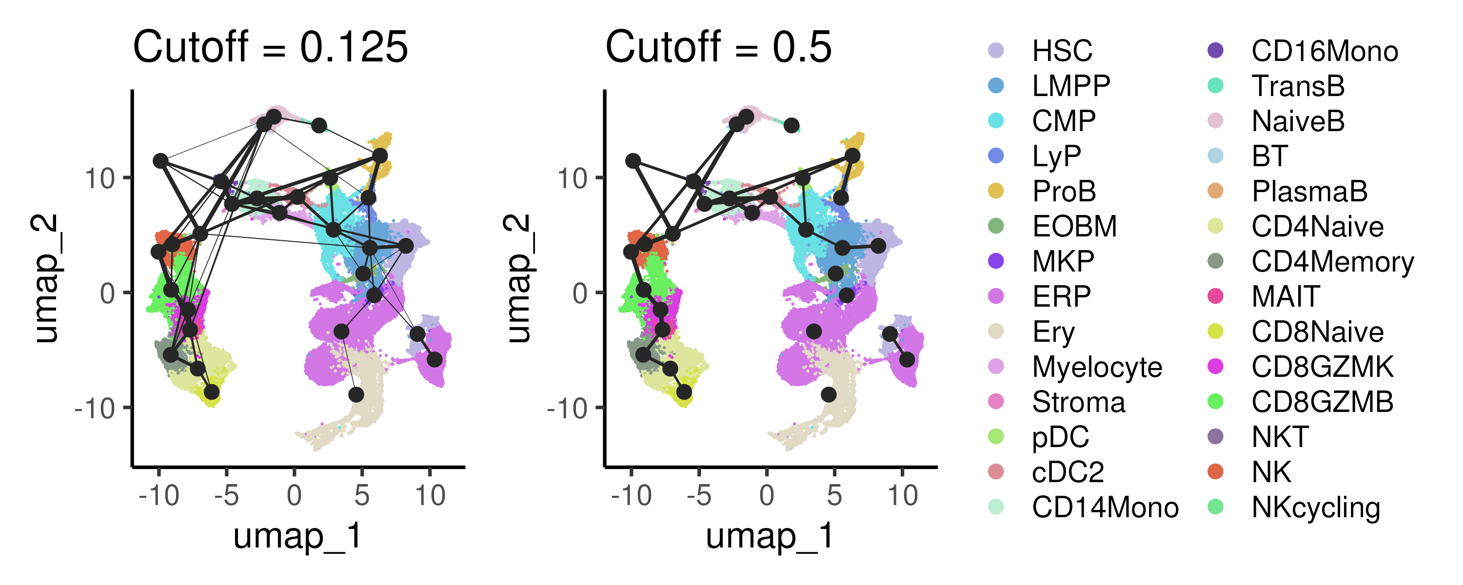
Figure 6.5: PAGA calculates the connectivity or transitions between cell clusters to capture the global connectivity between different cell populations.
6.5 Monocle3
Thus far, the Slingshot and PAGA methods construct trajectories by connecting the various clusters identified in the datasets. One can also infer trajectories at a finer resolution using Monocle3.
Monocle3 begins with reducing the dimensionality of the data using techniques such as UMAP to capture the major sources of variation. Next, the single cells are then partitioned to identify disconnected or “disjoint” trajectories if any. In Slingshot and previous versions of Monocle, all cells are assumed to be part of a single trajectory. However, this is not necessarily true e.g. the T cells in our bone marrow dataset is obviously disconnected from the progenitor cells. Thus, Monocle3 clusters the cells and determine if the clusters are part of the same trajectories. Cells from the same trajectory are “partitioned” into “supergroups” using a method derived from “approximate graph abstraction” (AGA). It then applies a technique called reversed graph embedding to learn a trajectory of cells in this reduced space, allowing it to model complex, branched lineage structures. Then, the user selects one or more positions on the trajectory that define the starting points of the trajectory. Monocle3 measures the distance from these start points to each cell, which is then used to determine the pseudotime. Figure 6.6 demonstrates the use of Monocle3 on the example bone marrow dataset.
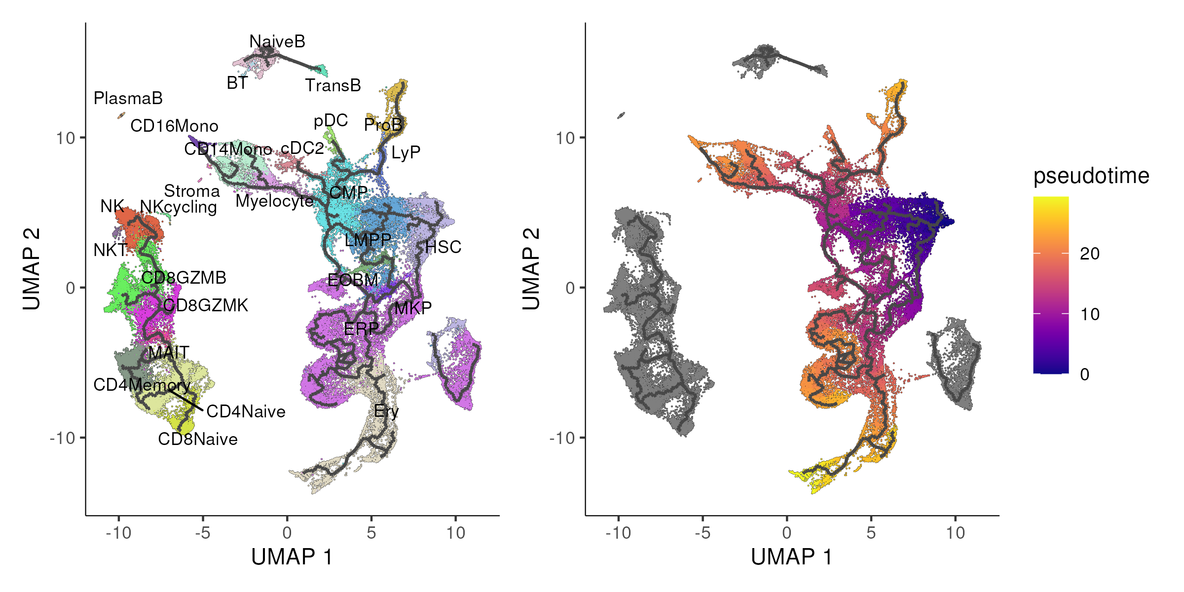
Figure 6.6: Monocle3 identifies four disjoint trajectories (left panel) with the UMAP being colored by the pseudotime of the stem and progenitor compartment in the right panel.
By default, Monocle 3 primarily relies on UMAP for reducing the dimensionality of scRNA-seq data and learning cellular trajectories. However, by substituting the UMAP embedding with other 2D embeddings, e.g. PHATE, you can effectively “trick” Monocle 3 into using these alternative embeddings for trajectory inference. This is done by manually replacing the UMAP coordinates in the Monocle3 object with PHATE coordinates. The algorithm then proceeds with trajectory inference, assuming the new coordinates are from UMAP. This flexibility allows one to explore how different dimensionality reduction techniques might impact the inferred trajectories, potentially offering new insights into cellular dynamics and relationships that might be more apparent in one embedding over another. In Figure 6.7, we applied Monocle3 algorithm using PHATE coordinates.
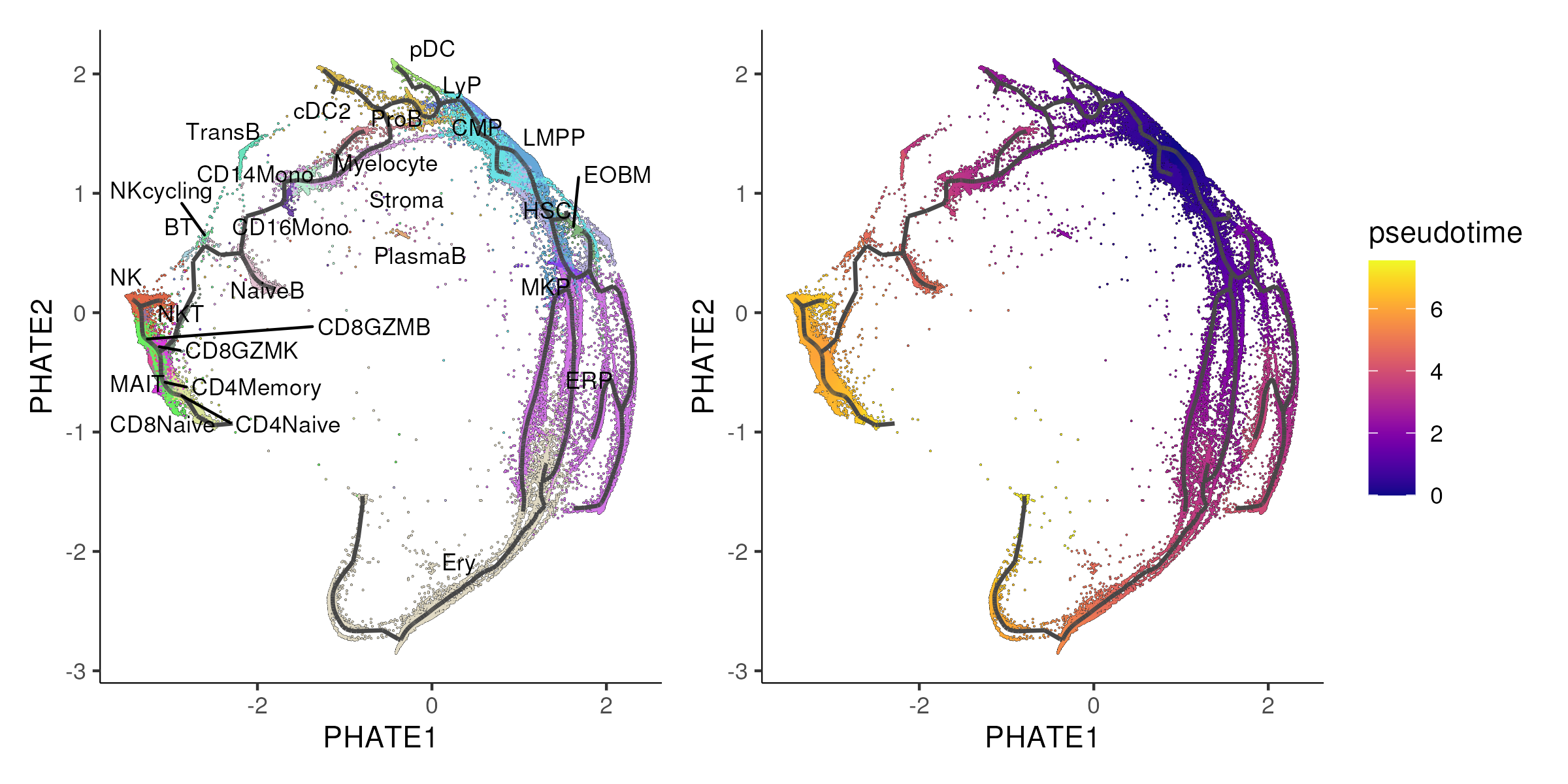
Figure 6.7: Monocle3 is applied to the PHATE coordinates instead of the default UMAP coordinates.
6.6 Diffusion Pseudotime
In section 5.5, we explained how diffusion Maps model the data as a random walk on a graph and determines the “diffusion distance” between points, which is then reduce the data to a lower-dimensional space i.e. the diffusion components. After constructing the diffusion map, one can select a root cell representing the starting point of the trajectory. The diffusion pseudotime (DPT) is then calculated by measuring the diffusion distance from this root cell to all other cells. This diffusion distance effectively represents pseudotime, reflecting the progression of cells along a developmental or differentiation pathway. Cells further from the root cell in diffusion space are assigned a higher pseudotime value, allowing for an ordering of the cells.
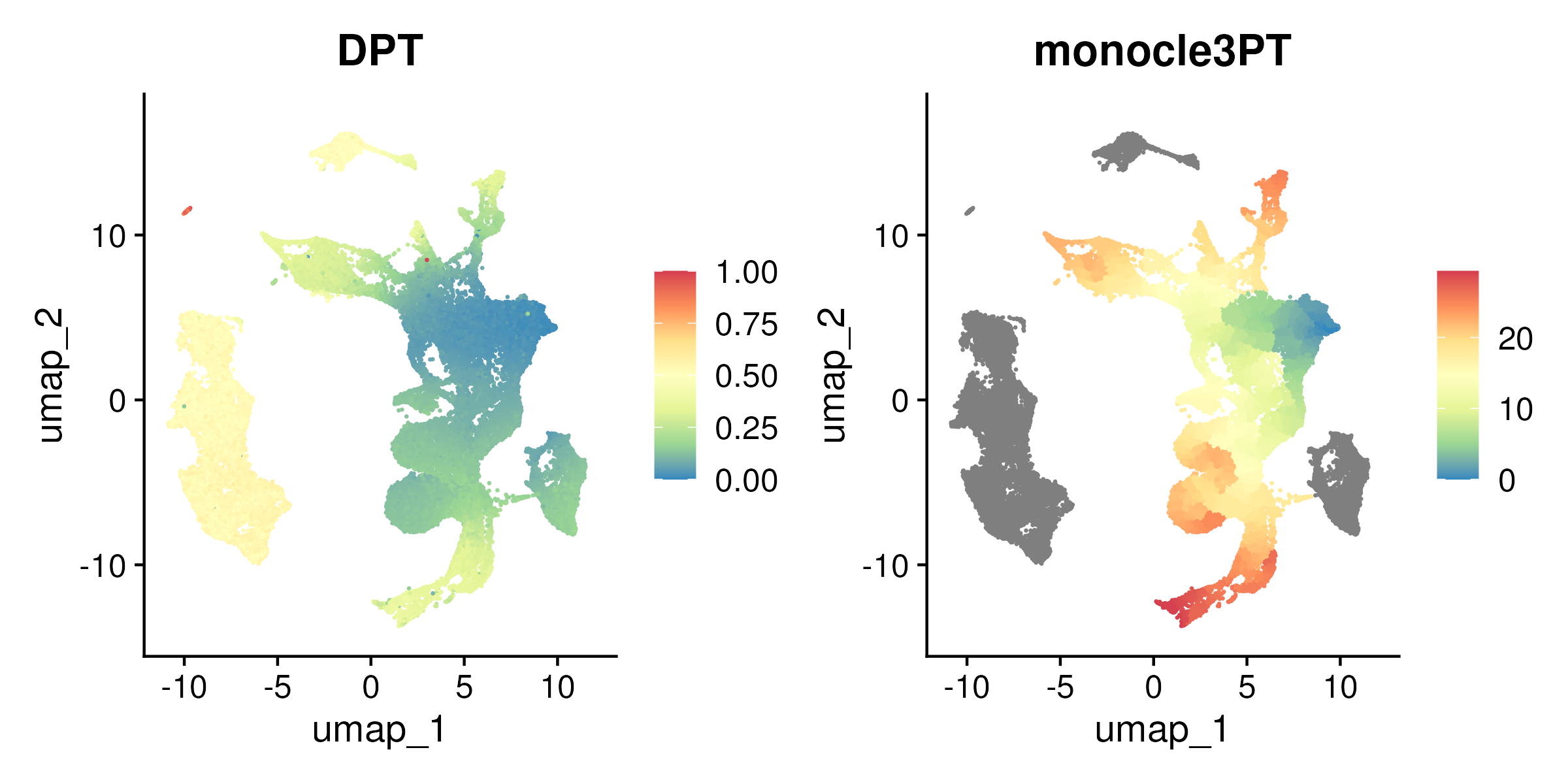
Figure 6.8: UMAP colored by Diffusion Pseudotime (DPT, left panel) and Monocle3 pseudotime for the stem and progenitor compartment only (right panel).
6.7 Pseudotime-based DE using tradeSeq
As explained in section 6.3, one can identify genes whose expression levels vary with pseudotime. Here, we use the tradeSeq algorithm to achieve this analysis. tradeSeq (Trajectory Differential Expression analysis for Sequencing data) is a statistical framework designed to identify genes with varying expression patterns along cellular trajectories inferred from single-cell data. It works by fitting generalized additive models (GAMs) to gene expression data along pseudotime. An important aspect of this modeling process is the selection of “knots” which are specific points along the pseudotime where the spline functions, used in the GAMs, are allowed to bend or change slope. The number of knots determines the flexibility of the model: more knots allow the model to capture more complex gene expression patterns, while fewer knots result in smoother, more generalized trends. To determine the number of knots, one can evaluate the genewise AIC, a measure of goodness of fit for each gene and identify the number of knots where the AIC starts to taper off i.e. identify the elbow (Figure 6.9).
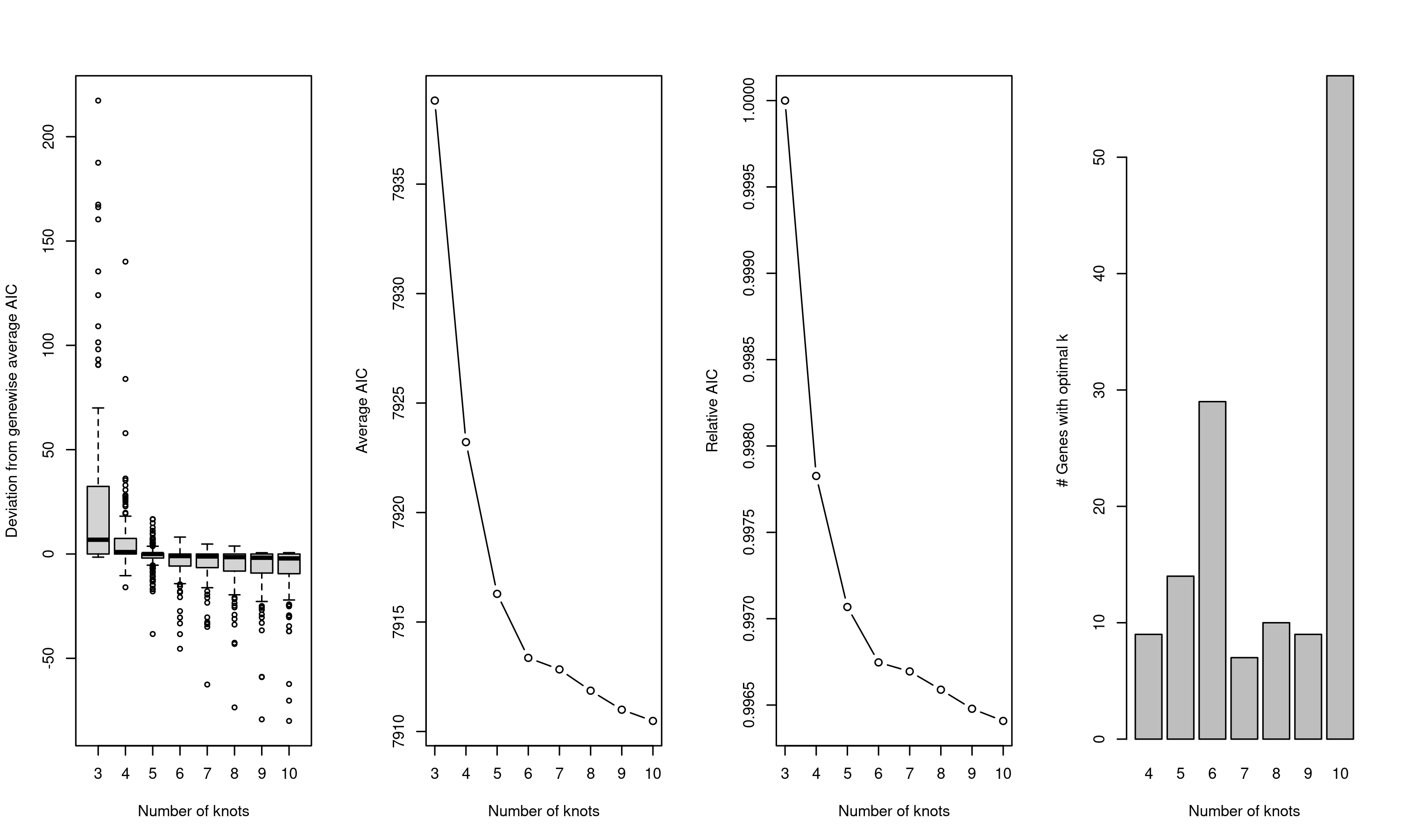
Figure 6.9: Genewise AIC for different number of knots. The optimal number of knots is 6 where the genewise AIC starts to taper off.
Upon fitting the model, different types of differential expression can be performed either for a single trajectory or comparing two or more trajectories (Figure 6.10). Different tests can be performed including testing for global changes in pattern (association test and pattern test for single and multiple trajectories respectively) or comparing specific points along the trajectory (startVsEnd test and diffEnd test).
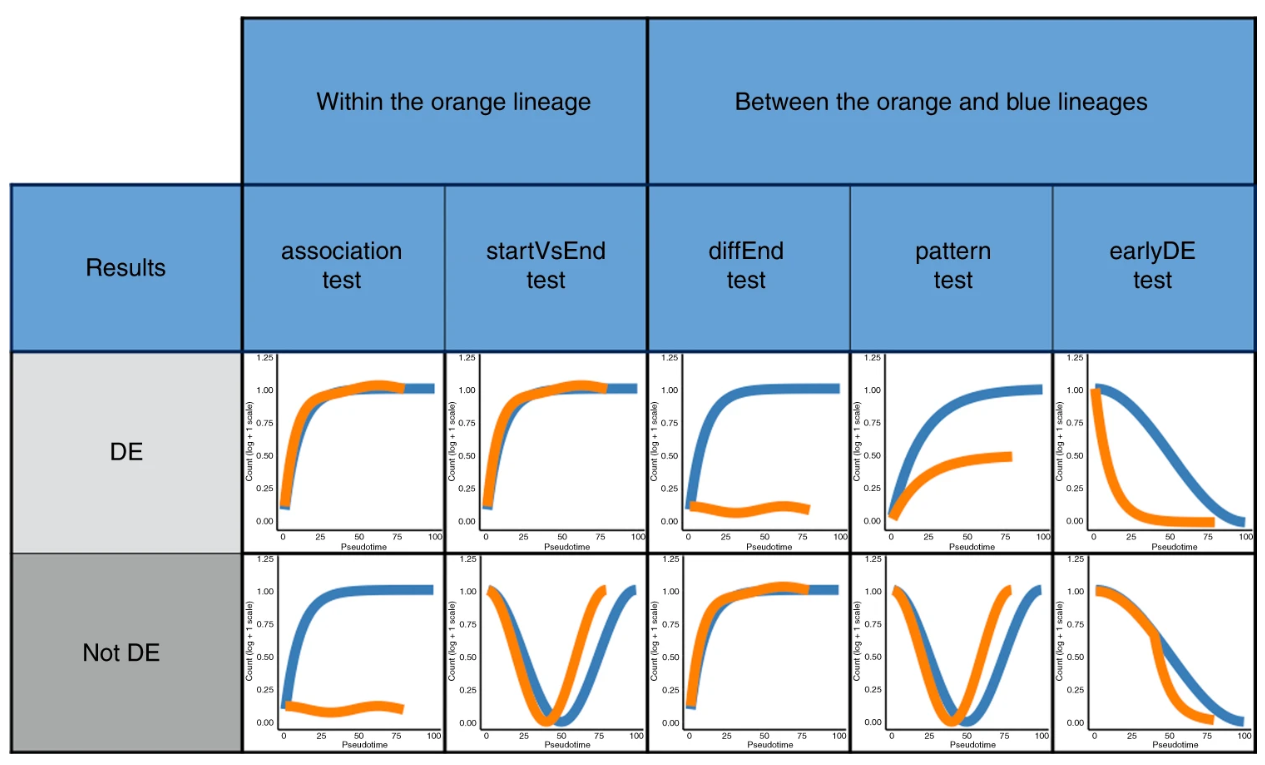
Figure 6.10: Different types of differential expression testing in tradeSeq, comparing for a single trajectory or across two or more trajectories.
Here, we demonstrate the use of tradeSeq to perform pseudotime-based DE in two use cases. First, a common task is to identify genes that change along pseudotime, which can be used to identify genes that are transiently upregulated along the trajectory. To this end, we subsetted the HSC-LMPP-CMP differentiation progression and tried to identify genes that are changing along this differentiation trajectory. This subset is performed so that the resulting analysis can be completed in a reasonable timeframe as a coding tutorial. We then applied the association test to find genes changing along this trajectory. The identified genes are then visualised on UMAP (Figure 6.11) and as a heatmap (Figure 6.12).
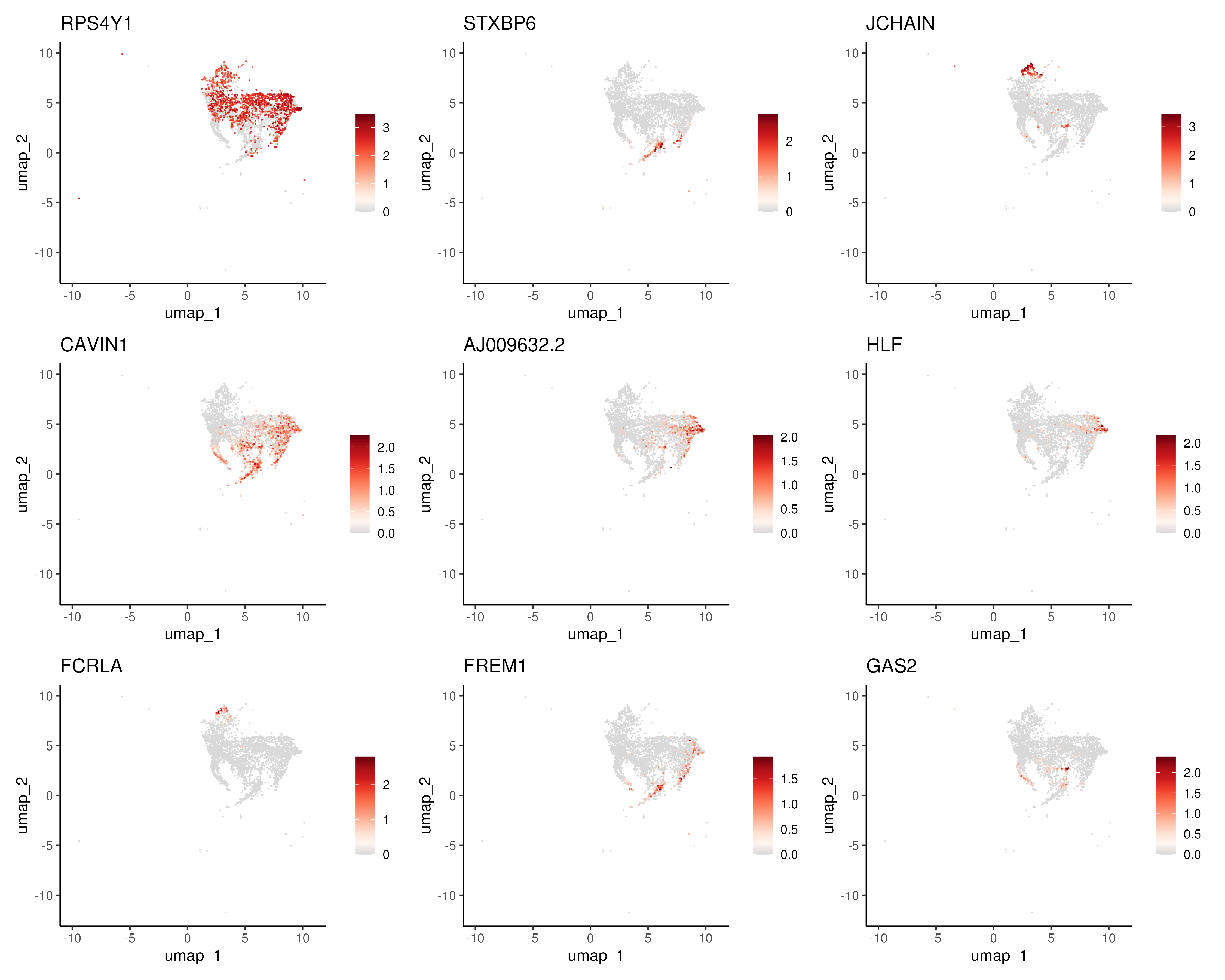
Figure 6.11: Top genes changing along the HSC-LMPP-CMP differentiation trajectory visualised on UMAP.
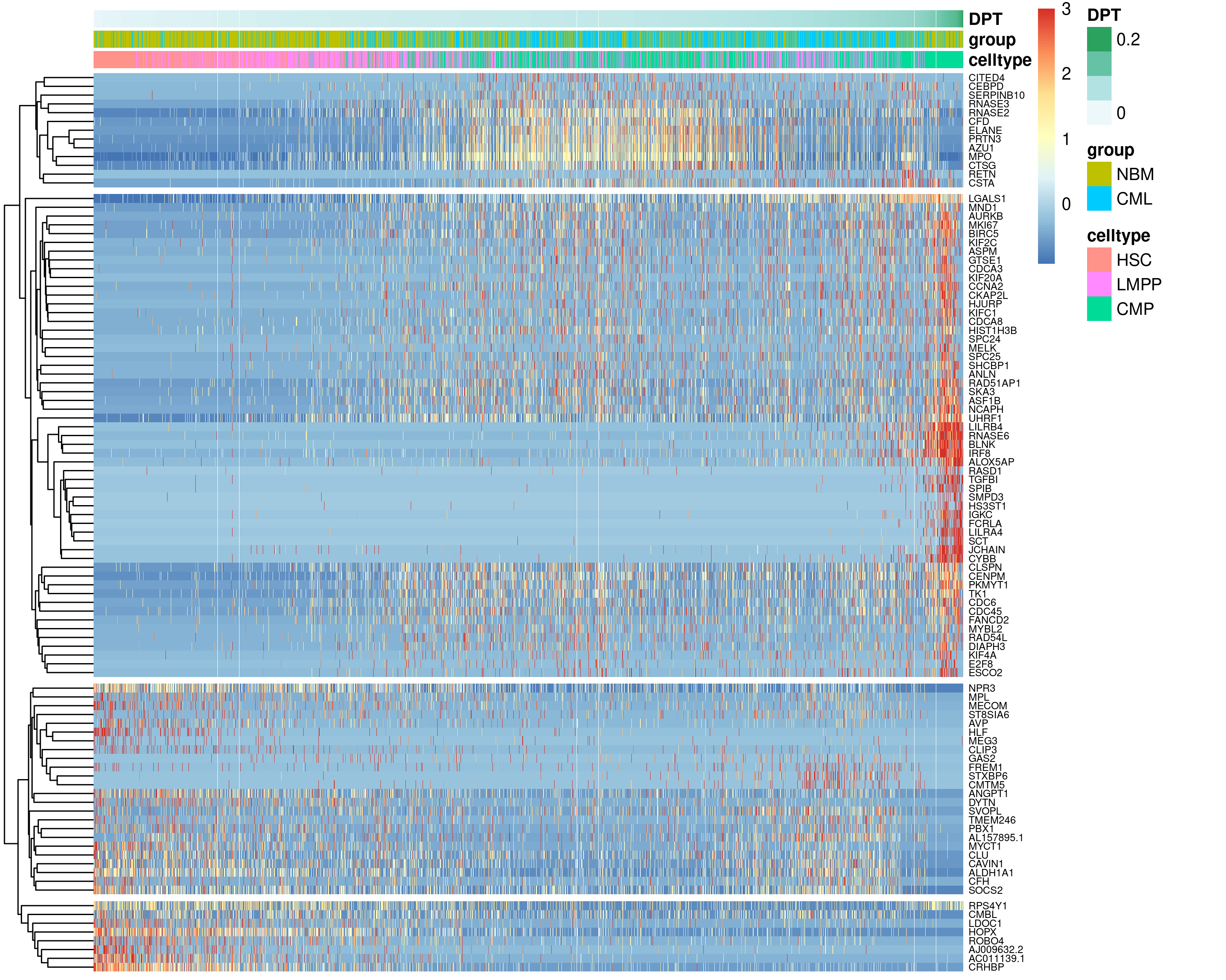
Figure 6.12: Gene expression of top 50 genes changing along the HSC-LMPP-CMP differentiation trajectory visualised on a heatmap with cells ordered by pseudotime.
In a second example, we used the same HSC-LMPP-CMP subset of cells from the
first use case but we wanted to identify any differences between normal bone
marrow (NBM) and CML counterpart. To this end, we performed two tests. The
diffEndTest was first performed to compare the endpoints of normal
HSC-LMPP-CMP trajectory and its CML counterpart to find DEGs for the
differentiated CMP celltype (Figure 6.13).
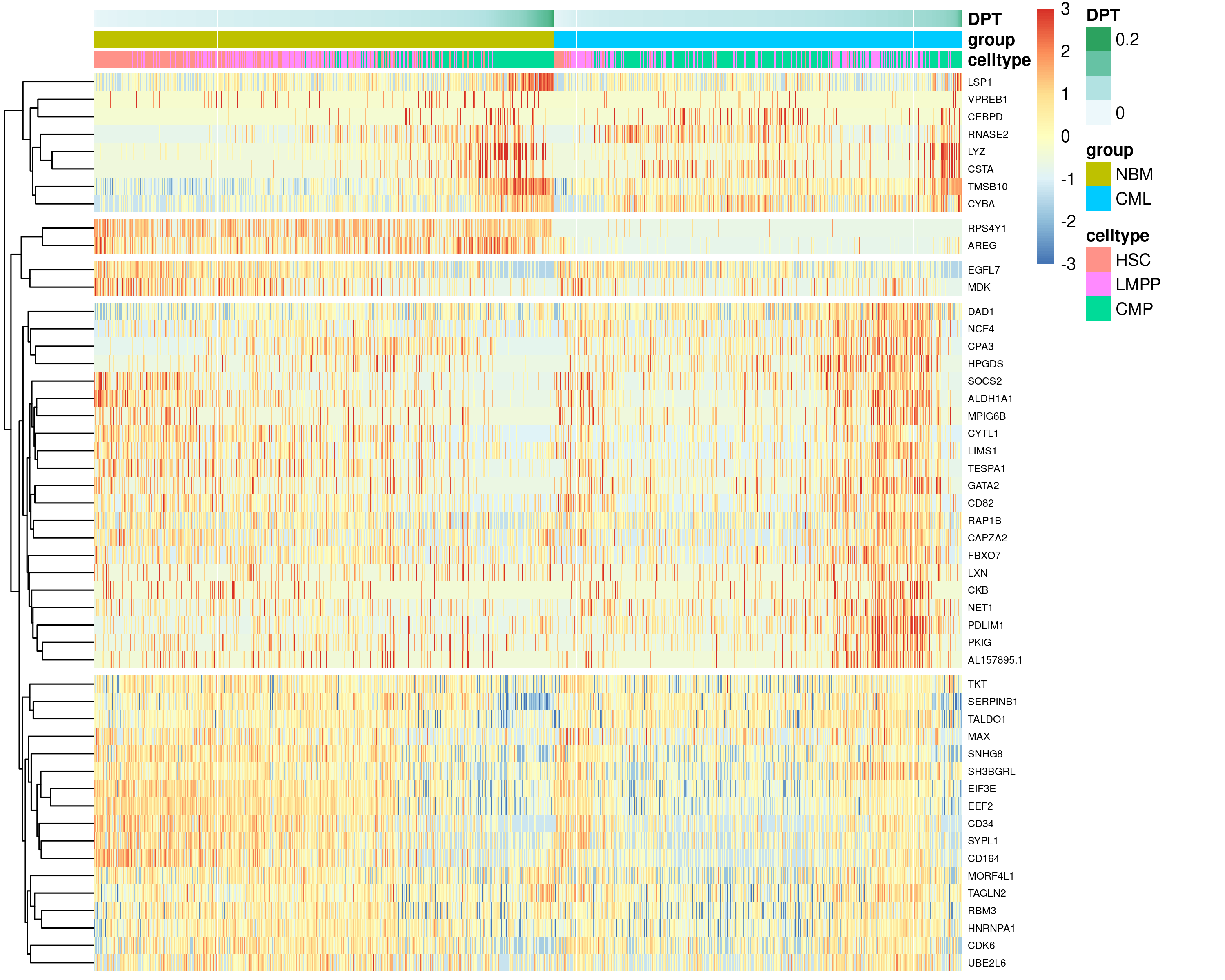
Figure 6.13: Top 50 DEGs identified from the diffEndTest, comparing the endpoints of normal HSC-LMPP-CMP trajectory and its CML counterpart.
The patternTest was next performed to compare the expression patterns along
pseudotime between the normal and CML HSC-LMPP-CMP trajectory by contrasting a
fixed set of equally spaced pseudotimes (M=100 by default).
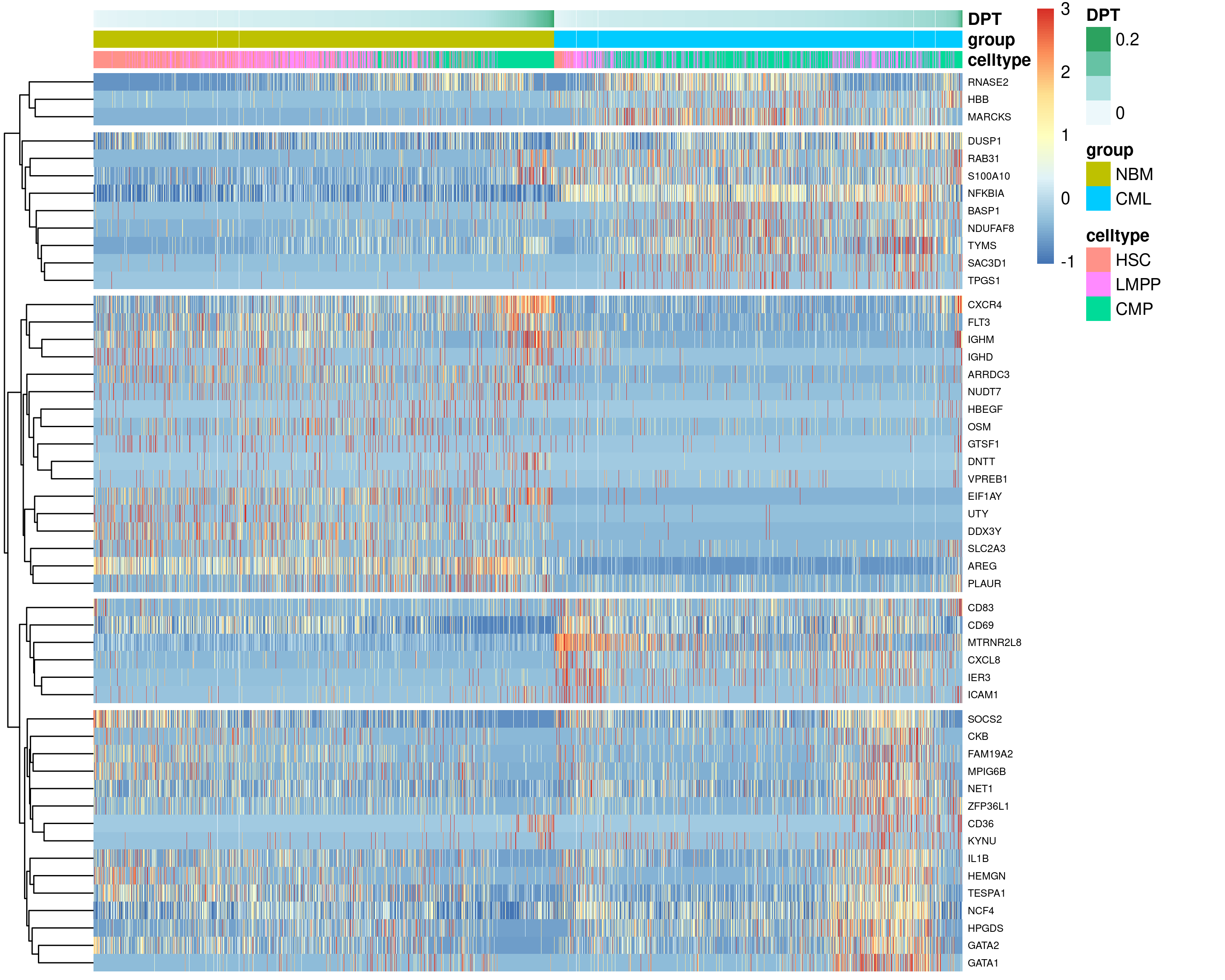
Figure 6.14: Top 50 DEGs identified from the patternTest, comparing the expression patterns along pseudotime between the normal and CML HSC-LMPP-CMP trajectory.
6.8 Code
##### Load required packages
rm(list = ls())
library(data.table)
library(Matrix)
library(ggplot2)
library(ggrepel)
library(patchwork)
library(randomcoloR)
library(RColorBrewer)
library(Seurat)
library(SeuratWrappers)
library(reticulate)
library(magrittr)
library(dplyr)
library(pdist)
library(slingshot)
library(monocle3)
library(tradeSeq)
library(BiocParallel)
library(pheatmap)
if(!dir.exists("output/")){dir.create("output/")} # Folder to store outputs
use_python("/usr/bin/python3")    # py_config()
os <- import("os")
py_run_string("r.os.environ['OMP_NUM_THREADS'] = '4'")


### Define color palettes
colPat = brewer.pal(8, "Paired")                 # color for patients
names(colPat) = c("NBM250267","NBM40316","NBM80350","NBM90222",
                  "P677","P685","P735","P742")
colGEX = c("grey85", brewer.pal(9, "Reds"))      # color for gene expression
colCcy = c("black", "blue", "darkorange")        # color for cellcycle phase
set.seed(42); colCT  = distinctColorPalette(28)  # color for celltype
set.seed(42); colCT2 = distinctColorPalette(30)  # color for celltype2


##### A. Slingshot and PAGA #####
seu <- readRDS("output/sec5_bmSeu.rds")
seu$celltype2 <- as.character(seu$celltype)
seu@meta.data[seu$cluster %in% c(50,34), "celltype2"] = "HSC2"
seu@meta.data[seu$cluster %in% c(14,19), "celltype2"] = "ERP2"
seu$celltype2 <- factor(seu$celltype2, levels = c(
  "HSC","HSC2","LMPP","CMP","LyP","ProB","EOBM","MKP","ERP","ERP2",
  "Ery","Myelocyte","Stroma","pDC","cDC2","CD14Mono","CD16Mono","TransB","NaiveB","BT","PlasmaB",
  "CD4Naive","CD4Memory","MAIT","CD8Naive","CD8GZMK","CD8GZMB","NKT","NK","NKcycling"))

# Run slingshot
sce <- as.SingleCellExperiment(seu)
sce <- slingshot(sce, reducedDim = "UMAP", clusterLabels = sce$celltype2,
                 start.clus = "HSC", approx_points = 200)
slsMST <- slingMST(sce, as.df = TRUE)
slsCrv <- slingCurves(sce, as.df = TRUE)

# Plot slingshot
p0 <- DimPlot(seu, reduction = "umap", pt.size = 0.1, label = FALSE,
              cols = colCT) + theme_classic(base_size = 18)
p1 <- p0 +
  geom_point(data = slsMST, aes(umap_1, umap_2), size = 3, color = "grey15") +
  geom_path(data = slsMST %>% arrange(Order),
            aes(umap_1, umap_2, group = Lineage))
p2 <- p0 +
  geom_path(data = slsCrv %>% arrange(Order),
            aes(umap_1, umap_2, group = Lineage))
ggsave(p1 + p2 + plot_layout(guides = "collect"),
       width = 10, height = 4, filename = "output/6A_trajSlingshot.png")

# Setup python anndata for downstream PAGA etc
sc <- import("scanpy")
adata <- sc$AnnData(
  X   = np_array(t(GetAssayData(seu)[VariableFeatures(seu),]), dtype="float32"),
  obs = seu@meta.data[, c("patient", "celltype2")],
  var = data.frame(geneName = VariableFeatures(seu)))
adata$obsm$update(X_pca = Embeddings(seu, "pca"))
adata$obsm$update(X_umap = Embeddings(seu, "umap"))
adata$var_names <- VariableFeatures(seu)
adata$obs_names <- colnames(seu)
sc$pp$neighbors(adata, n_neighbors = as.integer(30), n_pcs = as.integer(50))

# Run PAGA
sc$tl$paga(adata, groups = "celltype2")
oupPAGA <- as.matrix(py_to_r(adata$uns[["paga"]]$connectivities))
oupPAGA[upper.tri(oupPAGA)] <- 0
oupPAGA <- data.table(source = levels(seu$celltype2), oupPAGA)
colnames(oupPAGA) <- c("source", levels(seu$celltype2))
oupPAGA <- melt.data.table(oupPAGA, id.vars = "source",
                           variable.name = "target", value.name = "weight")
seu@misc$PAGA <- oupPAGA     # Store PAGA results into Seurat object

# Plot PAGA
ggData = data.table(celltype2 = seu$celltype2, seu@reductions$umap@cell.embeddings)
ggData = ggData[,.(umap_1 = mean(umap_1), umap_2 = mean(umap_2)), by = "celltype2"]
oupPAGA = ggData[oupPAGA, on = c("celltype2" = "source")]
oupPAGA = ggData[oupPAGA, on = c("celltype2" = "target")]
colnames(oupPAGA) = c("celltype2A","UMAP1A","UMAP2A","celltype2B",
                      "UMAP1B","UMAP2B","weight")
oupPAGA$plotWeight = oupPAGA$weight * 1

p0 <- DimPlot(seu, reduction = "umap", pt.size = 0.1, label = FALSE,
              cols = colCT) + theme_classic(base_size = 18)
p1 <- p0 +
  geom_point(data = ggData, aes(umap_1, umap_2), size = 3, color = "grey15") +
  geom_segment(data = oupPAGA[weight > 0.125], color = "grey15",
               linewidth = oupPAGA[weight > 0.125]$plotWeight,
               aes(x = UMAP1A, y = UMAP2A, xend = UMAP1B, yend = UMAP2B)) +
  ggtitle("Cutoff = 0.125")
p2 <- p0 +
  geom_point(data = ggData, aes(umap_1, umap_2), size = 3, color = "grey15") +
  geom_segment(data = oupPAGA[weight > 0.5], color = "grey15",
               linewidth = oupPAGA[weight > 0.5]$plotWeight,
               aes(x = UMAP1A, y = UMAP2A, xend = UMAP1B, yend = UMAP2B)) +
  ggtitle("Cutoff = 0.5")
ggsave(p1 + p2 + plot_layout(guides = "collect"),
       width = 10, height = 4, filename = "output/6A_trajPAGA.png")


##### B. Monocle3-based trajectories #####
# Determine tip cell
rootCelltype <- "HSC"
oupDR <- Embeddings(seu)
oupDR <- data.table(celltype = seu$celltype2, oupDR)
tmp <- oupDR[, lapply(.SD, mean), by = "celltype"]         # celltype centroid
tmp <- tmp[celltype != rootCelltype]
tmp <- data.frame(tmp[, -1], row.names = tmp$celltype)
oupDR$sampleID <- colnames(seu)
oupDR <- oupDR[celltype == rootCelltype]
oupDR <- data.frame(oupDR, row.names = oupDR$sampleID)
oupDR <- oupDR[, colnames(tmp)]
tmp <- as.matrix(pdist(oupDR, tmp))
rownames(tmp) <- rownames(oupDR)
iTip <- grep(names(which.max(rowSums(tmp))), colnames(seu))     # tip cell

# Apply Monocle3 on UMAP
cds <- as.cell_data_set(seu)
cds <- cluster_cells(cds, reduction_method = "UMAP")
cds <- learn_graph(cds)
cds <- order_cells(cds, root_cells = colnames(cds)[iTip])
seu$monocle3PT <- pseudotime(cds)

p1 <- plot_cells(
  cds, color_cells_by = "celltype", cell_size = 0.2, group_label_size = 3,
  label_groups_by_cluster = F,
  label_branch_points = F, label_roots = F, label_leaves = F) +
  scale_color_manual(values = colCT)
p2 <- plot_cells(
  cds, color_cells_by = "pseudotime", cell_size = 0.2,
  label_branch_points = F, label_roots = F, label_leaves = F)
ggsave(p1 + p2, width = 8, height = 4, filename = "output/6B_MonocleUMAP.png")

# Apply Monocle3 on PHATE
cds <- as.cell_data_set(seu)
cds@int_colData@listData[["reducedDims"]]@listData[["UMAP"]] <-
  cds@int_colData@listData[["reducedDims"]]@listData[["PHATE"]]
cds <- cluster_cells(cds, reduction_method = "UMAP")
cds <- learn_graph(cds)
cds <- order_cells(cds, root_cells = colnames(cds)[iTip])

p1 <- plot_cells(
  cds, color_cells_by = "celltype", cell_size = 0.2, group_label_size = 3,
  label_groups_by_cluster = F,
  label_branch_points = F, label_roots = F, label_leaves = F) +
  scale_color_manual(values = colCT)
p2 <- plot_cells(
  cds, color_cells_by = "pseudotime", cell_size = 0.2,
  label_branch_points = F, label_roots = F, label_leaves = F)
ggsave(p1 + p2 & xlab("PHATE1") & ylab("PHATE2"),
       width = 8, height = 4, filename = "output/6B_MonoclePHATE.png")


##### C. Diffusion Pseudotime #####
# Calculate DPT
# First, we set the tip cell determined earlier
py_run_string(paste0("r.adata.uns['iroot'] = ", as.integer(iTip-1))) # 0-base
sc$tl$diffmap(adata)
sc$tl$dpt(adata)
seu$DPT <- py_to_r(adata$obs$dpt_pseudotime)

# Plot DPT and compare with Monocle3 PT
p1 <- FeaturePlot(seu, pt.size = 0.1, feature = c("DPT","monocle3PT")) &
  scale_color_distiller(palette = "Spectral")
ggsave(p1, width = 8, height = 4, filename = "output/6C_DPT.png")


##### D. Pseudotime-based DE #####
# https://statomics.github.io/tradeSeq/articles/tradeSeq.html
# Prepare input data
seuSUB <- subset(seu, celltype2 %in% c("HSC","LMPP","CMP"))
Idents(seuSUB) <- seuSUB$group; set.seed(42)
seuSUB <- subset(seuSUB, downsample = 2000)
counts <- GetAssayData(seuSUB, assay = "RNA", layer = "counts")
counts <- counts[rowSums(counts >= 3) >= 10, ] # Relax this if you want more genes

inpDPT <- cbind(seuSUB$DPT, seuSUB$DPT)
colnames(inpDPT) <- c("CML", "NBM")
inpWgt <- matrix(data = 0, nrow = nrow(inpDPT), ncol = ncol(inpDPT))
rownames(inpWgt) <- rownames(inpDPT); colnames(inpWgt) <- colnames(inpDPT)
inpWgt[colnames(seuSUB)[which(seuSUB$group == "CML")], "CML"] <- 1
inpWgt[colnames(seuSUB)[which(seuSUB$group == "NBM")], "NBM"] <- 1

# Calculate trade-seq GAM
register(MulticoreParam(10)); set.seed(42)
oupTrsK <- evaluateK(counts = counts, pseudotime = inpDPT, cellWeights = inpWgt,
                     nGenes = 200, verbose = TRUE)
dev.copy(png, width = 10, height = 6, units = "in", res = 300,
         filename = "output/6D_evalK.png"); dev.off()
oupTrs <- fitGAM(counts = counts, pseudotime = inpDPT, cellWeights = inpWgt,
                 nknots = 6, verbose = TRUE)
saveRDS(oupTrs, file = "output/sec6_oupTrs.rds")

# Association test to find lineage-associated genes
oupTrSassoc <- associationTest(oupTrs, lineages = FALSE)
oupTrSassoc <- data.table(gene = rownames(oupTrSassoc), oupTrSassoc)
oupTrSassoc$padj <- p.adjust(oupTrSassoc$pvalue, method = "fdr")
oupTrSassoc <- oupTrSassoc[order(padj, -meanLogFC)]

p1 <- FeaturePlot(seuSUB, reduction = "umap", pt.size = 0.1, order = TRUE,
                  feature = oupTrSassoc$gene[1:9]) &
  scale_color_gradientn(colors = colGEX) & theme_classic(base_size = 14)
ggsave(p1, width = 15, height = 12, filename = "output/6D_assocUMAP.png")

ggData <- GetAssayData(object = seuSUB, slot = "data")
ggData <- ggData[oupTrSassoc[1:100]$gene, order(seuSUB$DPT)]
ggData <- t(scale(t(ggData)))
ggData[ggData > 3] <- 3; ggData[ggData < -3] <- -3
tmp <- data.frame(celltype = seuSUB$celltype,
                  group = seuSUB$group, DPT = seuSUB$DPT,
                  row.names = rownames(seuSUB@meta.data))
pheatmap(as.matrix(ggData), cluster_cols = FALSE, show_colnames = FALSE,
         cutree_rows = 4, annotation_col = tmp, fontsize_row = 6,
         width = 10, height = 8, filename = "output/6D_assocHmap.png")

# patternTest for CML-vs-NBM DE
oupTrSpatt <- patternTest(oupTrs)
oupTrSpatt <- data.table(gene = rownames(oupTrSpatt), oupTrSpatt)
oupTrSpatt$padj <- p.adjust(oupTrSpatt$pvalue, method = "fdr")
oupTrSpatt <- oupTrSpatt[order(padj, -fcMedian)]

ggData <- GetAssayData(object = seuSUB, slot = "data")
ggData <- ggData[oupTrSpatt[1:50]$gene, order(seuSUB$group, seuSUB$DPT)]
ggData <- t(scale(t(ggData)))
ggData[ggData > 3] <- 3; ggData[ggData < -3] <- -3
tmp <- data.frame(celltype = seuSUB$celltype,
                  group = seuSUB$group, DPT = seuSUB$DPT,
                  row.names = rownames(seuSUB@meta.data))
pheatmap(as.matrix(ggData), cluster_cols = FALSE, show_colnames = FALSE,
         cutree_rows = 5, annotation_col = tmp, fontsize_row = 6,
         width = 10, height = 8, filename = "output/6D_pattHmap.png")

# diffEndTest for CML-vs-NBM DE
oupTrSdiff <- diffEndTest(oupTrs)
oupTrSdiff <- data.table(gene = rownames(oupTrSdiff), oupTrSdiff)
oupTrSdiff$padj <- p.adjust(oupTrSdiff$pvalue, method = "fdr")
oupTrSdiff <- oupTrSdiff[order(padj, -logFC1_2)]

ggData <- GetAssayData(object = seuSUB, slot = "data")
ggData <- ggData[oupTrSdiff[1:50]$gene, order(seuSUB$group, seuSUB$DPT)]
ggData <- t(scale(t(ggData)))
ggData[ggData > 3] <- 3; ggData[ggData < -3] <- -3
tmp <- data.frame(celltype = seuSUB$celltype,
                  group = seuSUB$group, DPT = seuSUB$DPT,
                  row.names = rownames(seuSUB@meta.data))
pheatmap(as.matrix(ggData), cluster_cols = FALSE, show_colnames = FALSE,
         cutree_rows = 5, annotation_col = tmp, fontsize_row = 6,
         width = 10, height = 8, filename = "output/6D_diffHmap.png")


##### Z. Save Seurat Object at end of each section #####
# No need to save here unless you want to keep the module scores
# saveRDS(seu, file = "output/sec6_bmSeu.rds")