Chapter 3 Cell Clusters and Gene Modules
3.1 Cell clustering
Unsupervised clustering on single cells provides a data-driven and unbaised approach to discover the natural groupings of cells. The ability to define cell types through unsupervised clustering on the basis of transcriptome similarity has emerged as one of the most powerful applications of scRNA-seq (Kiselev, Andrews, and Hemberg 2019), forming the basis of many cell atlasing efforts e.g. Human Cell Atlas (HCA)(Rozenblatt-Rosen et al. 2017) and Tabula Murris(The Tabula Muris Consortium 2018).
3.1.1 Different approaches to clustering
There are several approaches to unsupervised clustering, which has been summarized in the review by Kiselev, Andrews, and Hemberg (2019) (Figure 3.1). One of the most popular approach is graph-based algorithms, which has been implemented in the Seurat and scanpy packages. Graph-based algorithms uses a graph to represent the transcriptome similarity between single cells. A graph consists of a set of nodes (i.e. single cells) connected to each other with a set of edges, representing the cell-cell similarity. Closely related cells have a lot more connections and community detection algorithms (e.g. Louvain community detection, Blondel et al. (2008)) can be used to find these tightly connected communities, corresponding to clusters. To control the number of resulting clusters, one can vary the resolution parameter where a higher resolution gives more clusters. For example, Seurat recommends a default resolution of 0.8 for typical single-cell datasets. A higher resolution may be more suitable for larger datasets and vice versa. Graph-based clustering have been routinely applied to social network analysis and scale very well with increaing number of nodes / single cells. Thus, with the increase in number of cells in single-cell studies, graph-based clustering has increasingly become the default in many analysis pipelines. However, these algorithms may not be accurate for small datasets (< 1K cells) as they rely on having many connections between nodes.
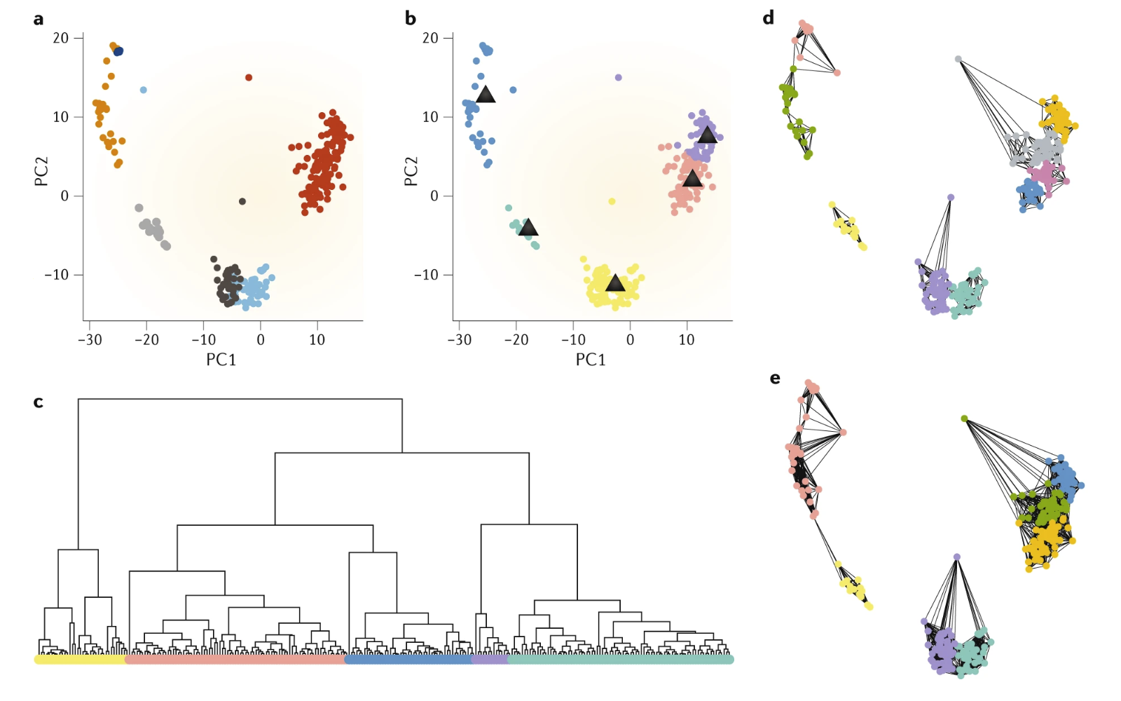
Figure 3.1: Different approaches to clustering of single cells. (a) Each point represents a single cell and are coloured by the true clusters. (b) k-means clustering seperates cells into k=5 clusters while (c) hierarchical clustering creates a hierarchy of cells which can be cut at different levels, in this case into 5 clusters. (d,e) k-nearest neighbour graphs with different k with similar cells being highly connected. Image taken from Kiselev, Andrews, and Hemberg (2019).
Also, there are density-based algorithms (e.g. DBSCAN) which cluster points that are densely packed in some low-dimensional space. These density-based algorithms are more sensitive to small populations (i.e. rare cell types) but are not effective for the detection of large clusters. Furthermore, there is \(k\)-means clustering which aims to partition the data into \(k\) clusters where each single cell belong to the cluster with the nearest mean. \(k\)-means is not very scalable and results may be highly stochastic as the mean of each cluster is updated iteratively with the inclusion of new cells. Another approach is hierarchical clustering where single cells are progressively grouped together (agglomerative clustering) or the entire datset is increasingly split into smaller groups (divisive clustering). Dendrograms generated from hierarchical clustering are reminiscent of cladograms and phylogenetic trees, which is intuitive to many biologists. Traditional hierarchical clustering are sensitive to noise and not scalable, making them unsuitable for single-cell analysis. However, due to the ease of interpreting dendrograms, hierarchical-based algorithms e.g. TooManyCells (Schwartz et al. 2020) have been developed to circumvent the above limitations. Finally, there are consensus methods which applies clustering at different settings and combines the different clustering results. This relies on the “wisdom of the crowds”, hoping that different clustering results will capture different aspects of the data. One notable example is the SC3 algorithm (Kiselev et al. 2017).
It should be pointed out that in certain large single-cell datasets, a single round of clustering may be insufficient. Instead, some studies opt for two or more rounds of clustering where the first round of clustering identify the major cell types in the system and each of these major cell types are further sub-clustered into cellular sub-states. For this guide, we will be performing a single round of clustering using the graph-based Louvain community detection algorithm implemented in Seurat. The next section will discuss how we can vary the resolution parameter to determine the optimal number of clusters.
3.1.2 Finding the optimal number of clusters
In most algorithms, it is possible to obtain different number of clusters depending on some parameter such as the resolution in graph-based methods or \(k\) in \(k\)-means or the dendrogram height cutoff in hierarchical clustering. Determining the number of clusters is non-trivial and often dependent on the biological question. For example, specifying higher number of clusters may lead to identification of cellular subtypes. Also, in timeseries experiment, where there is a continuous change in cell identity, the number of cell clusters or cell states is not well defined.
Nonetheless, there are some algorithms designed to help choose the number of clusters. In this guide, we use the clustree package (Zappia and Oshlack 2018) here. This package generates a clustering tree, which visualizes how cluster membership of single cells changes with an increasing number of clusters. In the clustering tree, each row represents a clustering resolution and each node represents a cluster with the node size indicating the number of single cells in the cluster. Edges are then constructed between nodes from consecutive rows, showing the distribution of single cells from a lower-resolution cluster to a higher-resolution cluster. Thus, as we go down the clustree plot, the clustering resolution and number of cluster increases and single cells get split/redistributed into new clusters. Such a clustree plot allows us to identify distinct or unstable clusters. For example, single cells shuffling between clusters are indicative of unstable clusters. This usually occurs at very low and very high clustering resolution, indicative of under-clustering and over-clustering respectively. Thus, one can choose an intermediate resolution where the clustering results are the most stable, with the least amount of shuffling cells.
For this guide, we performed clustering using resolutions of 0.4–1.5 in steps of 0.1 (Figure 3.2). We observed cells shuffling between res=0.4–0.7 (under-clustering) and res=1.3–1.5 (over-clustering). Thus, we settled on an optimal resolution of 1.0, resulting in a total of 29 clusters.
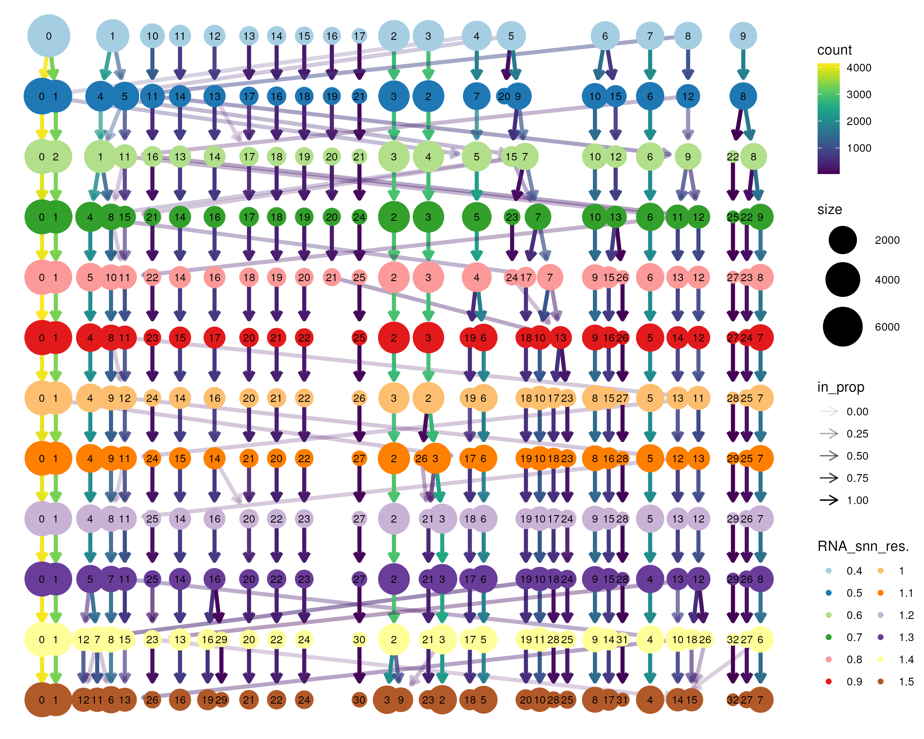
Figure 3.2: Clustering tree applied to the bone marrow dataset. Graph-based clustering was performed between resolution 0.4–1.5 in steps of 0.1 to obtain different number of clusters. The clustering tree then tracks how single cells move with an increasing number of clusters. Cells shuffling between clusters (for example, between res=0.4–0.7 and res=1.3–1.5) are indicative of unstable clusters. Here, we choose an optimal resolution of 1.0 between the two ranges of unstable clusters.
By default, the clusters are numbered by the number of cells with cluster 0 having the largest number of cells. This numbering is usually not meaningful. Thus, we reordered the cluster labels such that clusters in the same region in UMAP space are ordered together. For example, clusters 4,9,12,13,20,14,16 are ordered together representing progenitor cells (based on CD34 expression, Figure 3.3. It should be noted that such reordering of clusters is meant to better present / organise the data. Thus, this is often an iterative process where clusters are reordered after some new analysis is performed to inform more of the underlying biology.
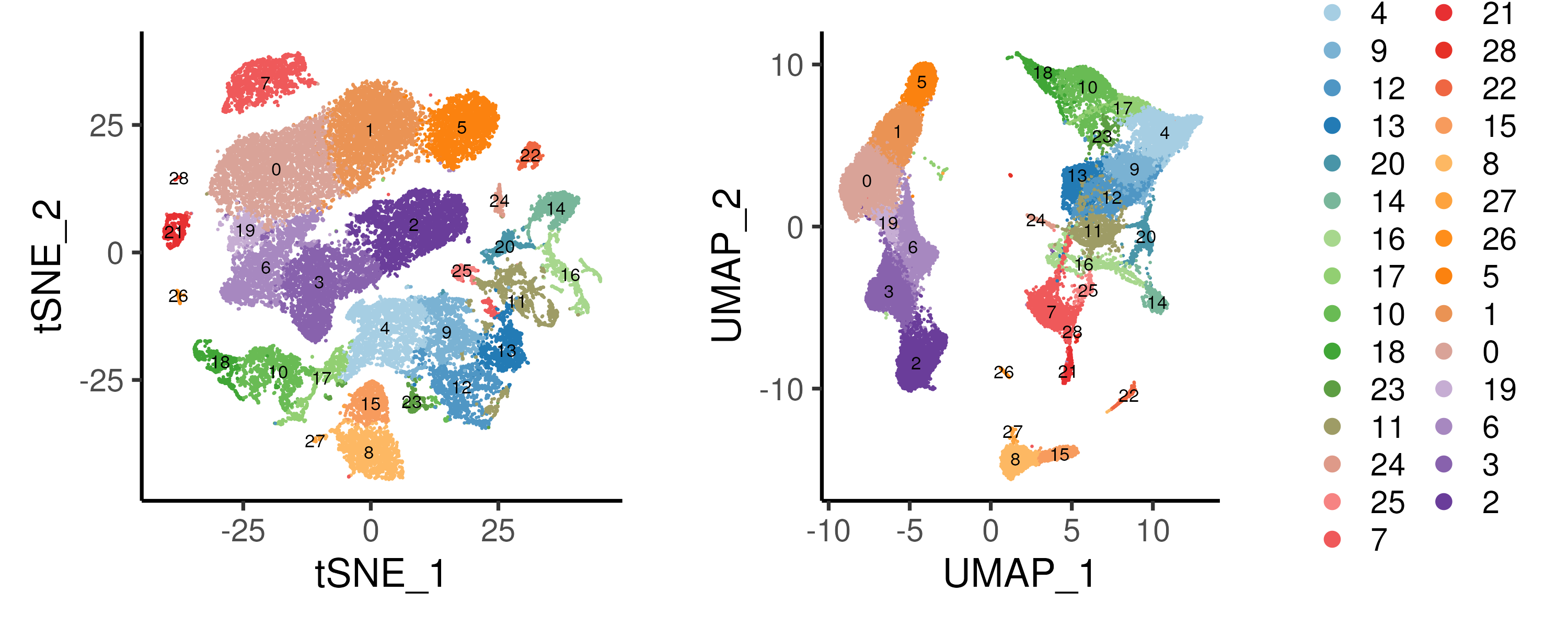
Figure 3.3: Unsupervised graph-based clustering using resolution = 1.0 on the bone marrow dataset. Distinct clusters can be observed on the UMAP embedding.
3.1.3 Cluster composition (proportion and cell numbers)
It is often useful to investigate the proportion of single cells within each library or cell cluster. For example, in Figure 3.4, we plot the proportion of cells assigned to each cluster e.g. 0.075 of cells in BM0pos library are assigned to cluster 4. By clustering the cell proportions, we can identify potential batch effect in a systematic manner. Here, we observe minimal batch effect with the CD34+ libraries clustering separately with CD34- counterparts.
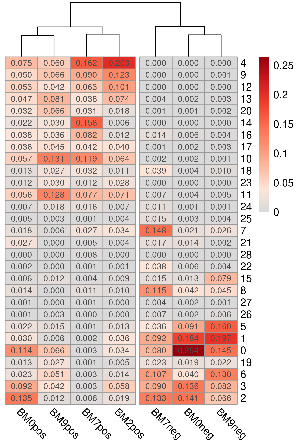
Figure 3.4: Proportion of cells assigned to each cluster for each library plotted as a heatmap. Libraries cluster according to their CD34+ / CD34- status.
The above proportion can also be plotted in the form of a stacked bar plot (Figure 3.5). Here, we see that cells in CD34+ libraries are assigned to progenitor cell clusters (clusters 4,9,12,13,20,14,16) while cells in CD34- libraries are assigned to remaining differentiated cell clusters. Instead of cell proportion, actual cell numbers can be plotted as well.
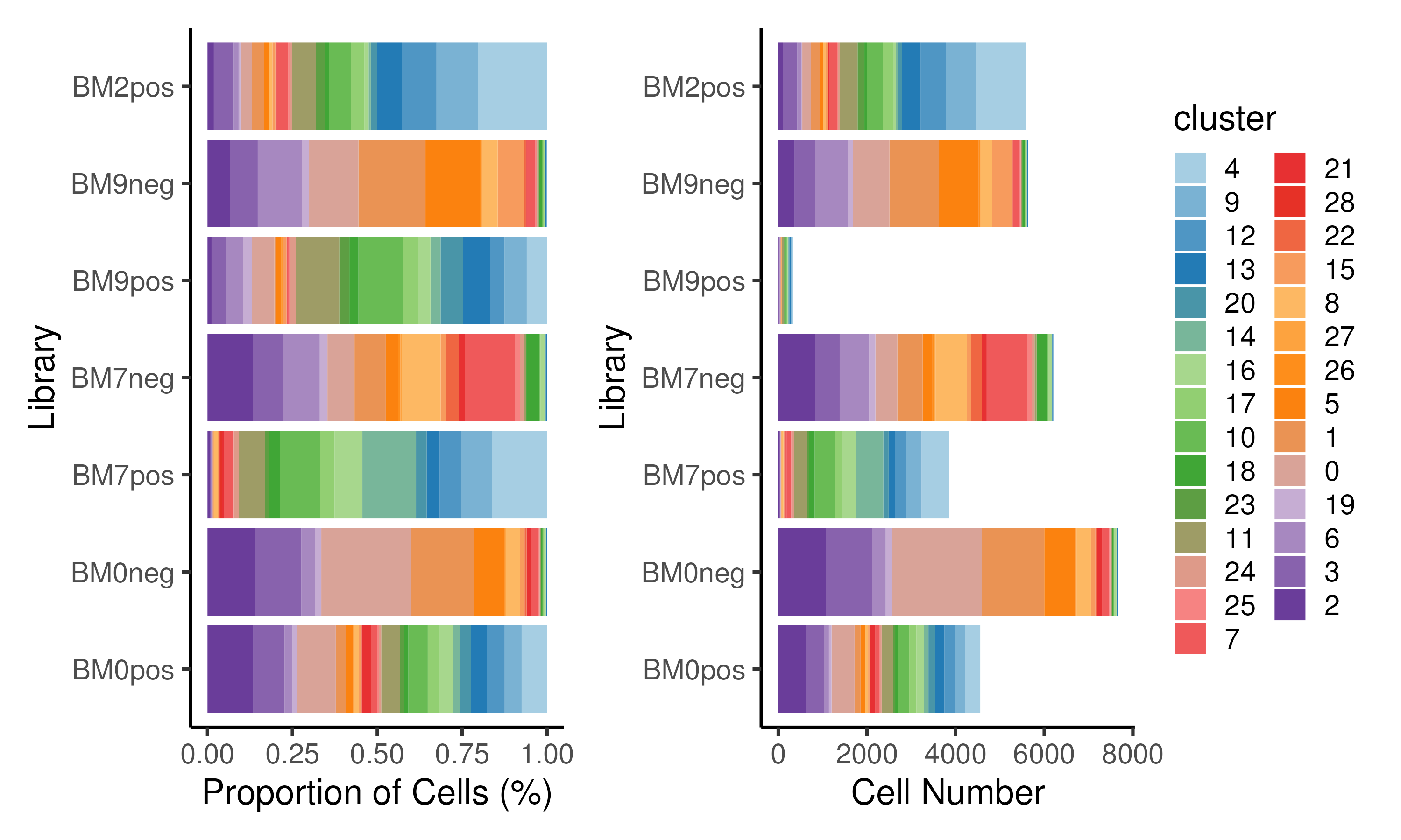
Figure 3.5: Proportion of cells / cell numbers assigned to each cluster for each library plotted as a stacked barplot.
We can also plot the cell proportion within each cluster (Figure 3.6). This may be helpful in annotating the cell cluster e.g. a cluster comprising cells from CD34+ libraries is likely a progenitor cell cluster. Also, cell clusters that only contain cells from a particular group e.g. diseased patients as compared to healthy donors can be identified. These group/donor-specific clusters may represent interesting biology.
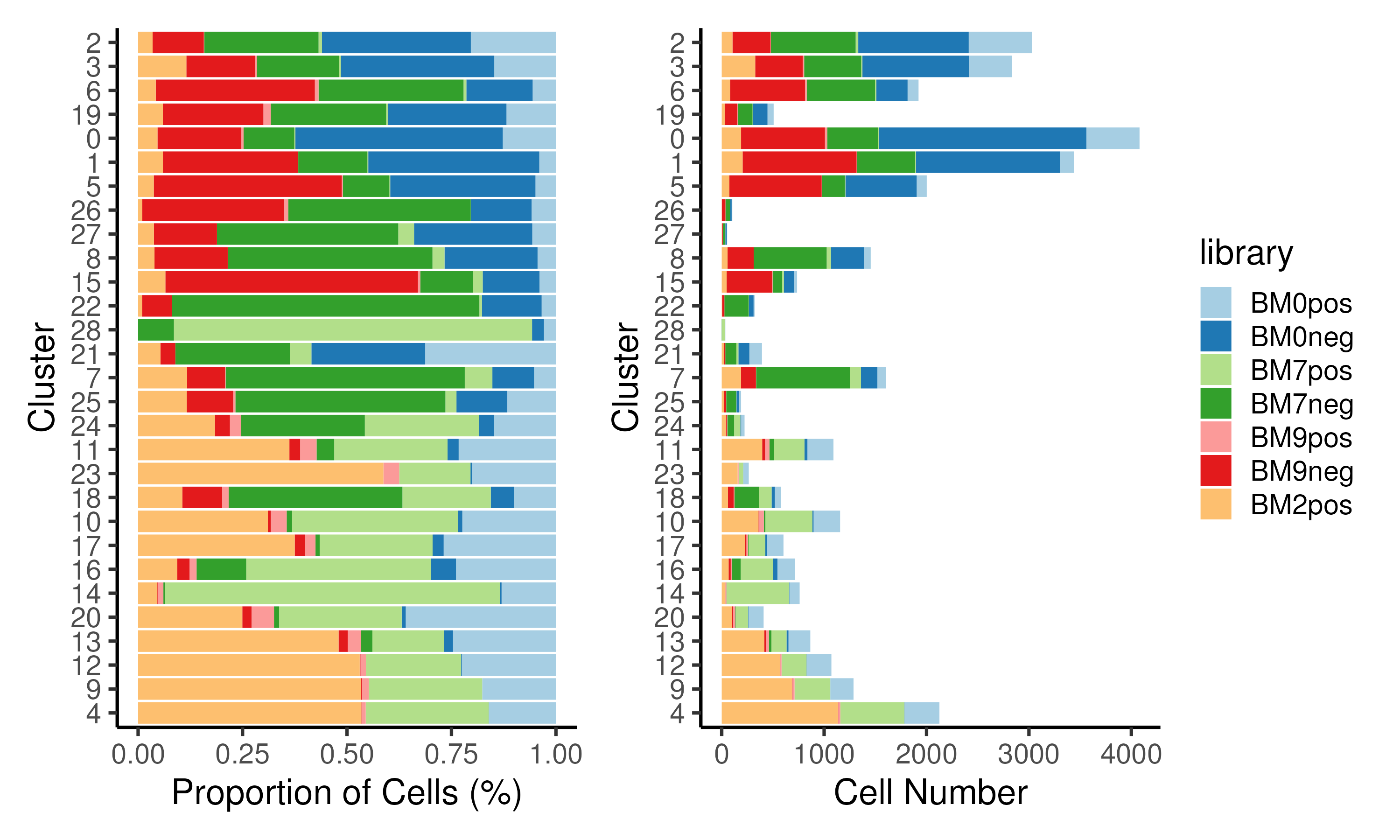
Figure 3.6: Proportion of cells / cell numbers assigned to each library for each cluster plotted as a stacked barplot. Clusters predominantly comprises cells from either CD34+ or CD34- libraries.
3.1.4 Code
Graph-based clustering is performed using the Seurat package. A \(k\)-nearest
neighbour graph is constructed using FindNeighbors, followed by identifying
the number of clusters via FindClusters. Here, we ran the clustering at
different resolutions (0.4–1.5), which was then visualized using clustree to
determine the optimal number of clusters. From the clustering tree, we have
chosen a resolution of 1.0, resulting in 29 cell clusters. The clusters are
then visualized on PCA and UMAP. The proportion of cells / cell numbers per
library or cluster are also plotted.
### A. Clustering
# Perform clustering
seu <- FindNeighbors(seu, dims = 1:nPC)
seu <- FindClusters(seu, resolution = seq(0.4,1.5,0.1), verbose = FALSE)

# Find ideal resolution
p1 <- clustree(seu)
ggsave(p1 + scale_color_manual(values = brewer.pal(12, "Paired")) +
         guides(color = guide_legend(ncol = 2)),
       width = 10, height = 8, filename = "images/clustClustree.png")
optRes <- 1.0                # determined from clustering tree
seu$seurat_clusters <- NULL  # Remove this column to prevent confusion
seu$cluster <- seu[[paste0("RNA_snn_res.", optRes)]]
reorderCluster = c("4","9","12","13","20","14","16",  # Prog
                   "17","10","18","23",               # Ery
                   "11","24","25","7","21","28",      # Myeloid
                   "22","15","8","27","26",           # B-Lymphoid
                   "5","1","0","19","6","3","2")      # T-Lymphoid
seu$cluster = factor(seu$cluster, levels = reorderCluster)
Idents(seu) <- seu$cluster     # Set seurat to use optRes

# Plot ideal resolution on tSNE and UMAP
nClust <- uniqueN(Idents(seu))         # Setup color palette
colCls <- colorRampPalette(brewer.pal(n = 10, name = "Paired"))(nClust)
p1 <- DimPlot(seu, reduction = "tsne", pt.size = 0.1, label = TRUE,
              label.size = 3, cols = colCls) + plotTheme + coord_fixed()
p2 <- DimPlot(seu, reduction = "umap", pt.size = 0.1, label = TRUE,
              label.size = 3, cols = colCls) + plotTheme + coord_fixed()
ggsave(p1 + p2 + plot_layout(guides = "collect"),
       width = 10, height = 4, filename = "images/clustDimPlot.png")

# Proportion / cell number composition per library
ggData <- as.matrix(prop.table(table(seu$cluster, seu$library), margin = 2))
pheatmap(ggData, color = colorRampPalette(colGEX)(100),
         cluster_rows = FALSE, cutree_cols = 2,
         display_numbers = TRUE, number_format = "%.3f", angle_col = 315,
         width = 4, height = 6, filename = "images/clustComLibH.png")

ggData = data.frame(prop.table(table(seu$cluster, seu$library), margin = 2))
colnames(ggData) = c("cluster", "library", "value")
p1 <- ggplot(ggData, aes(library, value, fill = cluster)) +
  geom_col() + xlab("Library") + ylab("Proportion of Cells (%)") +
  scale_fill_manual(values = colCls) + plotTheme + coord_flip()
ggData = data.frame(table(seu$cluster, seu$library))
colnames(ggData) = c("cluster", "library", "value")
p2 <- ggplot(ggData, aes(library, value, fill = cluster)) +
  geom_col() + xlab("Library") + ylab("Cell Number") +
  scale_fill_manual(values = colCls) + plotTheme + coord_flip()
ggsave(p1 + p2 + plot_layout(guides = "collect"),
       width = 10, height = 6, filename = "images/clustComLib.png")

# Proportion / cell number composition per cluster
ggData = data.frame(prop.table(table(seu$library, seu$cluster), margin = 2))
colnames(ggData) = c("library", "cluster", "value")
p1 <- ggplot(ggData, aes(cluster, value, fill = library)) +
  geom_col() + xlab("Cluster") + ylab("Proportion of Cells (%)") +
  scale_fill_manual(values = colLib) + plotTheme + coord_flip()
ggData = data.frame(table(seu$library, seu$cluster))
colnames(ggData) = c("library", "cluster", "value")
p2 <- ggplot(ggData, aes(cluster, value, fill = library)) +
  geom_col() + xlab("Cluster") + ylab("Cell Number") +
  scale_fill_manual(values = colLib) + plotTheme + coord_flip()
ggsave(p1 + p2 + plot_layout(guides = "collect"),
       width = 10, height = 6, filename = "images/clustComClust.png")
3.2 Identifying marker genes
After identifying the cell clusters in an unbiased manner, we next seek to find the genes that distinguishes these cell clusters. To achieve this, we need to perform differential expression (DE) analysis to identify differentially expressed genes (DEGs) between cell clusters. These marker genes can then be used to characterize and annotate the cell clusters (Section 3.3).
3.2.1 Different approaches for differential expression
Before the prominence of scRNA-seq, there already exist a plethora of DE tools designed for comparative transcriptomic analysis between bulk RNA-seq samples. The large number of DE tools arises because of the difficulty in estimating gene dispersion using a small number of bulk RNA-seq samples (typically \(n\) = 2 or 3). Accurate estimates of gene dispersion is important in quantifying the DE significance. Thus, different DE methods differ in how they estimate gene dispersion, which consequently affect their accuracy in identifying DEGs.
In the case of scRNA-seq, gene dispersion is a lot easier to estimate since there are a lot more single cells (\(n\) > 100) in DE comparisons. As a result, “simpler” statistical tests such as the Wilcoxon test (which is the default in Seurat) and the t-test perform well, as shown in a recent review by Soneson and Robinson (2018) (Figure 3.7). In fact, these simple statistical tests seem to outperform DE tools that are dedicated for scRNA-seq. These dedicated DE tools often use a zero-inflated model to account for the large number of zeros in single-cell gene expression. However, a recent report by Svensson (2020) suggests that single-cell expression is not zero-inflated and the large number of zeros are expected under a conventional negative binomial distribution. This could explain the poor performance of some of the single-cell dedicated DE tools. Another consideration is that some of the DE tools initially designed for bulk RNA-seq may not scale well computationally with the increasing number of single cells. From personal experience, the wilcoxon test suffices for simple pairwise DE while edgeR (Robinson, McCarthy, and Smyth 2010) can be used for more complex designs.
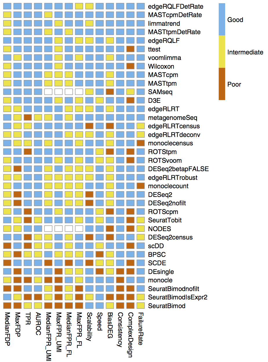
Figure 3.7: Comparison of the performance of DE methods applied to scRNA-seq datasets. Methods are ranked by their average performance across all the listed criteria. Image taken from Soneson and Robinson (2018).
3.2.2 Considerations in performing differential expression
Apart from the DE method, there are additional considerations when performing DE, namely (i) interpreting log-fold-changes and p-values, (ii) incorporating donor information for complex study design, (iii) the choice of background cells for comparison and (iv) distinguishing between change due to regulation versus composition.
For (i), due to the larger \(n\), the p-values obtained from single-cell DE are much smaller as compared to bulk RNA-seq comparisons. Thus, more emphasis should be placed on the effect size (i.e. the log-fold-change, LFC) rather than the statistical significance. Specifically, one should consider LFC cutoffs that can be observed experimentally. For example, the default LFC cutoff of 0.25 corresponds to \(2^{0.25} \approx 1.19\), a 19% increase in RNA levels and any value lower than that would be difficult to observe experimentally. The LFC cutoff should also agree with the biological resolution. If one is looking to identify marker genes separating cell types, a stricter LFC cutoff of 1.0–1.5 is more appropriate since different cell types should have very distinct transcriptomes. Conversely, when performing DE between subtypes e.g. comparing CD4 vs CD8 naive T cells, a lower LFC cutoff of 0.25–0.5 is more suitable since the transcriptomic difference is more subtle.
For (ii), single-cell studies are now more complex, often including samples from multiple donors. It is possible that there are more cells being profiled from a specific donor than others and this can skew the DE results. For example, consider a study where there are three diseased samples (D1,D2,D3) and three healthy samples (H1,H2,H3_ and there are a lot more cells from sample D1. In this scenario, a gene that is specifically expressed in D1 may be identified as differentially expressed when comparing diseased and healthy single-cells. In fact, Squair et al. have shown that ignoring biological replicates can often result in false discoveries in single-cell DE (Squair et al. 2021). To circumvent this, Squair et al. suggested the use of pseudo-bulk profiles where the single-cell profiles from each individual is being collected and then subjected to bulk RNA-seq based DE methods. Another possible approach is to downsample the number of single cells such that each individual have roughly a similar number of cells.
For (iii), when identifying marker genes, DE is often performed for the cluster of interest against all other cells, which we will refer to as the background. The choice of background can influence the DE results. For example, identifying marker genes for CD4 Naive T-cells against (a) cells from the bone marrow, which include progenitors and other myeloid cells versus (b) only T-cells will give different results. An appropriate choice of background cells is highly dependent on the biological question of interest. Furthermore, DE results may be biased towards clusters with more cells. This is because these larger clusters dominate the average expression of the DE background. Alternatively, pairwise DE can first be performed between all clusters. For every cluster, the log-fold-change against each of the other clusters can then be averaged for a better estimate.
For (iv), related to Section 1.1.3, when interpreting DE results, it is important to distinguish between change in regulation and change in composition. This can be investigated by checking the percentage of cells expressing the gene or plotting the gene expression on UMAP or violin plots. In fact, it is highly recommended to visualize the expression of identified marker genes, which will be covered in the next section.
3.2.3 Visualising marker genes
The most straightforward way to visualize gene expression is to plot the distribution on an UMAP. However, this can be difficult to interpret when tens to hundreds of genes are involved. Instead, one can use dotplots (Figure 3.8) which are essential modified versions of gene expression heatmaps. Similar to heatmaps, the color represents the relative levels of gene expression. An additional visual element is then introduced here, namely the size of the dot, which indicates the proportion of cells expressing a gene. This allows us to distinguish genes that are very rarely expressed i.e. with a high dropout rate, which would appear as a small dot.

Figure 3.8: Gene expression of the top 2 marker genes, ranked by log-fold-change, for each cluster.
Apart from dot plot, one can visualise the gene expression of a small number of genes using violin plots (Figure 3.9).
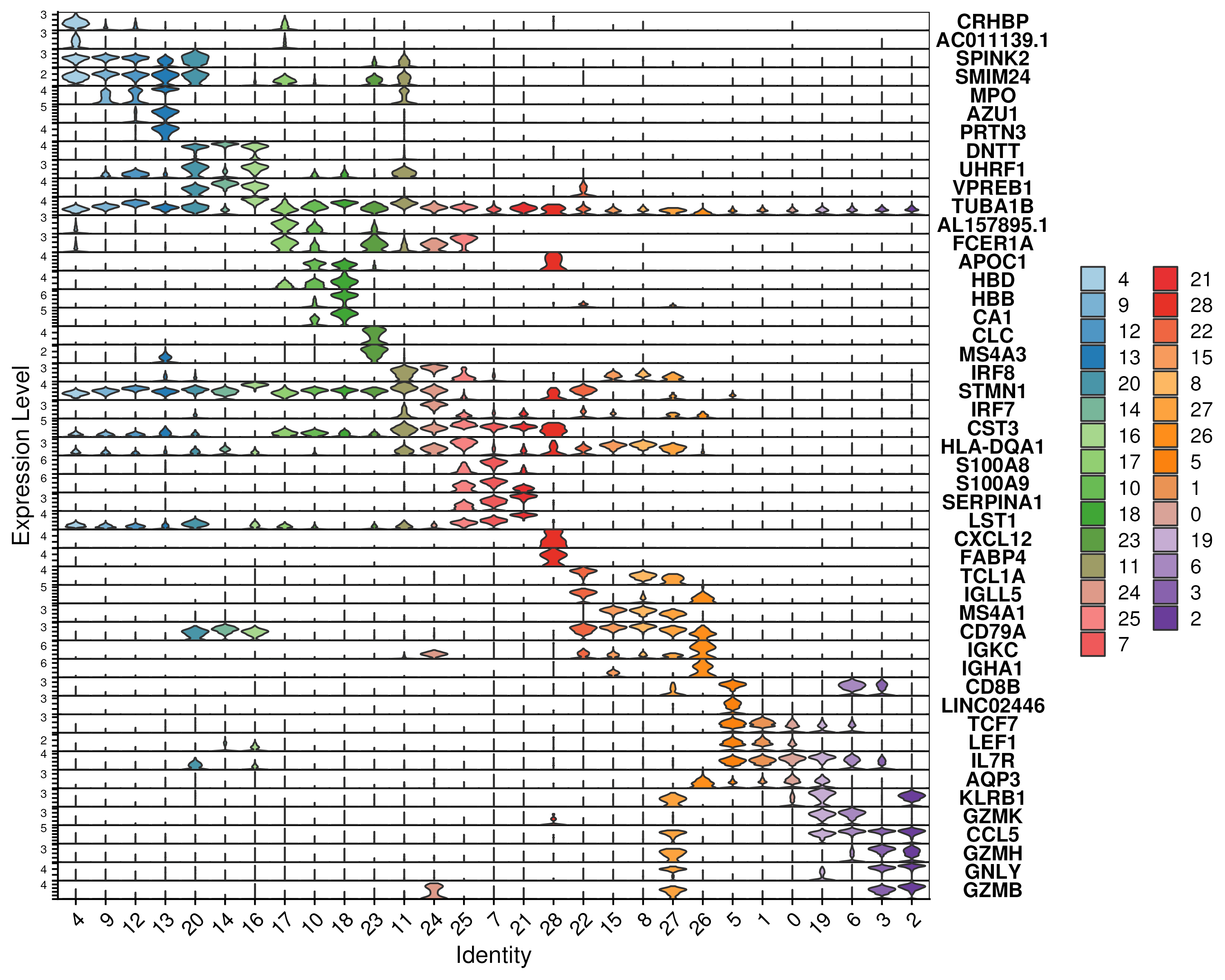
Figure 3.9: Violin plot of the gene expression of the top 2 marker genes, ranked by log-fold-change, for each cluster.
3.2.4 Code
Here, we identify the marker genes for each of the 29 clusters using the
FindAllMarkers function, which uses the straightforward approach of
performing DE between the cell cluster of interest and all the other single
cells. The statistical test to perform can be specified, which defaults to a
Wilcoxon test. As a visual check of the marker genes result, we plotted the
gene expression of the top 2 marker genes for each cluster using a dotplot and
a violin plot.
### B. Marker genes
# Find Markers
oupMarker <- FindAllMarkers(seu, only.pos = TRUE,
                            logfc.threshold = 1.0, min.pct = 0.2)
oupMarker <- data.table(oupMarker)
oupMarker$pct.diff = oupMarker$pct.1 - oupMarker$pct.2
oupMarker <- oupMarker[, c("cluster","gene","avg_log2FC","pct.1","pct.2",
                           "pct.diff","p_val","p_val_adj")]
fwrite(oupMarker, sep = "\t", file = "images/clustMarkers.txt")
seu@misc$marker <- oupMarker      # Store markers into Seurat object

# Check if known genes are in the marker gene list
knownGenes <- c("CD34","CRHBP","GATA1",  "CD14","IRF8","CD19",
                "CD4","CD8B","GNLY")
oupMarker[gene %in% knownGenes]

# Get top genes for each cluster and do dotplot / violin plot
oupMarker$cluster = factor(oupMarker$cluster, levels = reorderCluster)
oupMarker = oupMarker[order(cluster, -avg_log2FC)]
genes.to.plot <- unique(oupMarker[cluster %in% reorderCluster,
                                   head(.SD, 2), by="cluster"]$gene)
p1 <- DotPlot(seu, group.by = "cluster", features = genes.to.plot) +
  coord_flip() + scale_color_gradientn(colors = colGEX) +
  theme(axis.text.x = element_text(angle = -45, hjust = 0))
ggsave(p1, width = 10, height = 8, filename = "images/clustMarkersDot.png")
p2 <- VlnPlot(seu, group.by = "cluster", fill.by = "ident", cols = colCls,
              features = genes.to.plot, stack = TRUE, flip = TRUE)
ggsave(p2, width = 10, height = 8, filename = "images/clustMarkersVln.png")
3.3 Making sense of gene sets
After identifying the marker genes, one can “make sense” of these gene sets by associating them with different biological processes or marker gene sets generated from previous studies.
3.3.1 Functional analysis of marker genes
One way to associate marker gene sets to biological function is by comparing the overlap between the marker gene sets and other gene sets that have been annotated previously (which we shall refer to as “signatures” from now on). The degree of overlap and hence association can be determined using an over-representation statistical test, which determines whether the genes from each signatures are present more than would be expected (over-represented) in the user-supplied marker genes.
For the choice of pre-defined signatures, the Molecular Signatures Database
(MSigDB, https://www.gsea-msigdb.org/gsea/msigdb/) is an excellent resource
comprising signatures from various databases including Gene Ontology (GO) which
contain gene sets associated with different biological processes (BP), cellular
components (CC), or molecular functions (MF) and curated pathway databases such
as Kyoto Encyclopedia of Genes and Genomes (KEGG), Pathway Interaction Database
(PID) and WikiPathways. The MSigDB also include cell type signatures, which are
essentially marker gene sets from previous single-cell studies. Conveniently,
the signatures from MSigDB can be readily accessed from the R package msigdbr.
To perform over-representation analysis, there exist several R packages e.g.
clusterprofiler and gProfileR. Some of these packages e.g. gProfileR
require internet access to retrieve the pre-defined signatures from their
online databases. While this ensures that one is using the most updated data,
it can lead to reproducibility issues where the over-representation results
changes from time to time due to subtle updates in the signatures. Thus, for
this guide, we elected to use the R package clusterprofiler, which requires
users to provide the pre-defined gene sets and the signatures will be accessed
from a fixed version of package msigdbr to ensure reproducibility. Apart from
R packages, one can use online tools e.g. Enrichr
(https://maayanlab.cloud/Enrichr/) and DAVID (https://david.ncifcrf.gov/) to
perform a quick analysis to “get a feel” of the biological processes underlying
the marker gene sets.
3.3.2 Visualising functional analysis results
The pre-defined signature databases often contains thousands of gene sets and it is possible to get tens to hundreds of significant signatures for each cluster’s marker genes. Furthermore, there are several clusters, all of which we have calculated marker genes and tested for over-representation. Thus, the results can get overwhelming and difficult to interpret. Furthermore, it is possible to get “irrelevant” signatures e.g. biological processes related to the brain or the heart for our example bone marrow dataset.
To alleviate this problem, one can either (i) plot the top few signatures
ordered by significance or (ii) plot terms based on some keywords or (iii) plot
a selected subset of terms based on previous knowledge. In our guide, we
performed over-representation of the marker genes against MSigDB’s C8 cell type
signatures (Figure 3.10). Notably, within the C8 database,
there is a set of HAY_BONE_MARROW signatures comprising marker genes obtained
from a previous bone marrow single-cell study by Hay et al. (Hay et al. 2018).
Thus, we extracted the significant HAY_BONE_MARROW signatures and visualized
the over-representations in the form of a dotplot, allowing us to visualize
the significant bone-marrow-related signatures (on the y-axis) across different
clusters (x-axis). The color of the dots represent the statistical significance
while the size indicates the number of overlapping genes.
Clearly, there is significant signatures across all the clusters with the progenitor clusters (clusters 4,9,12,13,20,14,16) having progenitor-associated signatures. Also, other clusters are associated with monocytes (25,7,21,28) or B-cells (22,15,8,27) or T/NK-cells (5,1,0,19,6,3,2) related signatures.
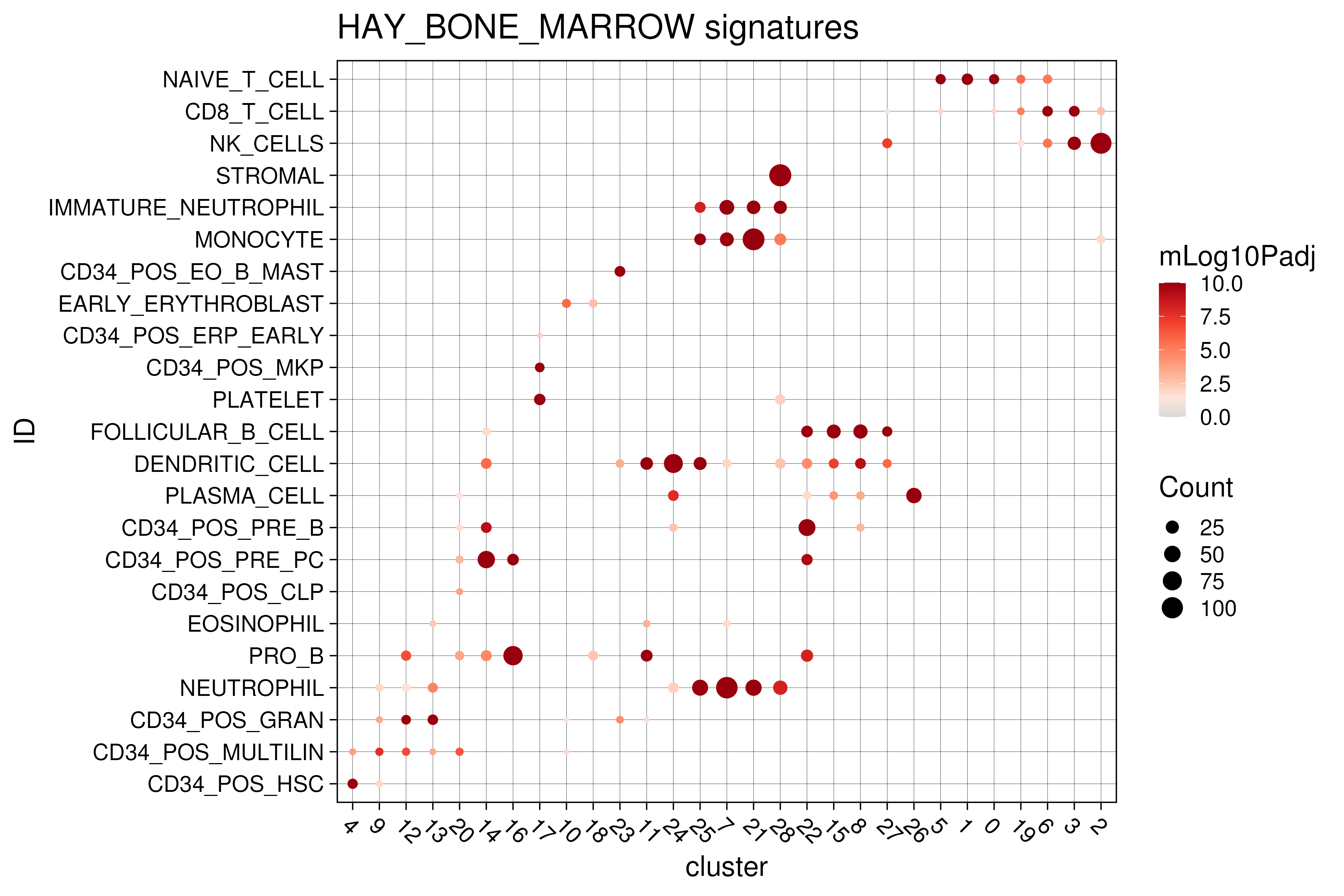
Figure 3.10: Functional analysis on marker genes against HAY_BONE_MARROW signatures from msigdb C8 database.
Here, we also demonstrate another use case, looking for signatures related to differentiation from the GO BP database (Figure 3.11). However, the results here are less informative with the monocyte (25,7,21,28) and B-cell (22,15,8,27) clusters having a lot of over-represented signatures.
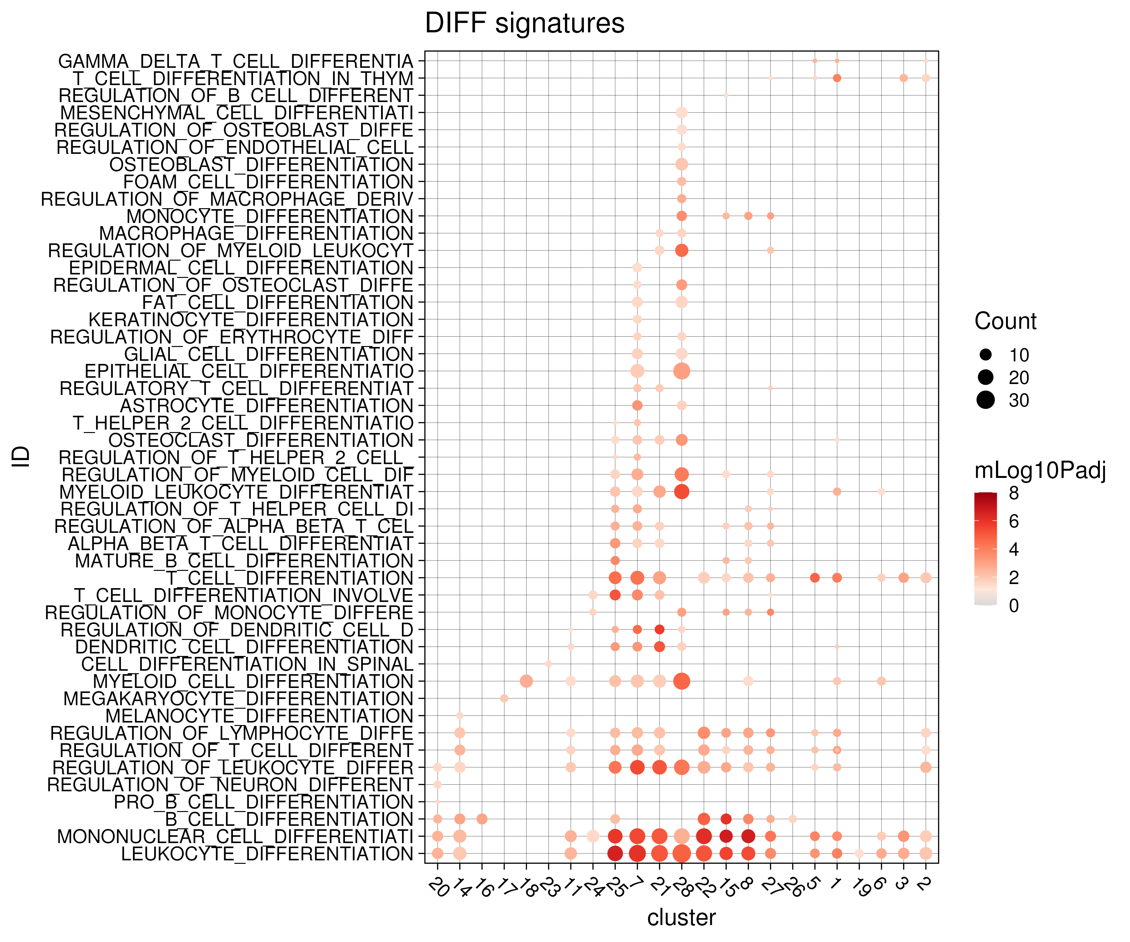
Figure 3.11: Functional analysis on marker genes against differentiation-related gene signatures from msigdb C5 GO BP database.
3.3.3 Cell cycle analysis
Another related biological analysis involving gene signatures / sets is the
prediction of the cell cycle phase of the single cells. This can be achieved
using a dedicated function in Seurat named CellCycleScoring. Briefly, the
function calculates the gene set activity (see Section @ref{sec:moduScor} for
more details) of cell cycle S-phase and G2M-phase related gene sets, giving the
S.Score and G2M.Score respectively. The cell cycle phase is then predicted
based on these two scores. If both the S.Score and G2M.Score are less than
zero, the cell is assigned G1 phase. Otherwise, the cells are assigned S or G2M
phase based on which of the two corresponding scores are higher.
For our bone marrow dataset, the majority of the CD34+ progenitor cells are predicted to be cycling in S/G2M phase with the exception of cluster 4, which is the HSC cluster (Figure @ref{clust-cellcycle}). This is in agreement with known biology that some of the HSCs are quiescent, protecting HSCs from functional exhaustion and cellular insults to enable lifelong hematopoietic cell production (Nakamura-Ishizu, Takizawa, and Suda 2014).
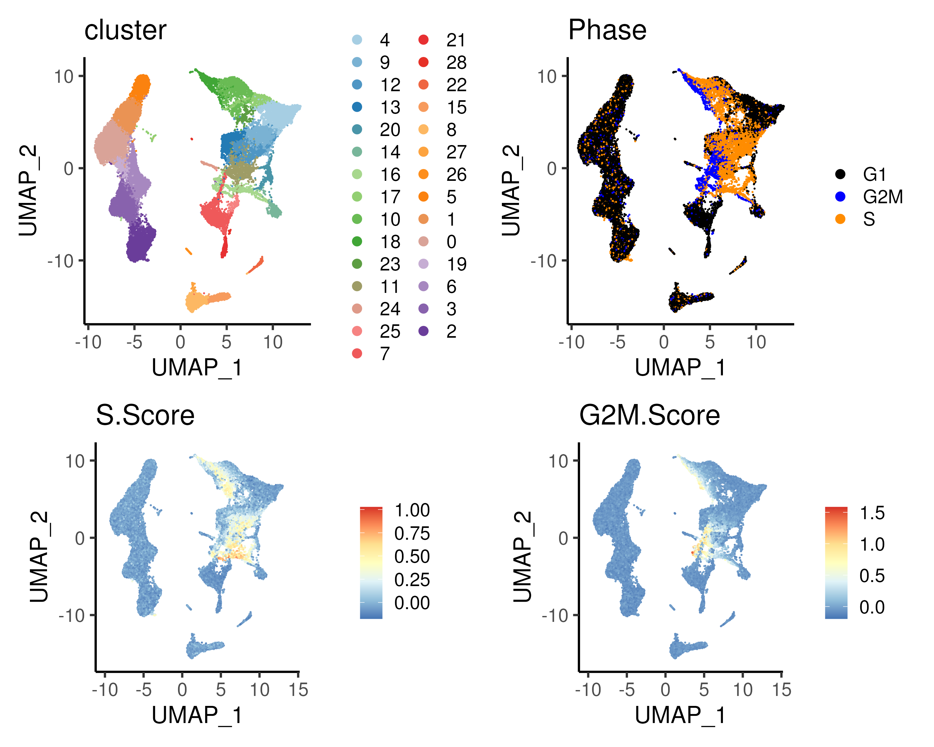
Figure 3.12: (Top left) clusters and (Top right) predicted cell cycle phase for the bone marrow dataset plotted on UMAP space. The cell cycle phase is predicted using both the S.Score (Bottom left) and G2M.Score (Bottom right); see text for more details. Notably, the CD34+ progenitor cells are predicyed to be cycling with the exception of cluster 4 which is the HSC cell population.
3.3.4 Calculating module scores
In the cell cycle analysis above, the overall expression of the S-phase and G2M-phase related genes are calculated separately to estimate the overall activity of these gene sets. This can be extended to any gene set to assess the activity of any biological processes associated with the gene set. Examples include gene sets associated with different signalling pathways, disease-specific gene sets or genes associated with a transcription factor. The use of such “gene set activity” is more robust than individual gene expression as the former relies on multiple genes and is less susceptible to the excess zero counts common in scRNA-seq. Note that the gene set activity is also known as the (gene) module score in Seurat.
To calculate the gene set activity, one possible approach is to compare the
expression of the genes of interest against that of a set of control genes that
has expression levels (Tirosh et al. 2016). In practice, all genes are binned
(separated into groups) based on their average expression across all single
cells. For each gene X in the input gene set, a number (usually 100) of control
genes are randomly selected from the same expression bin (as gene X). The
expression of gene X is then subtracted by the average expression of these
control genes. This procedure is repeated for all the genes in the input gene
set and the values are averaged to give the gene set activity. This is
implemented in Seurat via the AddModuleScore function. This calculated gene
set activity / module score is essentially the log-fold-change of the gene set
against a set of expression-level-adjusted control genes. It can be loosely
interpreted as the expression of a gene program against a baseline level.
Through binning the genes, it adjusts for genes with different expression
levels i.e. the highly and lowly expressed genes by “normalizing” each gene
against other genes with similar expression levels.
For our bone marrow dataset, we extracted 11 different gene sets associated with different signalling pathways obtained from MSigDB’s hallmark gene sets and calculated their module scores (Figure @ref{clust-moduSc}).
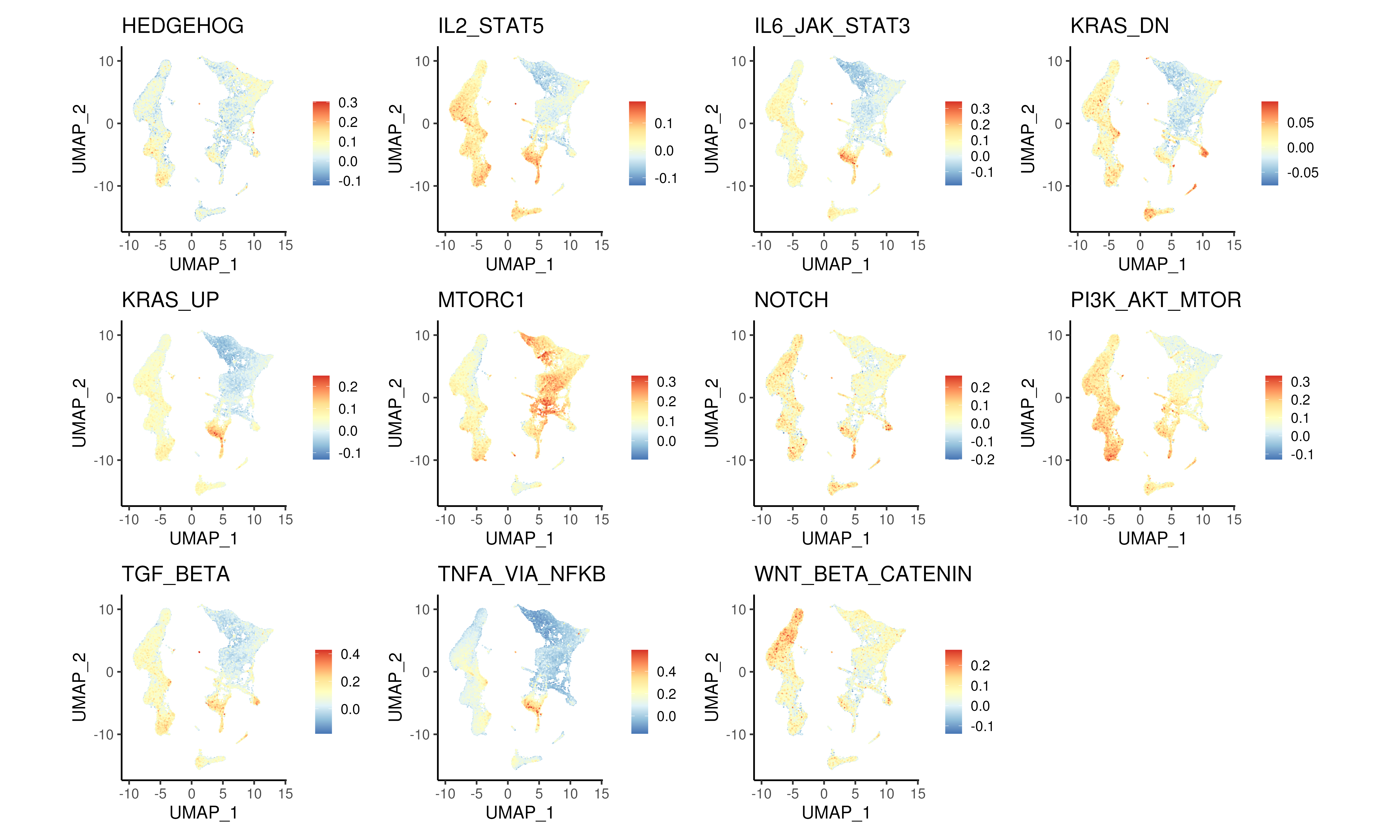
Figure 3.13: Module scores for different signalling pathways from MSigDB hallmark gene sets.
3.3.5 Code
Here, we provide the code to perform functional analysis on the marker genes calculated earlier against the (i) cell type signatures i.e. the C8 gene set in MSigDB and (ii) Gene Ontology (GO) Biological Process (BP) signatures in the C5 gene set in MSigDB. Two for loops are implemented to loop through the two gene sets and the different marker gene sets respectively. Parts of the functional analysis results are then visualized, specifically HAY_BONE_MARROW signatures in MSigDB C8 and differentiation-related signatures in MSigDB GO BP. Next, we provide code to perform cell cycle analysis and to calculate module scores for different signalling pathways from MSigDB hallmark gene sets.
### C. Gene module analysis + module score
# Functional analysis using clusterProfiler and msigdb
oupMarkerFunc = data.table()
set.seed(42)
for(iDB in c("C8", "C5_GO:BP")){
  # Get reference gene sets from msigdbr
  inpGS <- tstrsplit(iDB, "_")
  msigCat <- inpGS[[1]]; msigSubCat <- NULL
  if(length(inpGS) >= 2){msigSubCat <- inpGS[[2]]}
  inpGS <- data.frame(msigdbr(species = "Homo sapiens", category = msigCat,
                              subcategory = msigSubCat))
  inpGS <- inpGS[, c("gs_name","gene_symbol")]

  # Start up clusterProfiler
  for(i in unique(oupMarker$cluster)){
    tmpOut <- enricher(oupMarker[cluster == i]$gene,
                       universe = rownames(seu), TERM2GENE = inpGS)
    tmpOut <- data.table(sigdb = iDB, cluster = i, data.frame(tmpOut[, -2]))
    tmpOut$mLog10Padj <- -log10(tmpOut$p.adjust)
    tmpOut <- tmpOut[order(-mLog10Padj)]
    oupMarkerFunc <- rbindlist(list(oupMarkerFunc, tmpOut))
  }
}
oupMarkerFunc$cluster <- factor(oupMarkerFunc$cluster, levels = reorderCluster)
seu@misc$markerFunc <- oupMarkerFunc   # Store func analysis into Seurat object

# Plot functional analysis results
ggData <- oupMarkerFunc[grep("BONE_MARROW", ID)]
ggData$ID <- gsub("HAY_BONE_MARROW_", "", ggData$ID)
ggData$ID <- factor(ggData$ID, levels = unique(ggData$ID))
p1 <- ggplot(ggData, aes(cluster, ID, size = Count, color = mLog10Padj)) +
  geom_point() + ggtitle("HAY_BONE_MARROW signatures") +
  theme_linedraw(base_size = 18) +
  theme(axis.text.x = element_text(angle = -45, hjust = 0)) +
  scale_color_gradientn(colors = colGEX, limits = c(0,10), na.value = colGEX[8])
ggsave(p1, width = 12, height = 8, filename = "images/clustMarkersFuncBM.png")

tmp <- oupMarkerFunc[sigdb == "C5_GO:BP"]
tmp <- tmp[grep("DIFF", ID)][!grep("POSITIVE|NEGATIVE", ID)]$ID
ggData <- oupMarkerFunc[ID %in% tmp]
ggData$ID <- substr(gsub("GOBP_", "", ggData$ID), 1, 30)
ggData$ID <- factor(ggData$ID, levels = unique(ggData$ID))
p1 <- ggplot(ggData, aes(cluster, ID, size = Count, color = mLog10Padj)) +
  geom_point() + ggtitle("DIFF signatures") +
  theme_linedraw(base_size = 18) +
  theme(axis.text.x = element_text(angle = -45, hjust = 0)) +
  scale_color_gradientn(colors = colGEX, limits = c(0,8), na.value = colGEX[8])
ggsave(p1, width = 12, height = 10, filename = "images/clustMarkersFuncDiff.png")

# Cell cycle + plot on UMAP
seu <- CellCycleScoring(seu, s.features = cc.genes$s.genes,
                        g2m.features = cc.genes$g2m.genes)
p1 <- DimPlot(seu, reduction = "umap", pt.size = 0.1, group.by = "cluster",
              shuffle = TRUE, cols = colCls) + plotTheme + coord_fixed()
p2 <- DimPlot(seu, reduction = "umap", pt.size = 0.1, group.by = "Phase",
              shuffle = TRUE, cols = colCcy) + plotTheme + coord_fixed()
p3 <- FeaturePlot(seu, pt.size = 0.1, feature = "S.Score") +
  scale_color_distiller(palette = "RdYlBu") + plotTheme + coord_fixed()
p4 <- FeaturePlot(seu, pt.size = 0.1, feature = "G2M.Score") +
  scale_color_distiller(palette = "RdYlBu") + plotTheme + coord_fixed()
ggsave(p1 + p2 + p3 + p4,
       width = 10, height = 8, filename = "images/clustModuCellCycle.png")

# Add module score (Here, we use using HALLMARK SIGNALING gene sets)
inpGS <- data.table(msigdbr(species = "Homo sapiens", category = "H"))
inpGS <- inpGS[grep("SIGNAL", gs_name)]
inpGS$gs_name <- gsub("HALLMARK_", "", inpGS$gs_name)
inpGS$gs_name <- gsub("_SIGNALING", "", inpGS$gs_name)
inpGS <- split(inpGS$gene_symbol, inpGS$gs_name)
seu <- AddModuleScore(seu, features = inpGS, name = "HALLMARK")
colnames(seu@meta.data)[grep("HALLMARK", colnames(seu@meta.data))] <- names(inpGS)

p1 <- FeaturePlot(seu, reduction = "umap", pt.size = 0.1,
                  features = names(inpGS), order = TRUE) &
  scale_color_distiller(palette = "RdYlBu") & plotTheme & coord_fixed()
ggsave(p1, width = 20, height = 12, filename = "images/clustModuScore.png")
3.4 Annotating clusters
As mentioned at the start of this chapter, cell clustering has allowed biologists to define cell types in an unsupervised manner. Thus, an important end goal of cell clustering is to annotate the identified cell clusters. Cell type annotation / classification is not a trivial task and often require expert opinion in the tissue being studied. However, computational tools have been developed to leverage on large volumes of existing single-cell data to help accelerate the process of cell type annotation.
3.4.1 Different approaches to cell type annotation
There exist many computational tools that can assign cell type labels to single
cells as described by this benchmarking study (Abdelaal et al. 2019) and this
review (Pasquini et al. 2021). Briefly, there are three main
computational approaches to annotate cell types (Figure @ref{clust-celltype}).
First, marker gene approaches leverage on lists of marker gene sets that can
distinguish different cell types from existing literature and previous
single-cell studies. Single cells or clusters are then scored using these
marker gene sets e.g. using AddModuleScore to estimate the overall expression
levels of these genes. Some heuristics / scoring criteria is then applied to
assign the cell type. Second, correlation approaches apply multiple correlation
measures to estimate the similarity between the single cells / clusters in the
input dataset against some reference data e.g. single-cell atlases or bulk
RNA-seq databases such as GTeX / FANTOM. Third, supervised classification
approaches uses machine learning or deep learning to predict cell type labels.
The learning model is first trained on some single-cell reference atlas before
being applied onto the input dataset to compute the probability that a single
cell / cluster belong to a particular cell type.
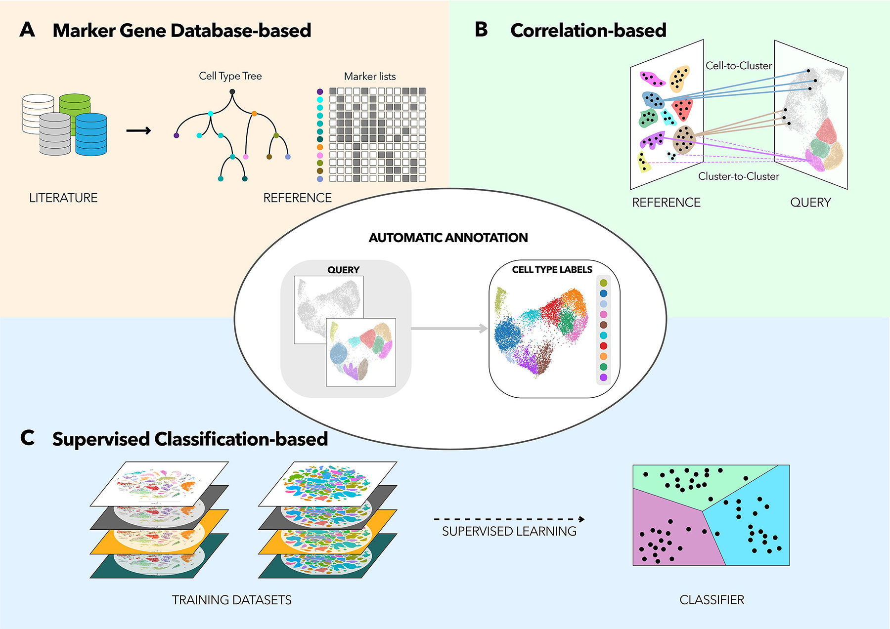
Figure 3.14: There are three main approaches to cell type annotation in single-cell studies, namely marker gene approaches, correlation approaches and supervised classification approaches. Image taken from Pasquini et al. (2021)
In all three approaches, the choice of the reference data is crucial for the success of the cell type annotation. Ideally, the reference data should be encompass the tissue / cell types that are profiled in the input dataset. Otherwise, spurious results may occur e.g. when one tries to annotate the bone marrow dataset using a brain atlas reference. Furthermore, the cell type labels in the reference data will determine the “resolution” of the predicted cell type annotation. For example, using a reference that only has coarse cell type labels (e.g. having a general T-cell label as opposed to CD4+ Naive, CD8+ Naive etc finer labels) can only result in coarse-level annotations and vice versa.
Also, it is important to have the option of having unassigned cells. This happens when a single cell / cluster has a very low score across all the cell types present in the reference. Biologically, this can be a novel rare cell population that is not annotated in the reference data or represent stressed / dying cells that has “lost” their cell fate identity. Furthermore, cell fate is highly plastic and there is a possibility that cells are trans-differentiating between two cell fates. In this scenario, it is possible that a single cell / cluster has high scores in two different cell types.
3.4.2 Annotation via marker genes and functional analysis
In this guide, we will be annotating the clusters manually based on the marker genes and HAY_BONE_MARROW gene signature overrepresentation analysis that we have performed earlier (Figure @ref{clust-annotTable}). The major cell state e.g. HSC / progenitors / erythroid / dendritic cell / monocyte / B cell / T cell / NK cell can be determined from the HAY_BONE_MARROW signatures and some of the cellular substates can be resolved using marker genes.
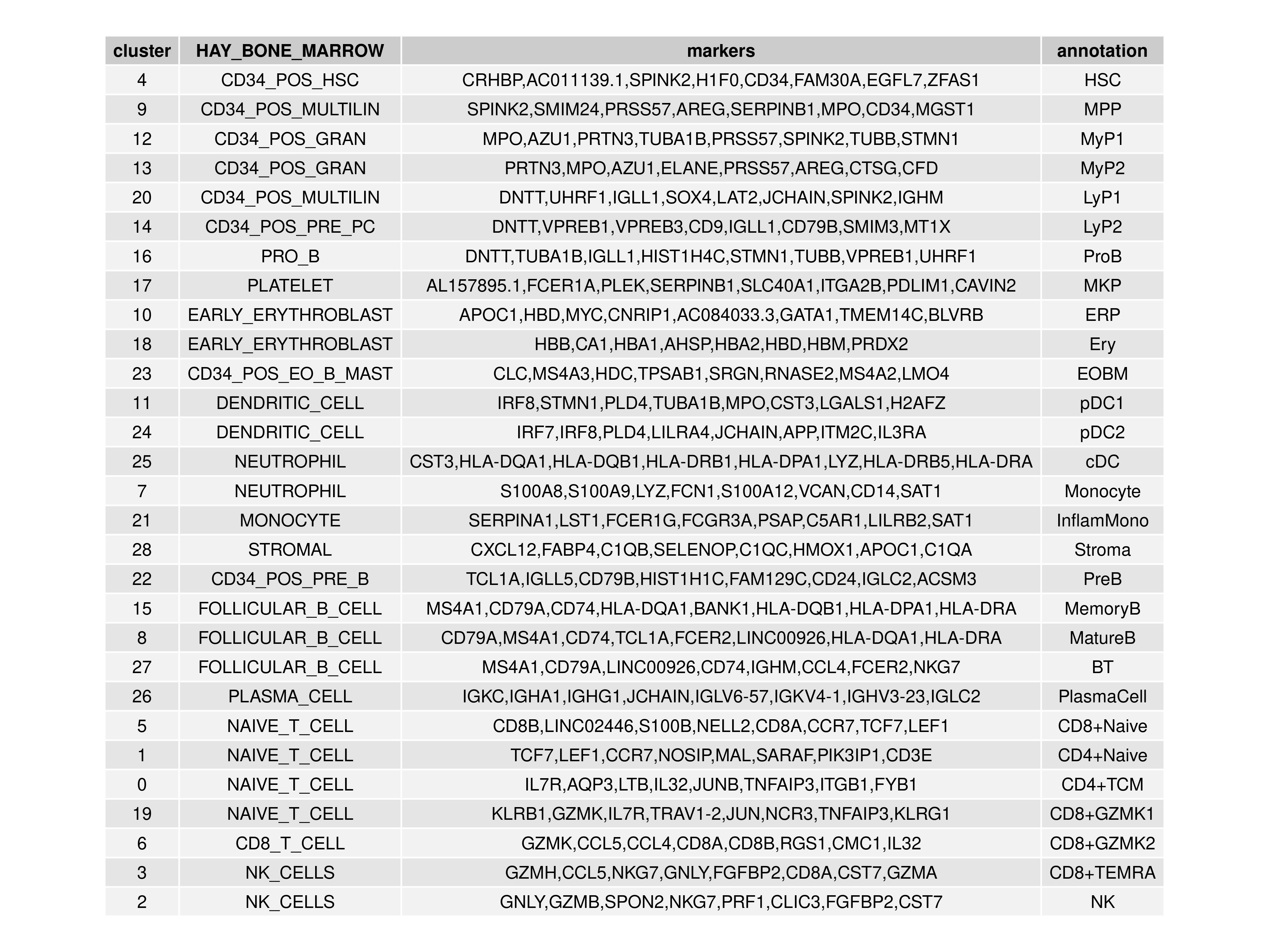
Figure 3.15: Annotation of the 29 clusters in the bone marrow dataset via marker genes and HAY_BONE_MARROW gene signature analysis.
3.4.3 Visualising annotated clusters
The final step is to relabel the cell clusters into the annotation labels. The resulting annotated cell types can then be visualised in t-SNE and UMAP projections (Figure @ref{clust-annotTsum}).
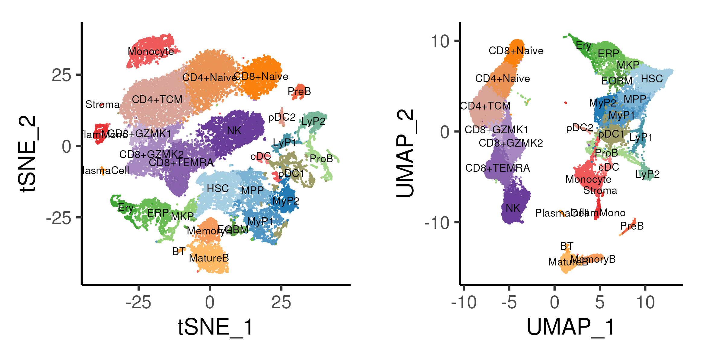
Figure 3.16: t-SNE and UMAP projections coloure by annotated cell types.
3.4.4 Code
Here, we provide code that extracts the most significant HAY_BONE_MARROW
signature and top 8 marker genes by log-fold-change for each cluster to
generate a table for the purposes of annotating the clusters. All 29 clusters
are then annotated and a new metadata called celltype is being created in the
Seurat object by mapping the cluster labels. The cell type label is then
visualized on both t-SNE and UMAP projections.
### D. Annotating clusters
oupAnnot = data.table(cluster = reorderCluster)
# Add in top 5 marker genes
ggData <- oupMarker[, head(.SD, 8), by = "cluster"]
ggData <- ggData[, paste0(gene, collapse = ","), by = "cluster"]
colnames(ggData)[2] <- "markers"
oupAnnot <- ggData[oupAnnot, on = "cluster"]
# Add in BONE_MARROW enrichment
ggData <- oupMarkerFunc[grep("BONE_MARROW", ID)][, head(.SD, 1), by = "cluster"]
ggData <- ggData[, c("cluster", "ID")]
ggData$ID <- gsub("HAY_BONE_MARROW_", "", ggData$ID)
colnames(ggData)[2] <- "HAY_BONE_MARROW"
oupAnnot <- ggData[oupAnnot, on = "cluster"]
# Add in annotation
oupAnnot$annotation <- c("HSC","MPP","MyP1","MyP2","LyP1","LyP2","ProB",
                         "ERP","Ery","MKP","EOBM",
                         "pDC1","pDC2","cDC","Monocyte","InflamMono","Stroma",
                         "PreB","MemoryB","MatureB","BT","PlasmaCell",
                         "CD8+Naive","CD4+Naive","CD4+TCM",
                         "CD8+GZMK1","CD8+GZMK2","CD8+TEMRA","NK")
# Output table
png("images/clustReAnnotTable.png",
    width = 12, height = 9, units = "in", res = 300)
p1 <- tableGrob(oupAnnot, rows = NULL)
grid.arrange(p1)
dev.off()

# Add new annotation into seurat and replot
tmpMap <- oupAnnot$annotation
names(tmpMap) <- oupAnnot$cluster
seu$celltype <- tmpMap[as.character(seu$cluster)]
seu$celltype <- factor(seu$celltype, levels = tmpMap)
Idents(seu) <- seu$celltype  # Set seurat to use celltype

# Plot ideal resolution on tSNE and UMAP
p1 <- DimPlot(seu, reduction = "tsne", pt.size = 0.1, label = TRUE,
              label.size = 3, cols = colCls) + plotTheme + coord_fixed()
p2 <- DimPlot(seu, reduction = "umap", pt.size = 0.1, label = TRUE,
              label.size = 3, cols = colCls) + plotTheme + coord_fixed()
ggsave(p1 + p2 & theme(legend.position = "none"),
       width = 8, height = 4, filename = "images/clustReAnnotTsUm.png")


# Save Seurat Object at end of each section
saveRDS(seu, file = "bmSeu.rds")